Better Daze
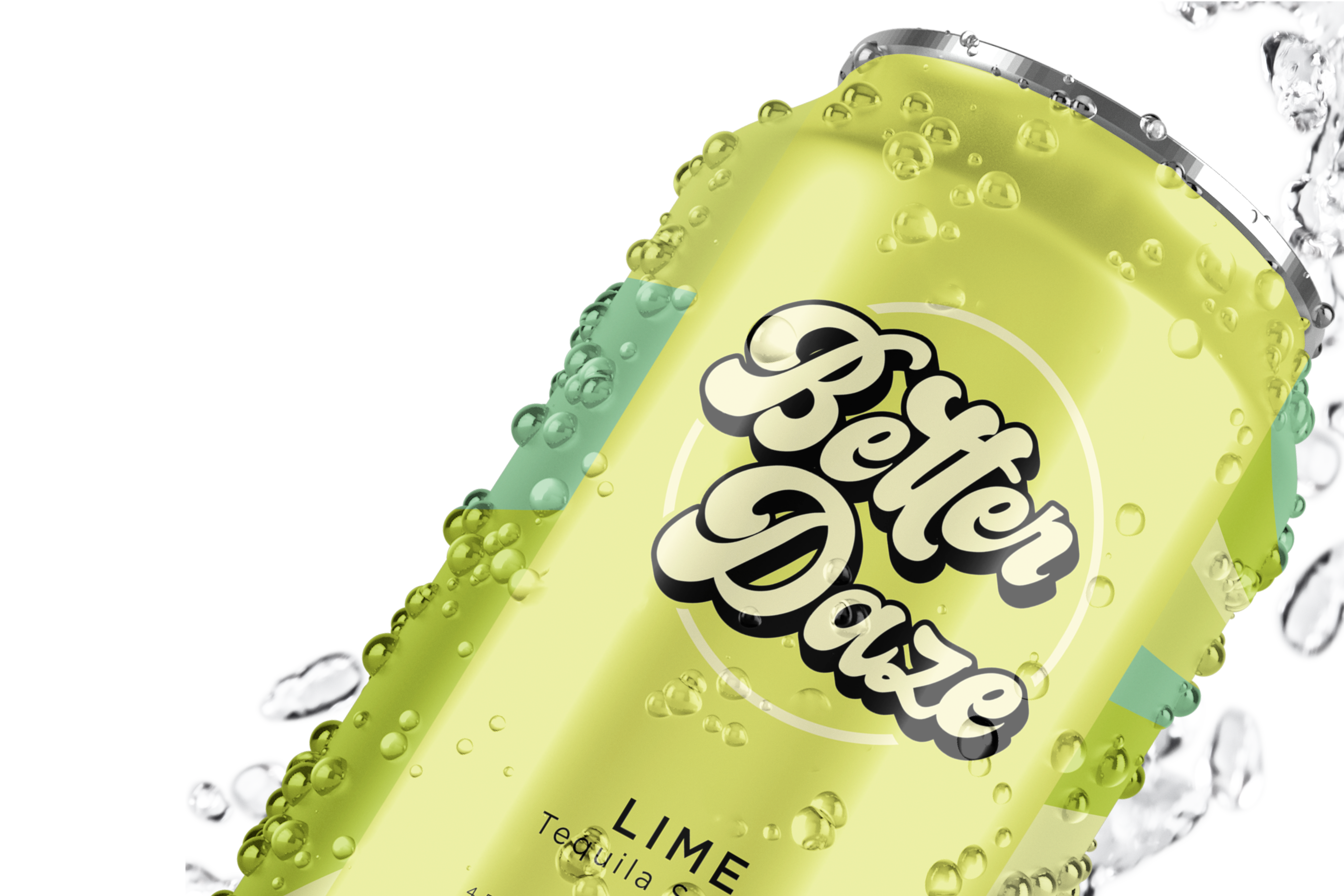
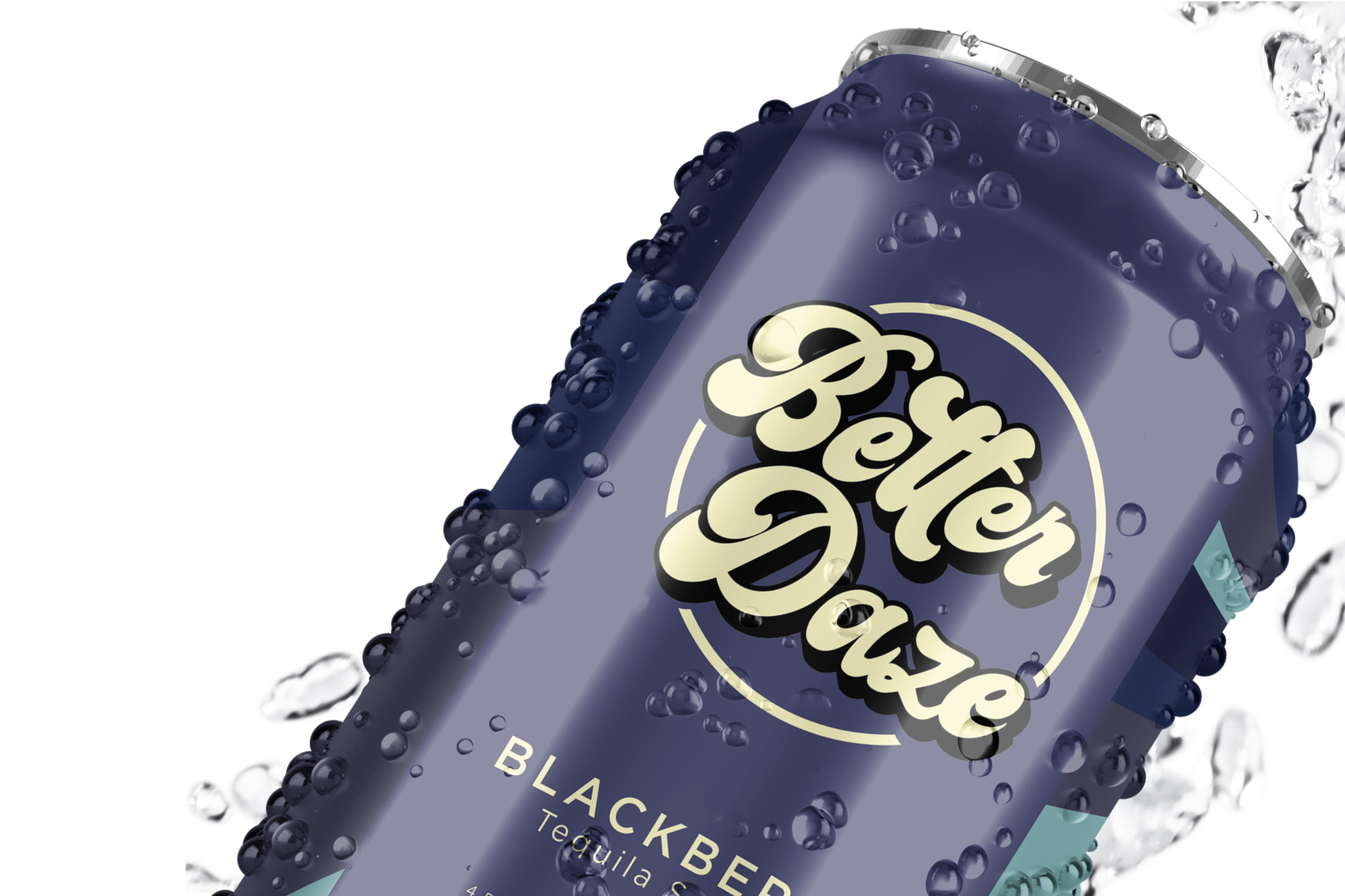
Brand and Package design for Better Daze TequilaIn the world of endless beverage brand designs, the Better Daze tequila seltzer package design emerges as a vibrant retro ode to flavour and festivity.


Better Daze Logo
The "Better Daze" logo design is a visual encapsulation of retro euphoria, a harmonious fusion of nostalgia and modernity. Inspired by the free-spirited typography of the 60s and 70s, the custom font radiates groovy vibes, echoing the carefree essence of those bygone eras, the nostagia working to attract consumers.
The design transcends mere aesthetics—it's a nostalgic journey, a nod to the past with a contemporary twist. "Better Daze" embodies a timeless spirit. The name and design invites viewers to revel in the euphoria of yesteryears while embracing the optimism of today.


The overarching motif of the fluid spiral is a visual metaphor for the intoxicating swirl of flavours within the design and the joyous journey that each sip undertakes.
The radiating spiral represents a rising or setting sun, implying that with this drink, “Better Days” are ahead, playing on the brand name. The design seeks not just to adorn a beverage receptacle but to elevate the entire drinking experience, inviting consumers to immerse themselves in a multisensory celebration of classic and refreshing flavours.
The radiating spiral represents a rising or setting sun, implying that with this drink, “Better Days” are ahead, playing on the brand name. The design seeks not just to adorn a beverage receptacle but to elevate the entire drinking experience, inviting consumers to immerse themselves in a multisensory celebration of classic and refreshing flavours.

