Packaging Design
12 weeksDESIGN
Tools
Adobe Illustrator
Adobe Photoshop
Quality Street Redesign
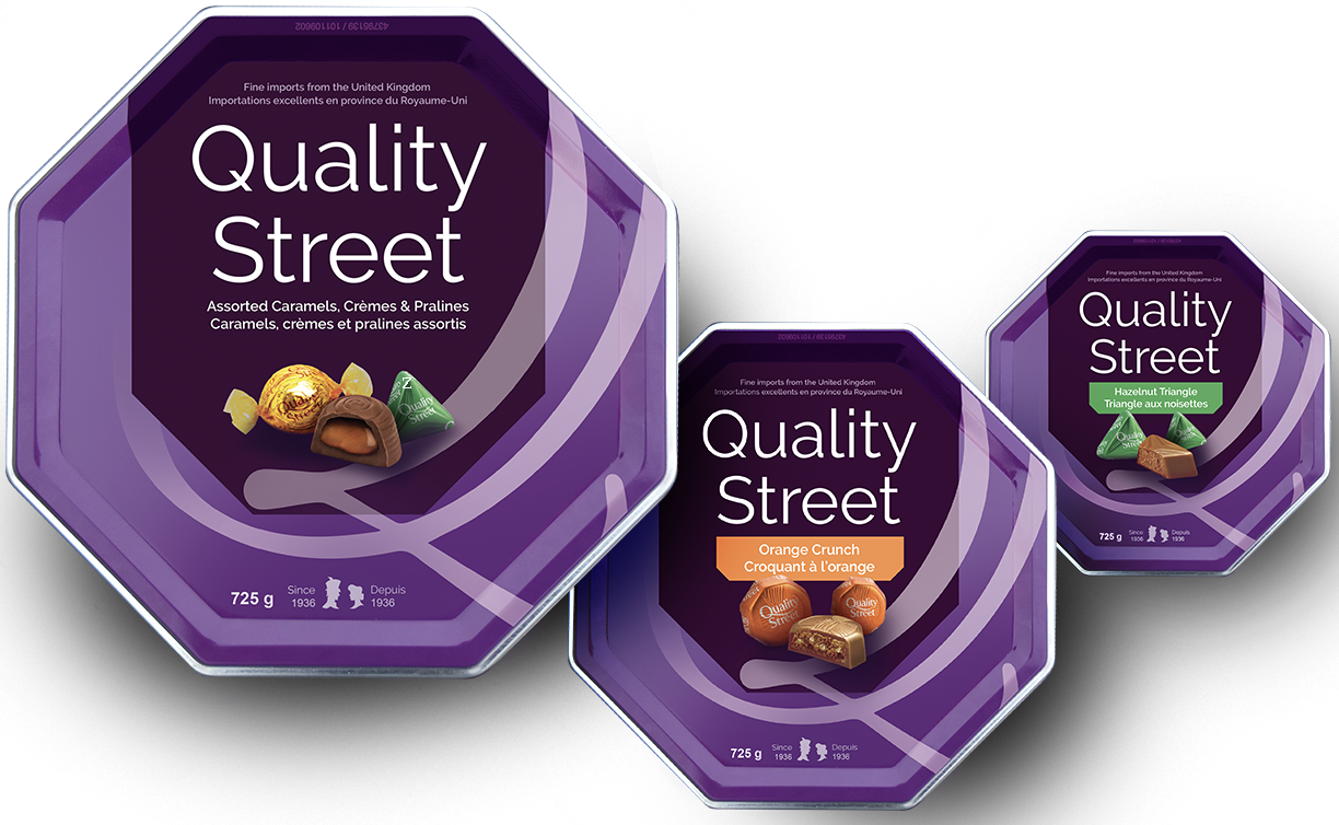
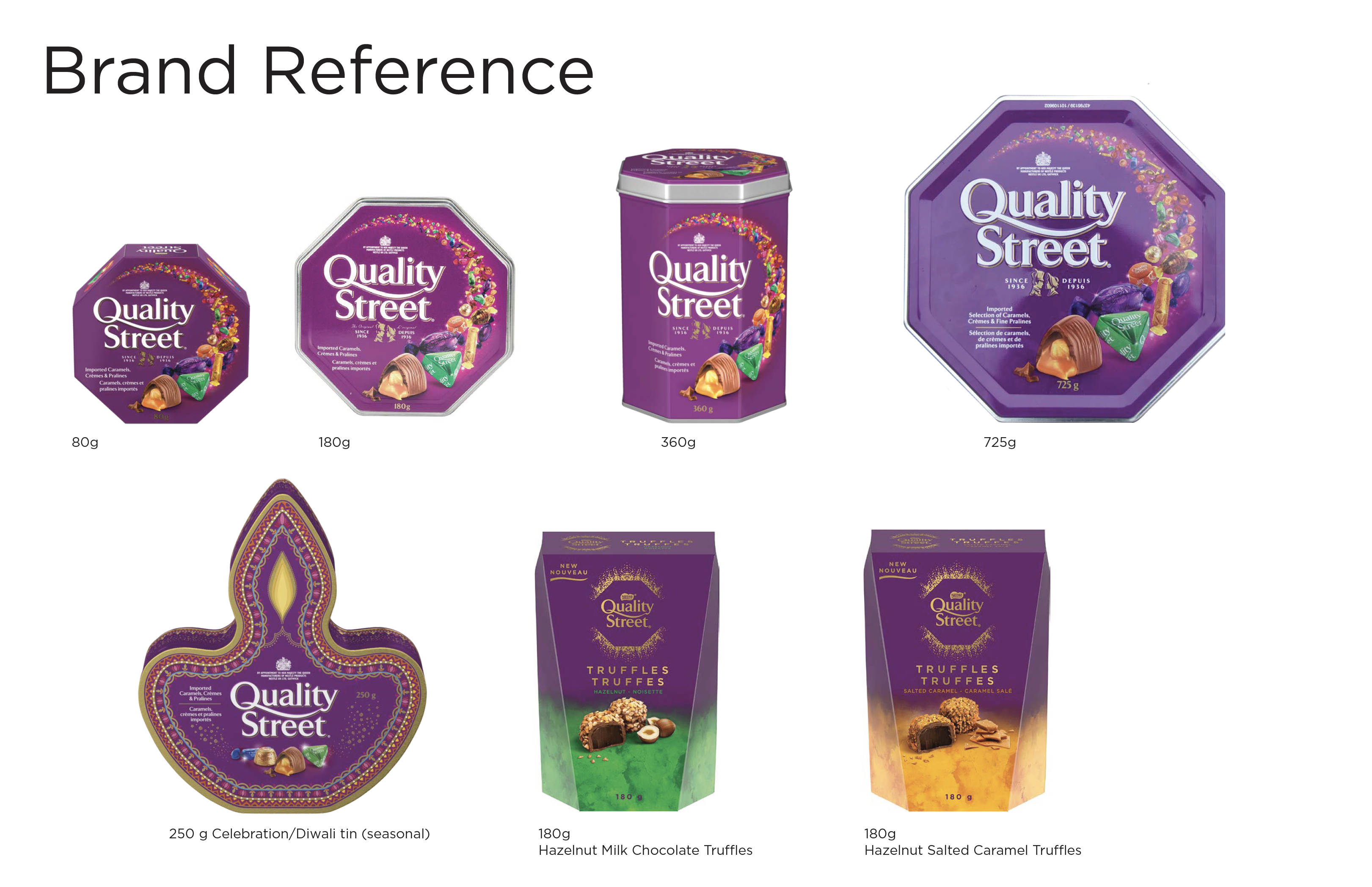
The Canadian Quality Street packaging was way overe due for a redesign. I wanted to preserve the iconic purple octagon shaped tin and accentuated it by mimicking the same lines on the plum coloured shape. I redesigned the Quality Street “Q” and used it as a new logo and hero graphic of the package. I went for an elegant and vibrant feel, while keeping tradition. Knowing how important tradition and the story behind the company is, I incorporated more modern and simplified versions of the original Quality Street brand characters; Miss. Sweetly and Major Quality.I also created line extensions and expanded the brand to two other fan favour flavours; The Green Triangle and Orange Crunch.


