Hi there! I’m Katerina
Hi there! I’m Katerina
Hi there! I’m Katerina
Hi there! I’m Katerina
Thesis Project
24 weeksCOMMEMORATION
Tools
Adobe Photoshop
Adobe Illustrator
Adobe InDesign
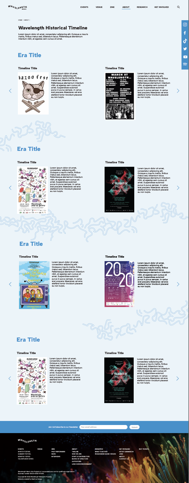
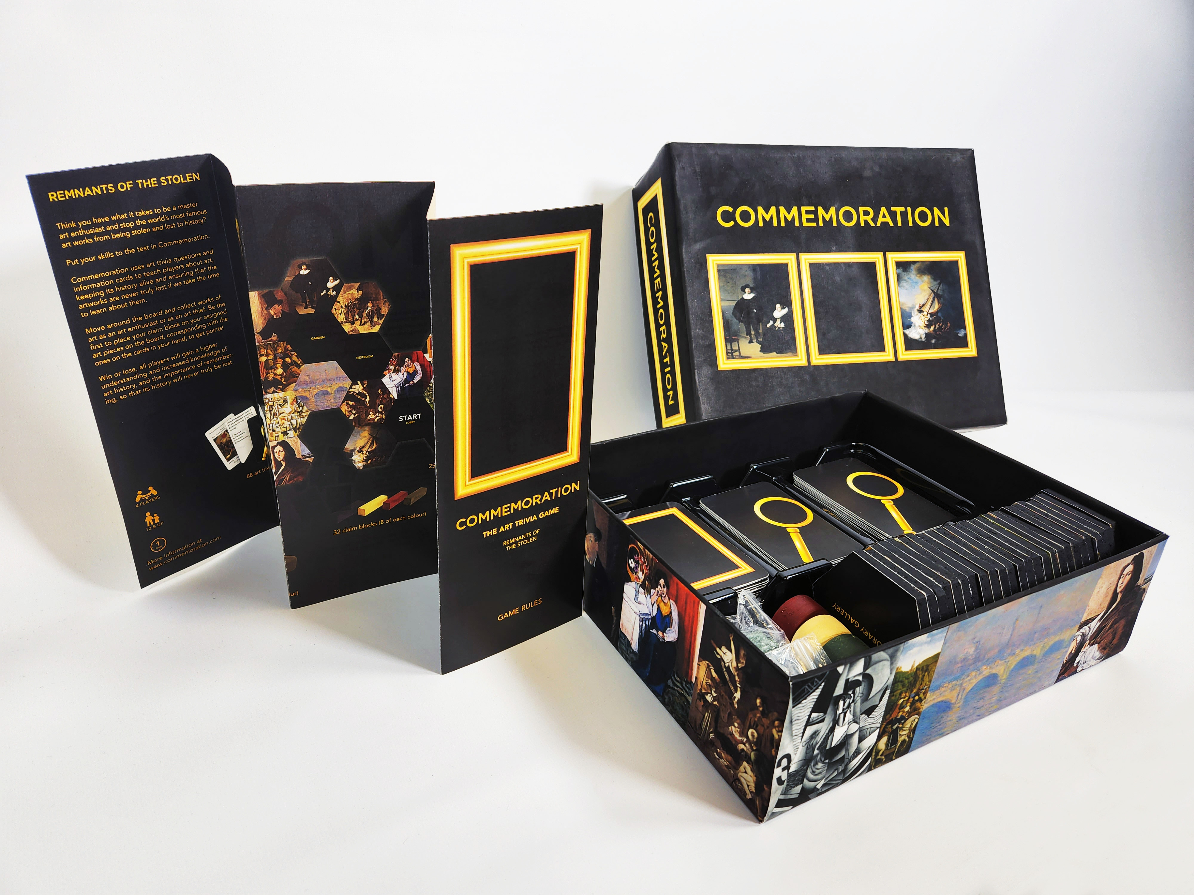
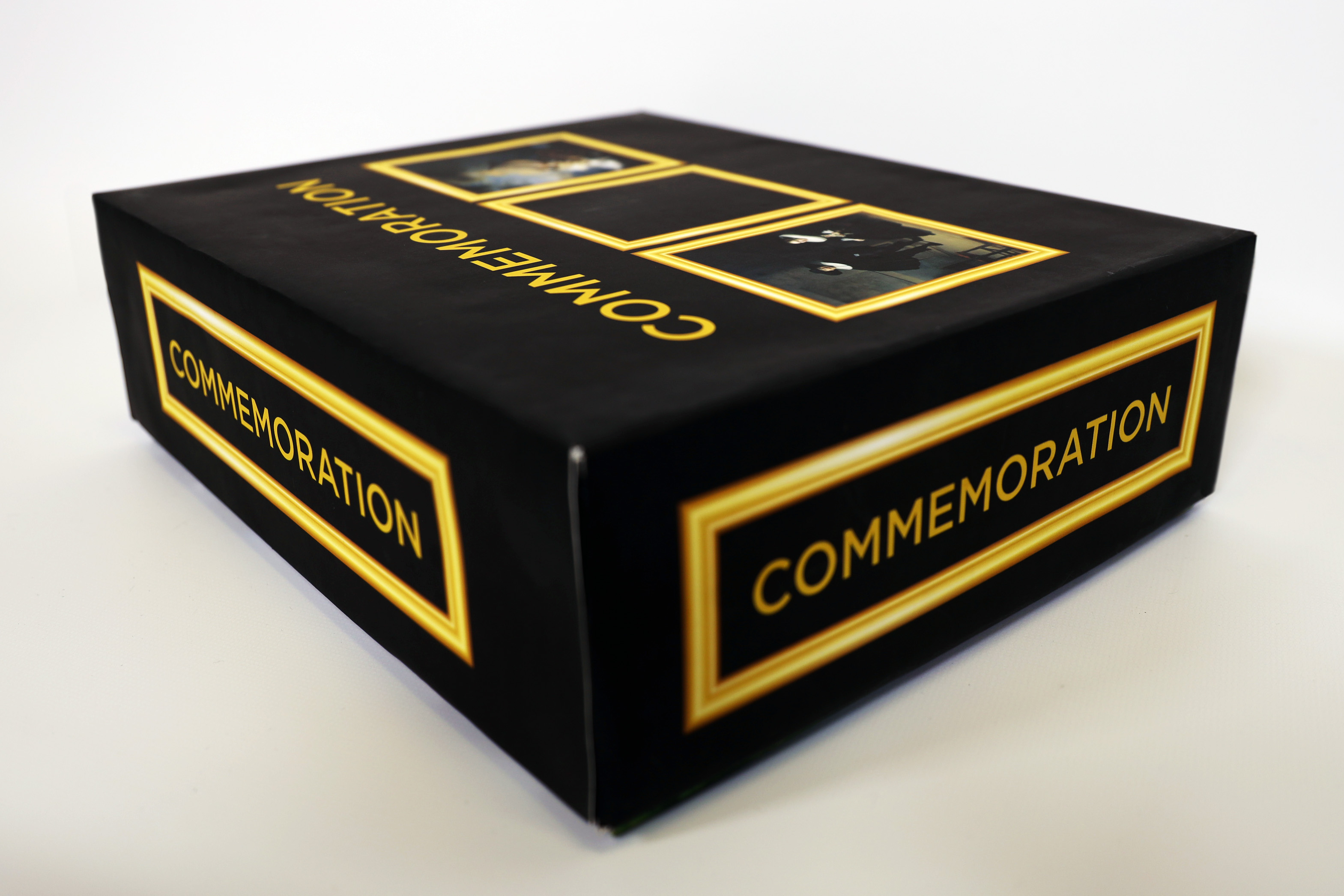
Commemoration
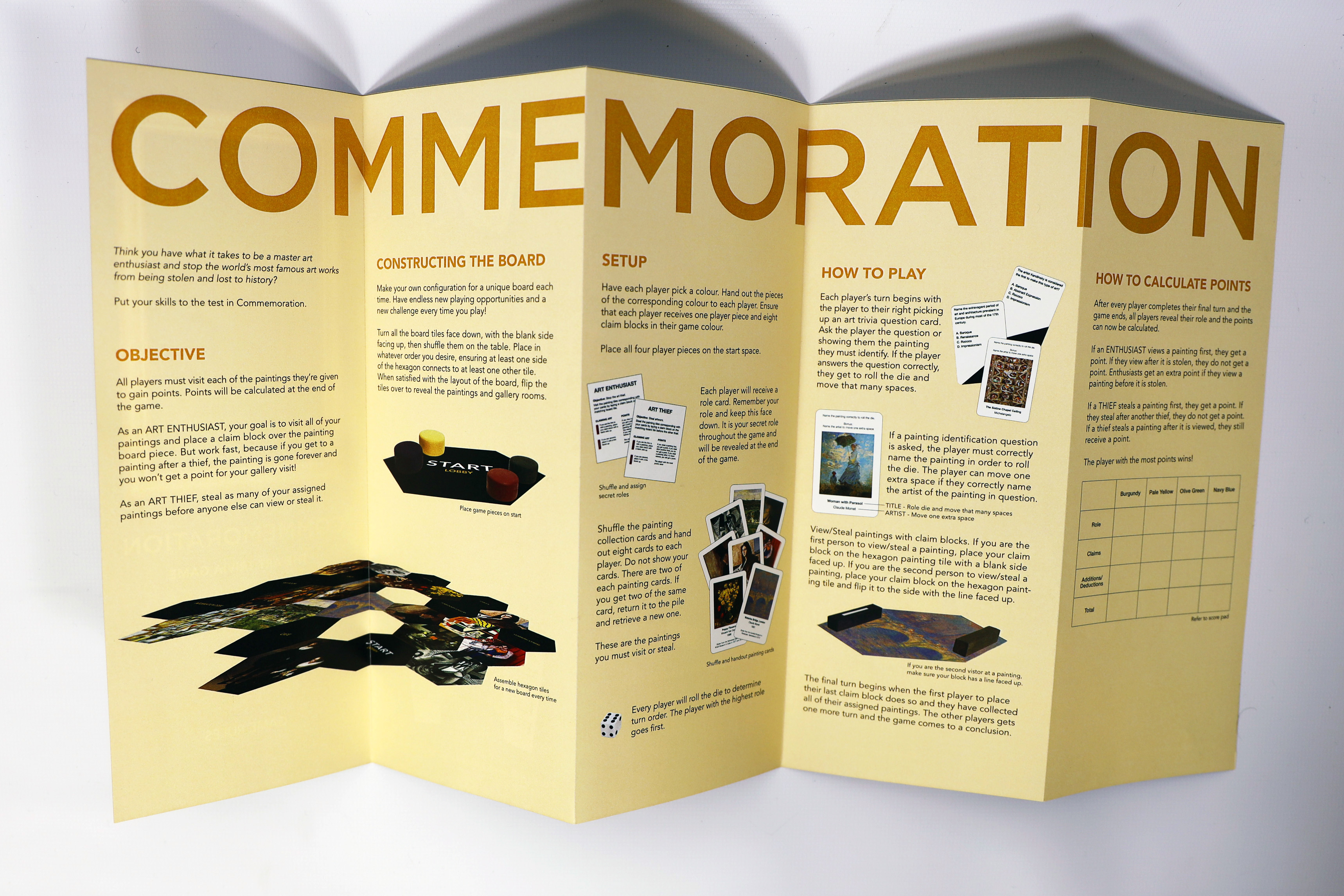
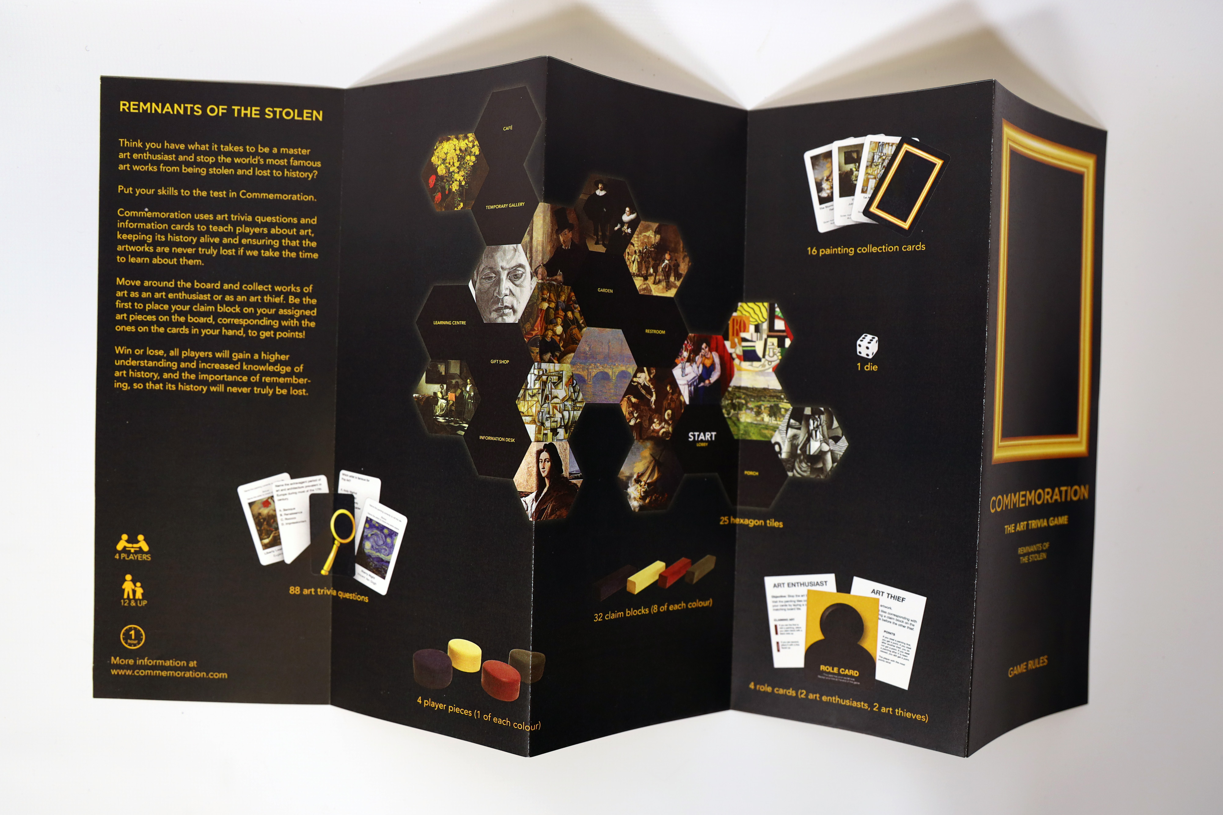
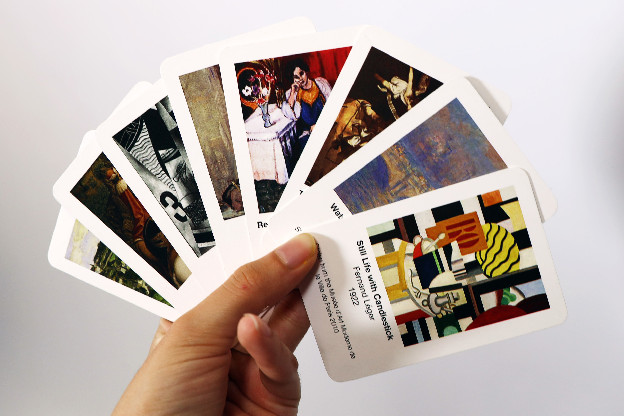
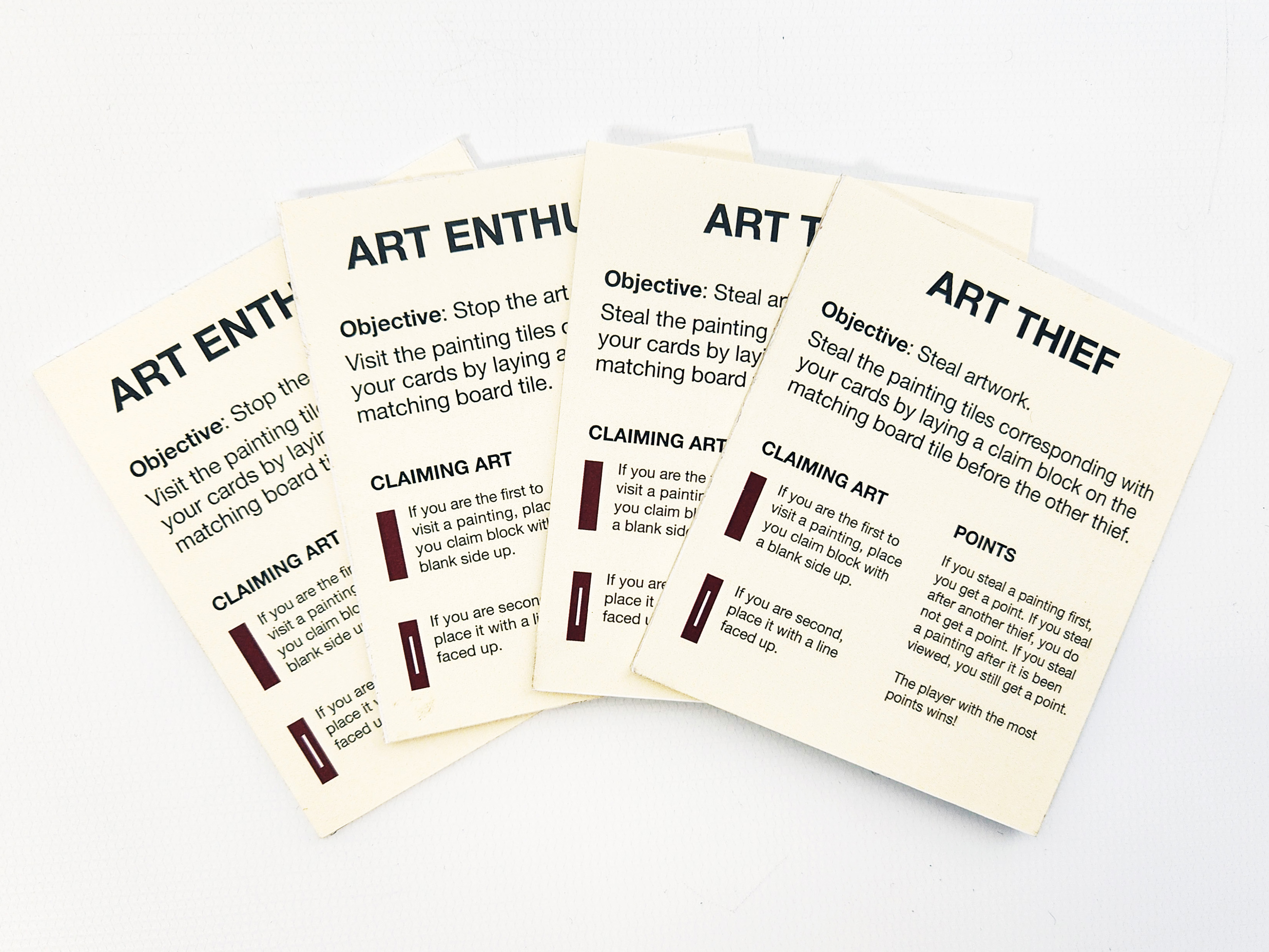
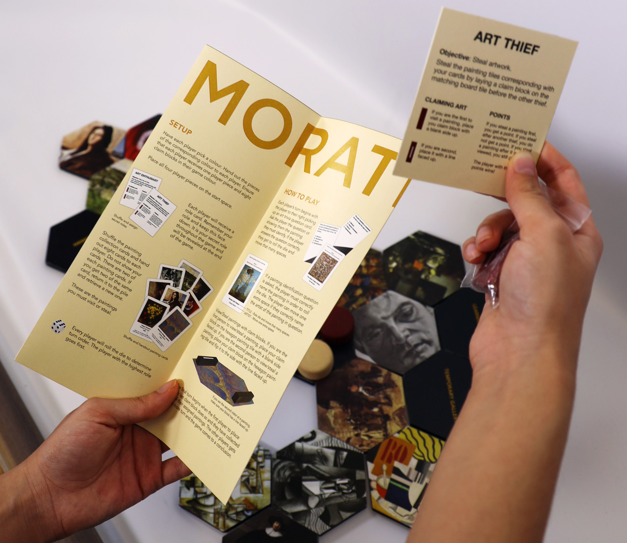
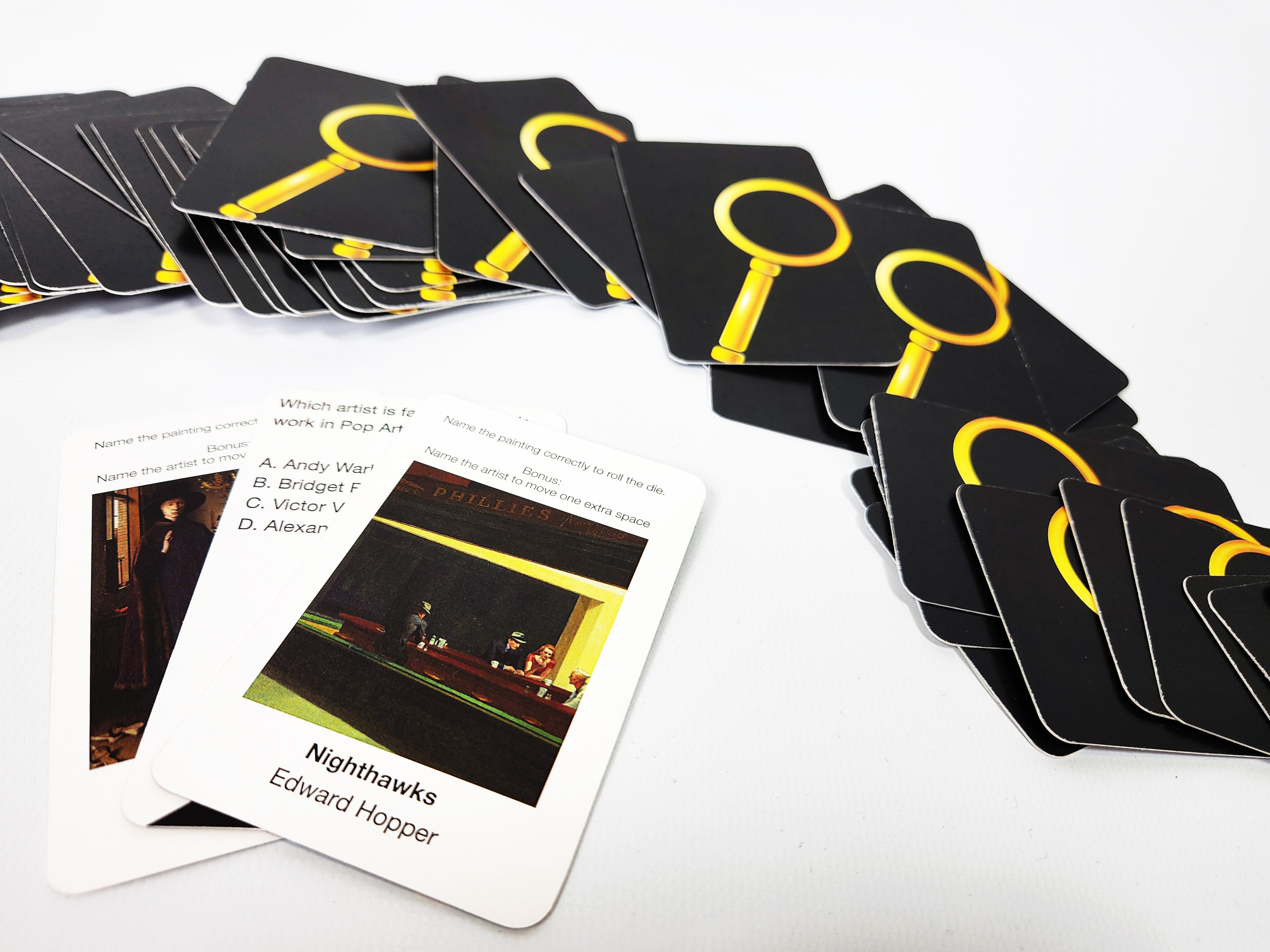
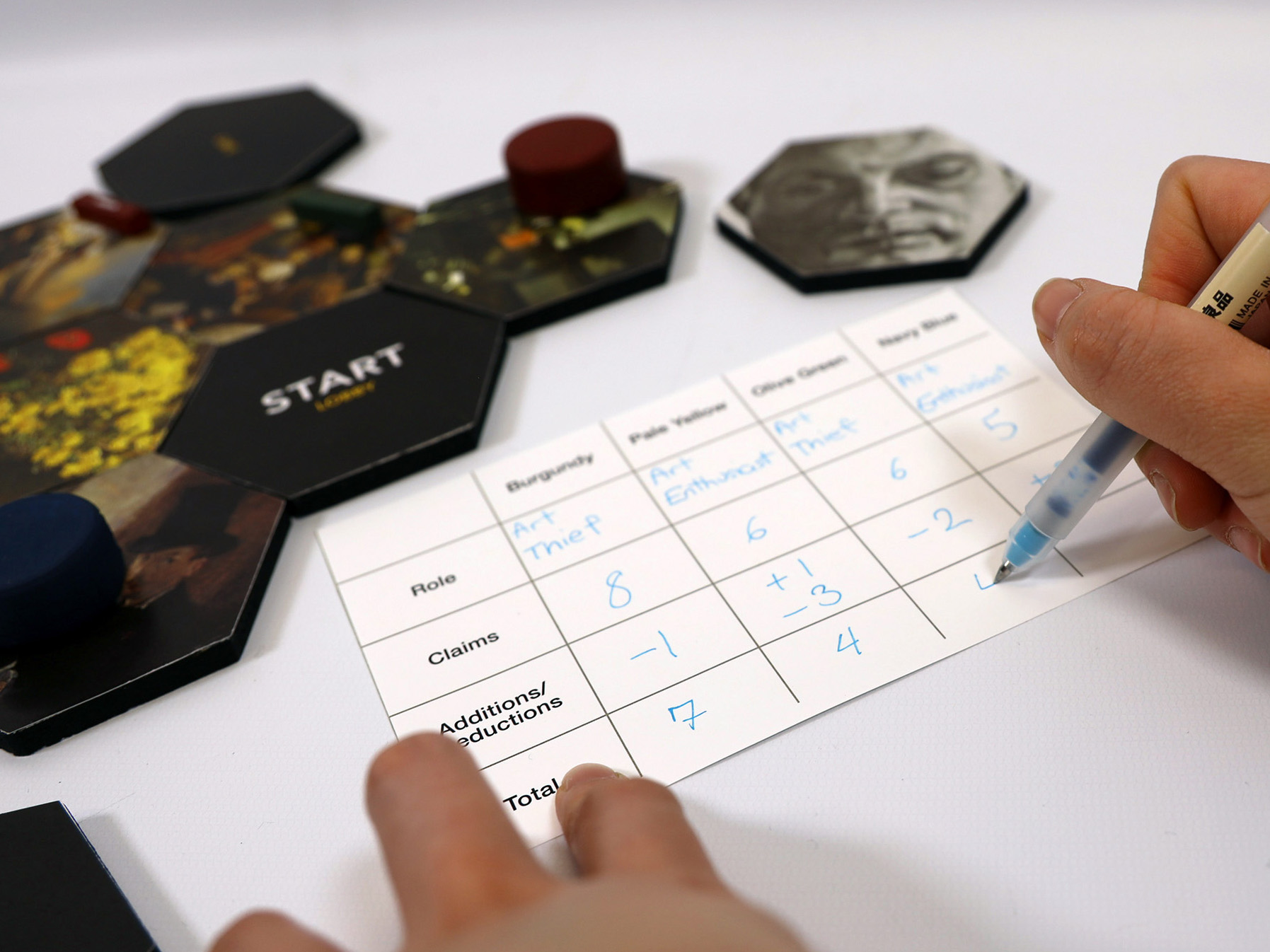
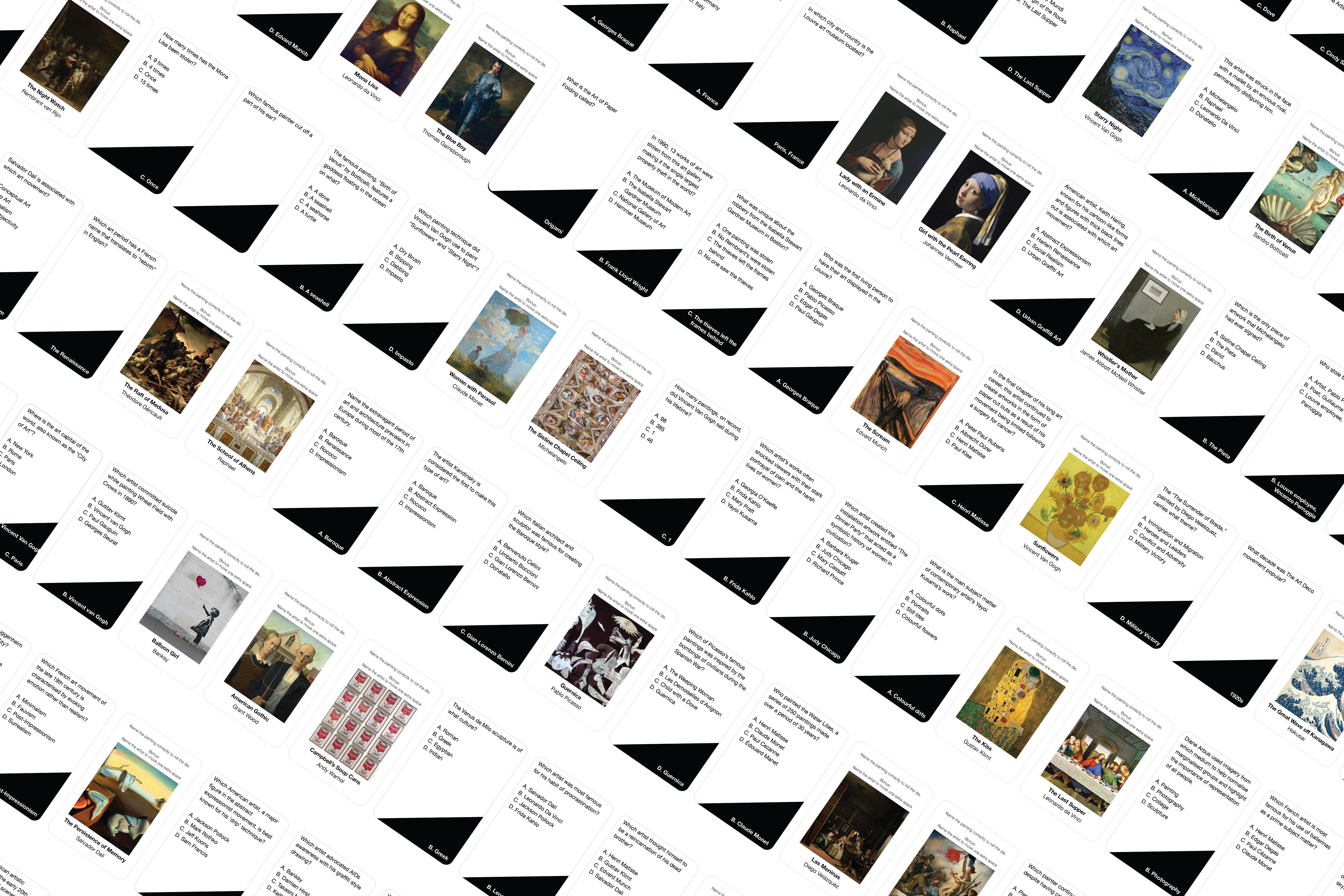
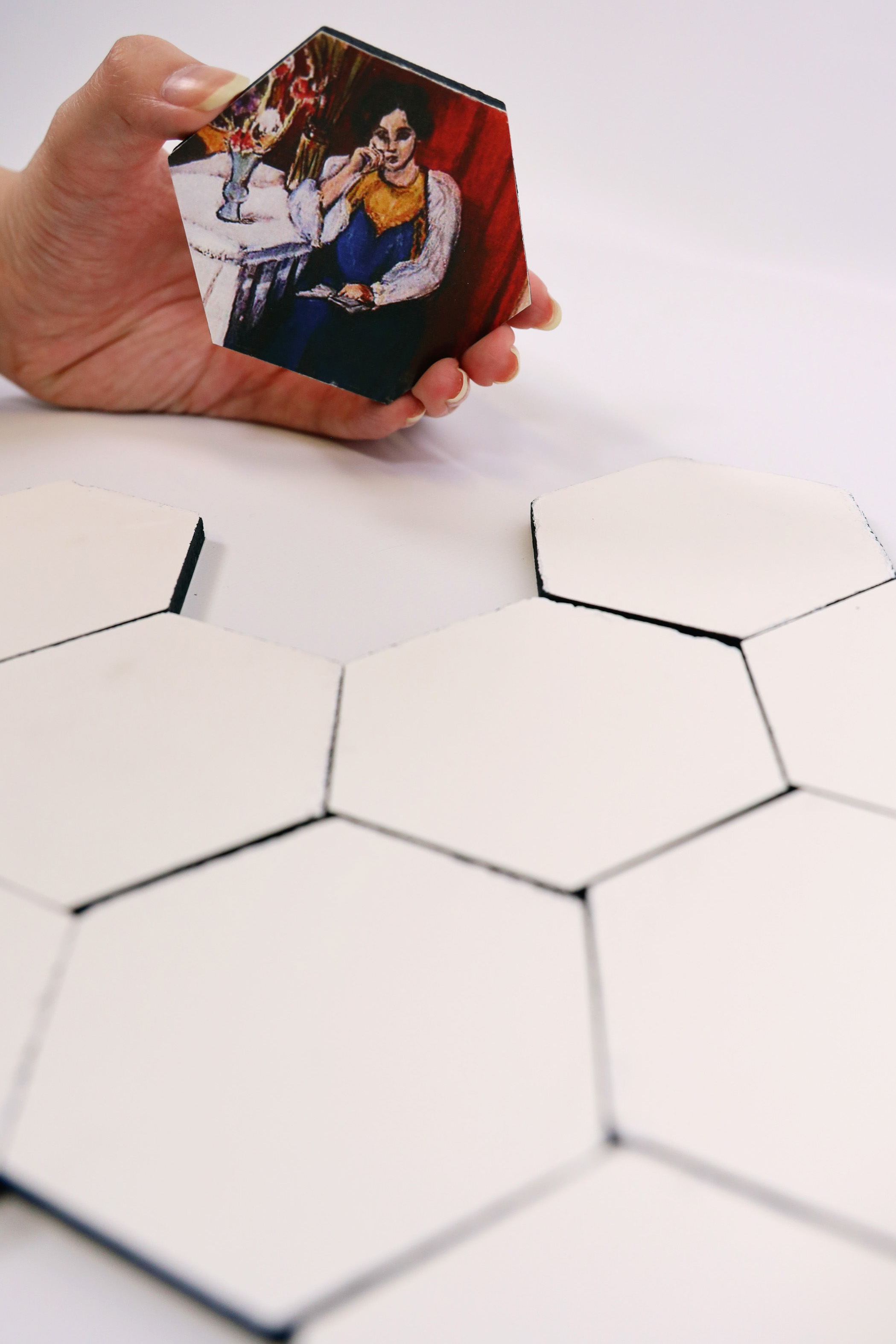
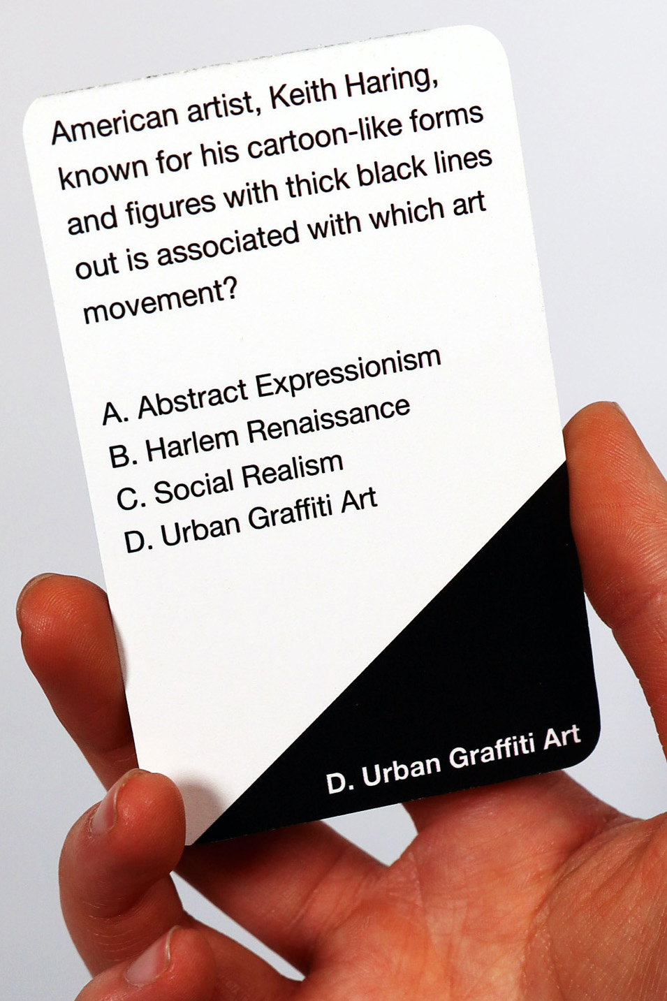
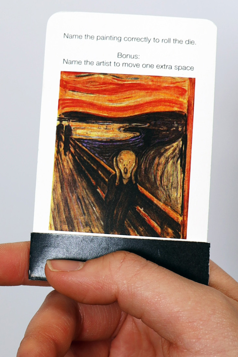
Commemoration is an art trivia board game that uses questions cards to teach players about art, keeping its history alive and ensuring that the artworks are never truly lost if we take the time to learn about them.Win or lose, all players will gain a higher understanding and increased knowledge of art history, and the importance of remembering and history.
A painting speaks a thousand words, and Commemoration is full of stories.
How can designers preserve stolen art and keep it’s image and historical significance alive? And possibly work the story of it being stolen into the history of the art?
The goal of this project is to keep the history of art that has been stolen alive, to not erase their stories even though they can no longer be seen. Currently, museums and galleries prefer to hide when art is stolen, hoping they fade from the public eye naturally as only 3% of art thefts are registered with the Art Loss Register (ALR) and Interpol (Durney & Proulx, 2011, p. 121). I believe the story of how and why valuable art was stolen should be worked into its history, making it more famous, not making it cease to exist.
My research examines goals, outcomes, factors that lead to their success or failures, as well as what we can learn from art heists around the world involving works by the great masters including Rembrandt, Picasso, and Braque throughout history. The theft of 13 artworks from the Isabella Stewart Gardner Museum in Boston on March 18th 1990 is the main case study. Other case studies include the theft from the Montreal Museum of Fine Arts in 1972, the Moderna Museet in Stockholm in 1993, the 2010 heist from Paris’s Musée d’Art Moderne de la Ville, and the Louvre heist of the Mona Lisa in 1911.
Most notably of these secondary case studies, in the context of Commemoration, is the stealing of the Mona Lisa in 1911 from the Louvre by Louvre employee Vincenzo Peruggia. The mystery had everyone talking about DaVinci’s masterpiece, contributing to its popularity and working the story of its tragic disappearance into the history of the painting, turning the Mona Lisa the famous wonder it is today.
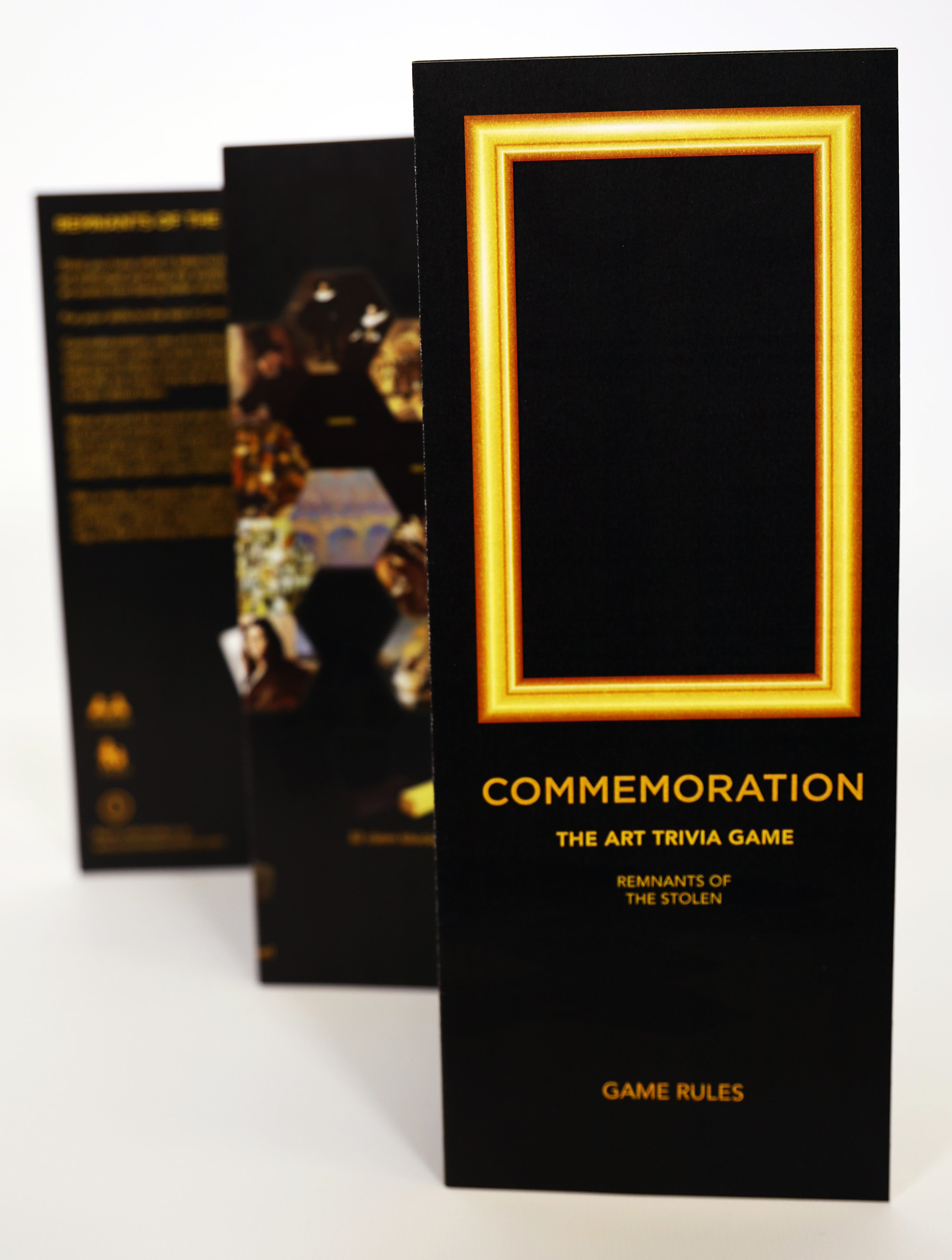
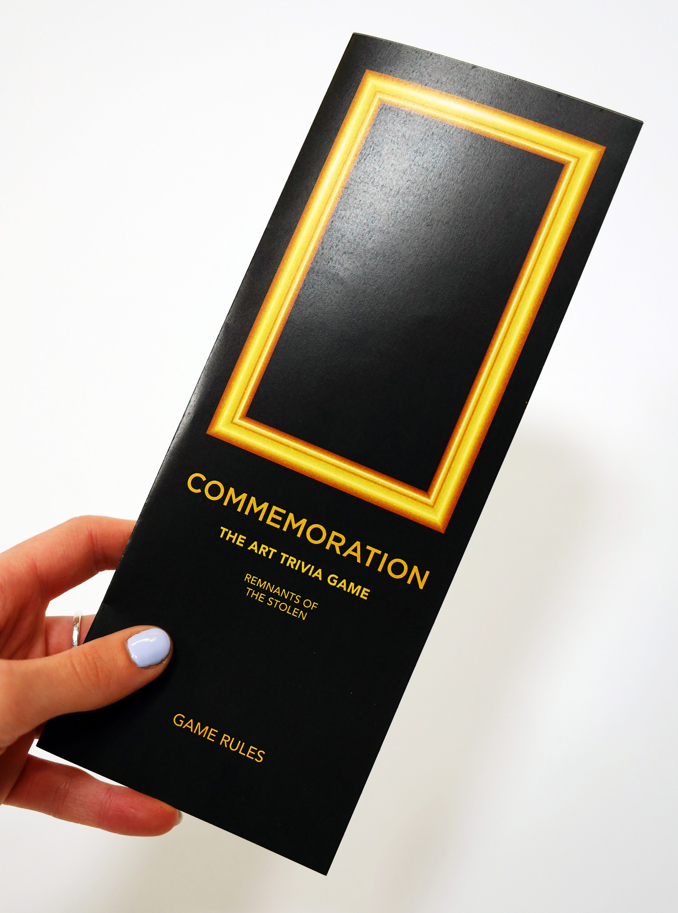
View the Instruction Manual and learn how to play here!

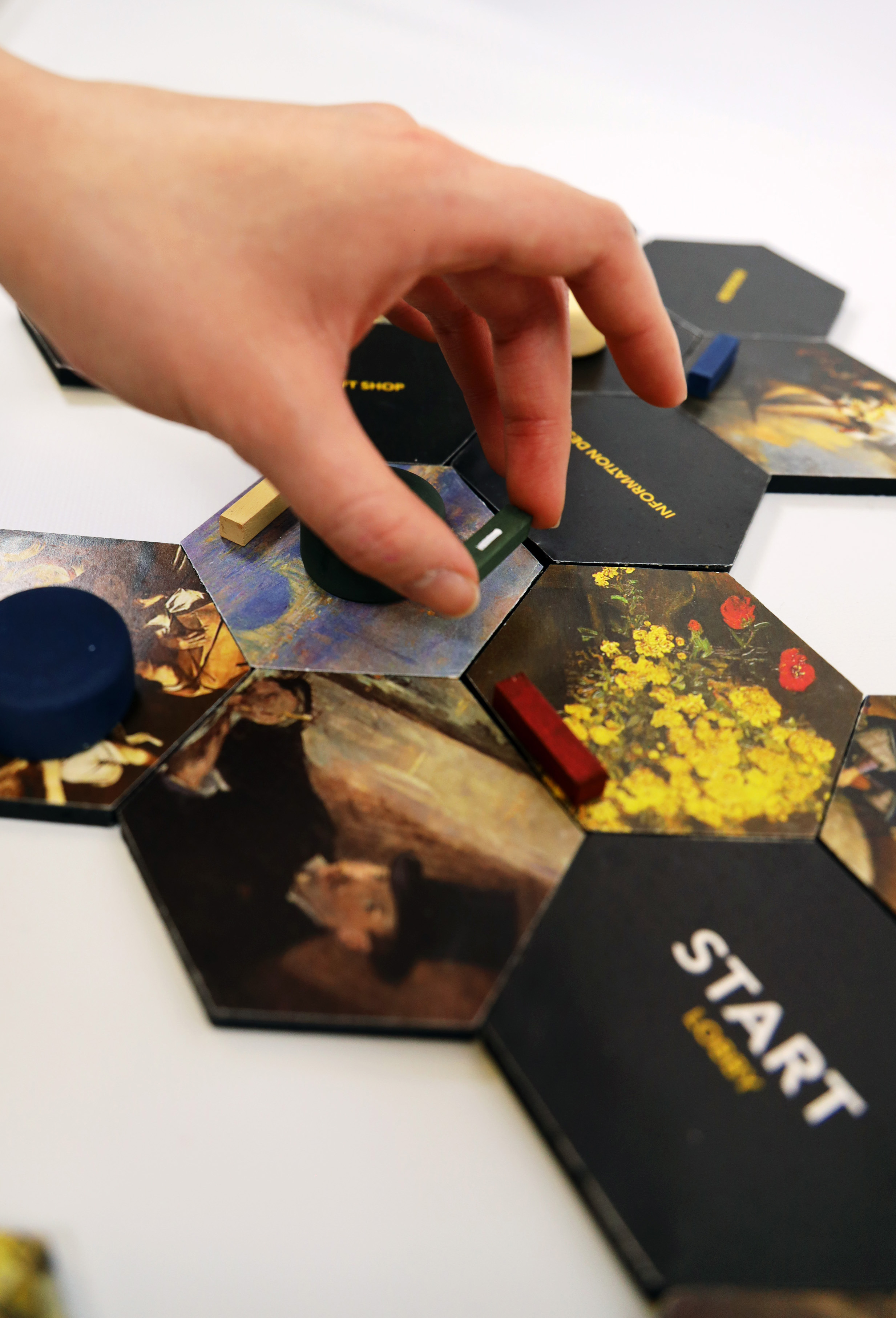
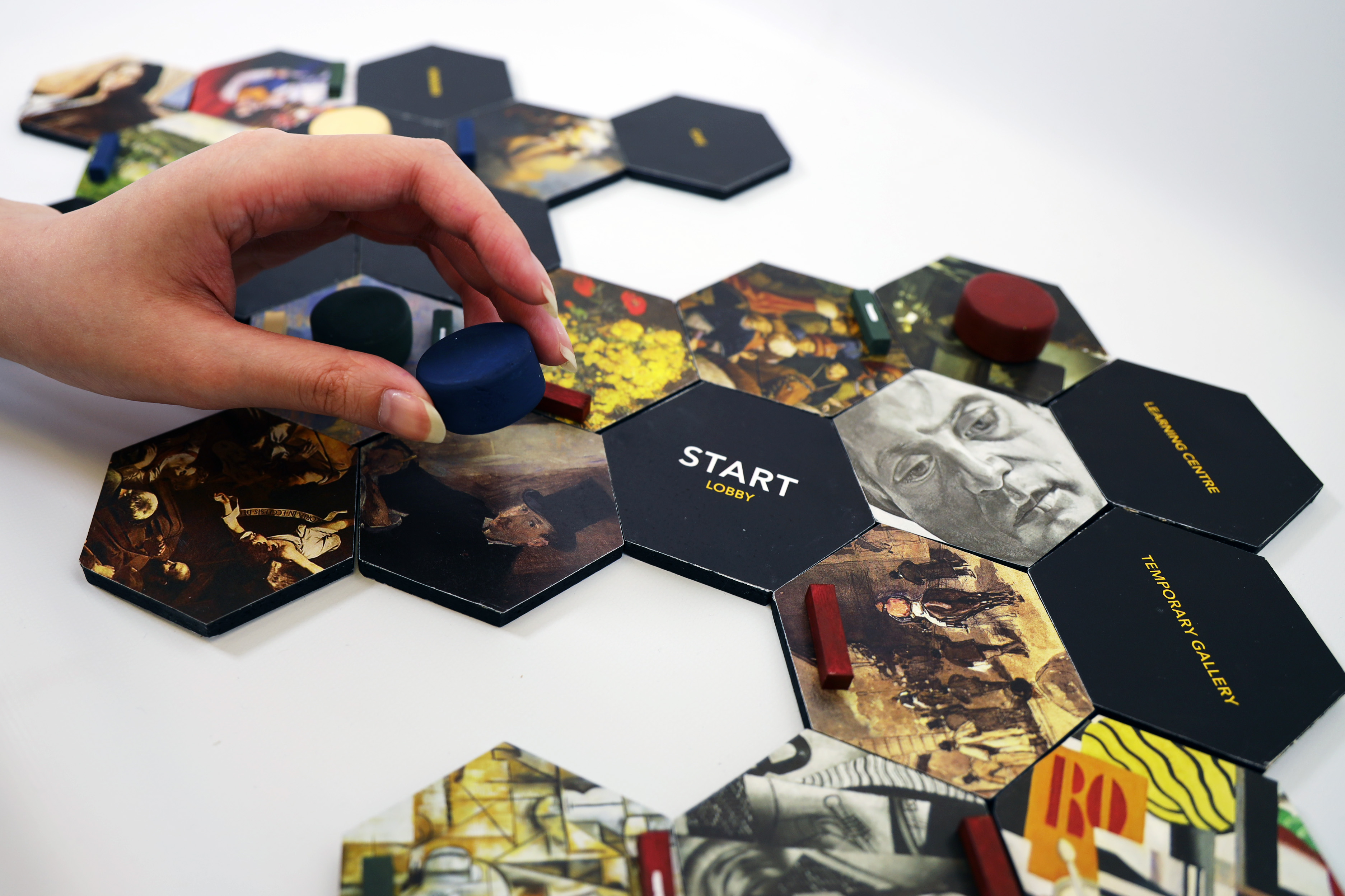
Inspired by the world's largest property theft at the Isabella Stewart Gardner Museum in Boston on March 18 1990, Commemoration follows the theme of this story, one of hope in times of tragedy. 13 works of art were stolen that night, some of which you will learn about in Commemoration. These art pieces, full of value, history, and culture, were cut from their frames in the middle of the night and taken by thieves. The empty frames still hang in the museum today, awaiting the hopeful return of the lost artwork.
Click here for a more indepth explanation of what happened on the night of March 18th 1990 at the Isabella Stewart Gardner Museum.
Click here for a more indepth explanation of what happened on the night of March 18th 1990 at the Isabella Stewart Gardner Museum.


“But the truth is, those missing things still have power.”
- Stephanie Storey, Art Historian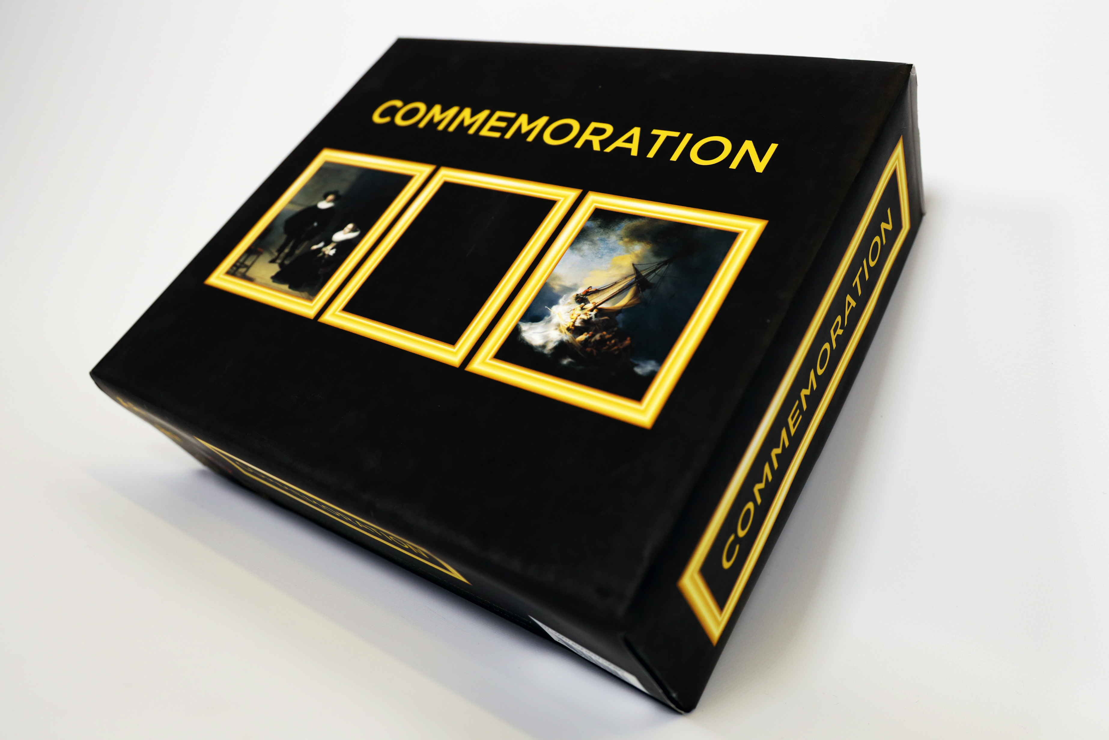
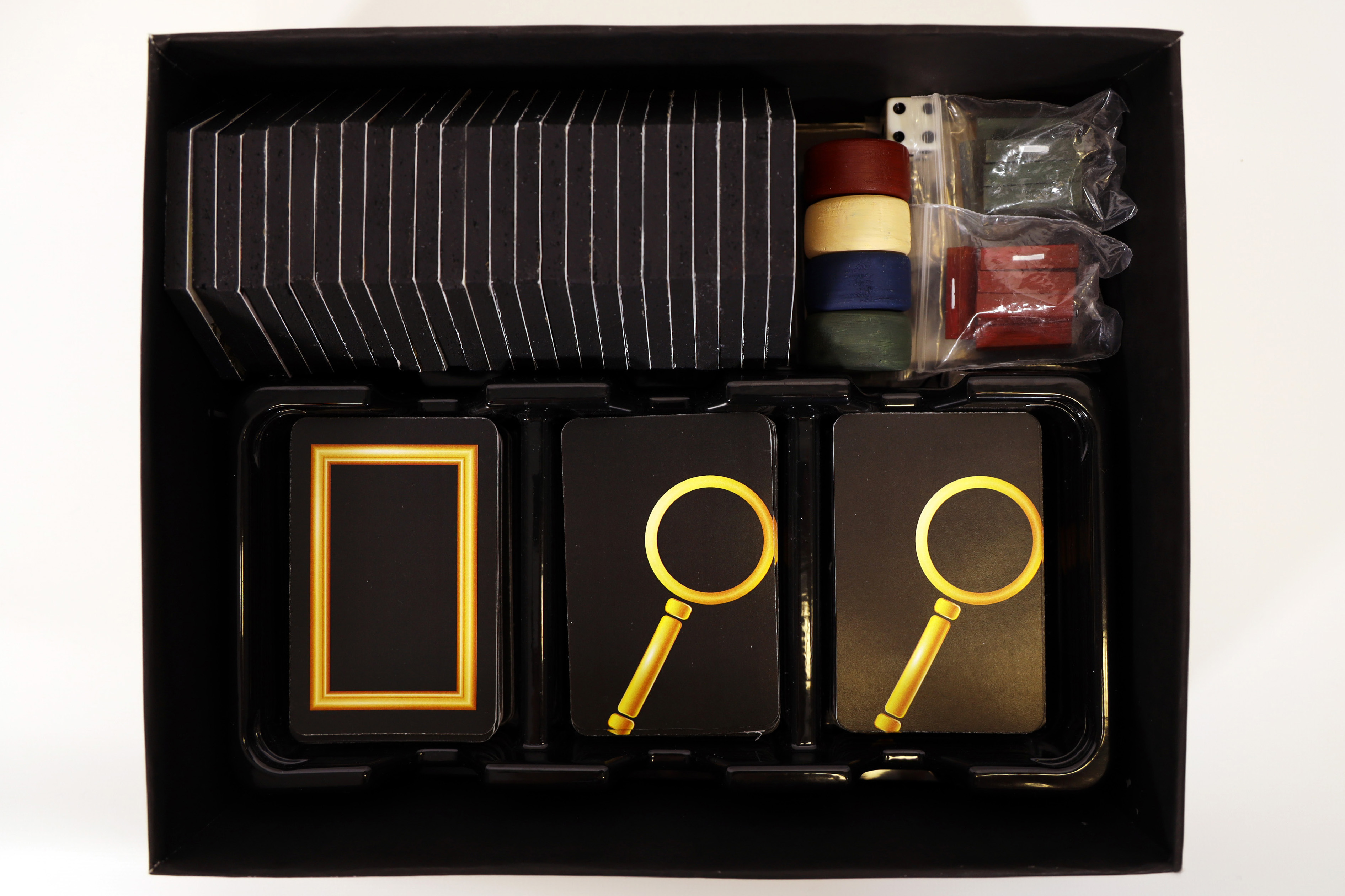
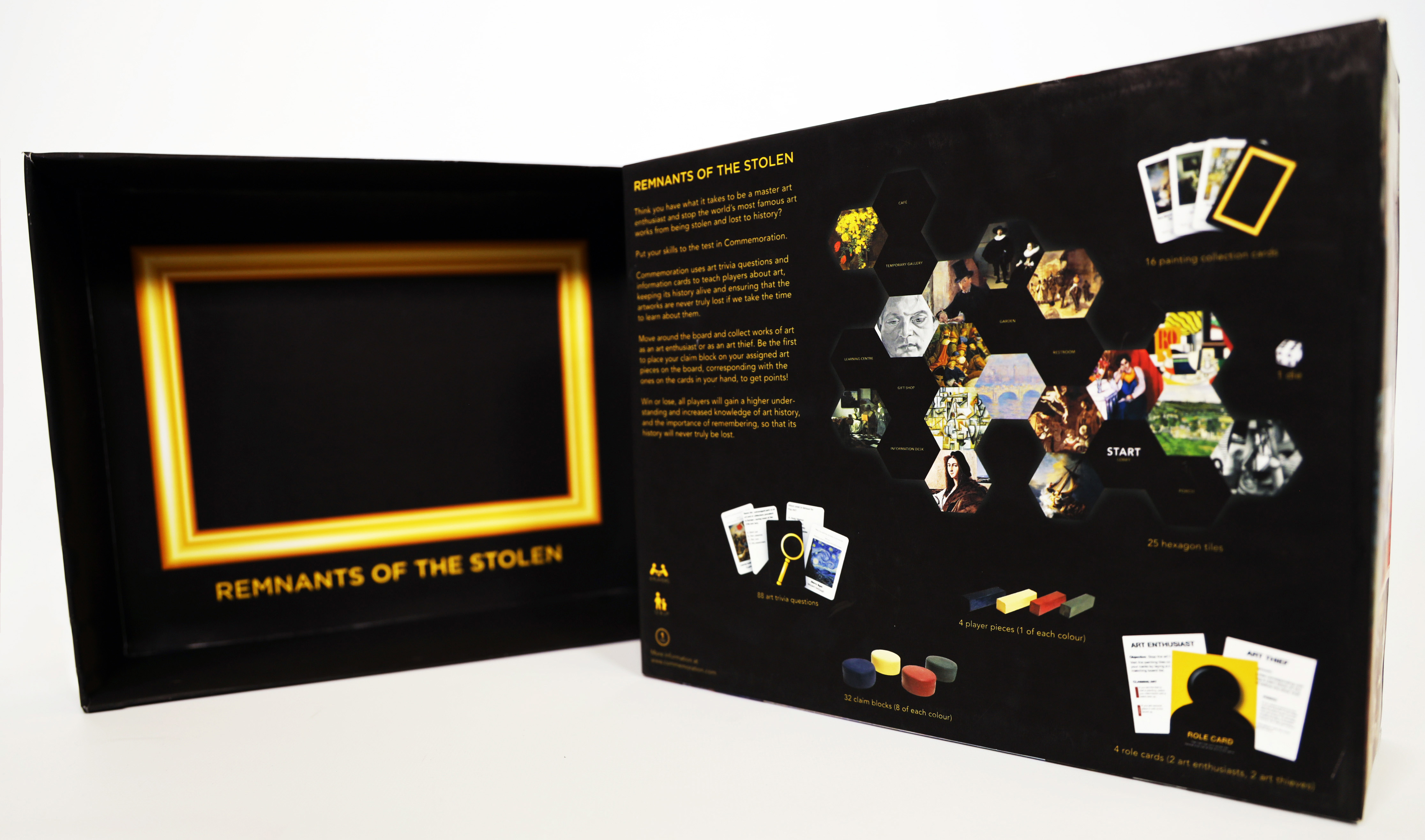
The board game approach is meant to educate users in a fun and engaging way. The questions vary in difficultly level, making it able to be enjoyed by players of varying art knowledge backgrounds.
When I studied art history, I had a never ending pile of flash cards. I always wondered if there was a more engaging way to learn the information I was interested in, especially in middle school and high school, which is why I took this approach.
When I studied art history, I had a never ending pile of flash cards. I always wondered if there was a more engaging way to learn the information I was interested in, especially in middle school and high school, which is why I took this approach.


The Future of Commemoration
I wanted Commemoration to capture art from all around the world and throughout all of time. Unfortunately, this isn’t something I could do, as I wanted it to be based on knowledge that North Americans would already have an idea about. The future of Commemoration has expansion packs for different cultures, time periods, as well as different art heists that were covered in my research.
Book Design
12 weeksDESIGN
Tools
Adobe InDesign
Adobe Illustrator
Adobe Photoshop
Procreate
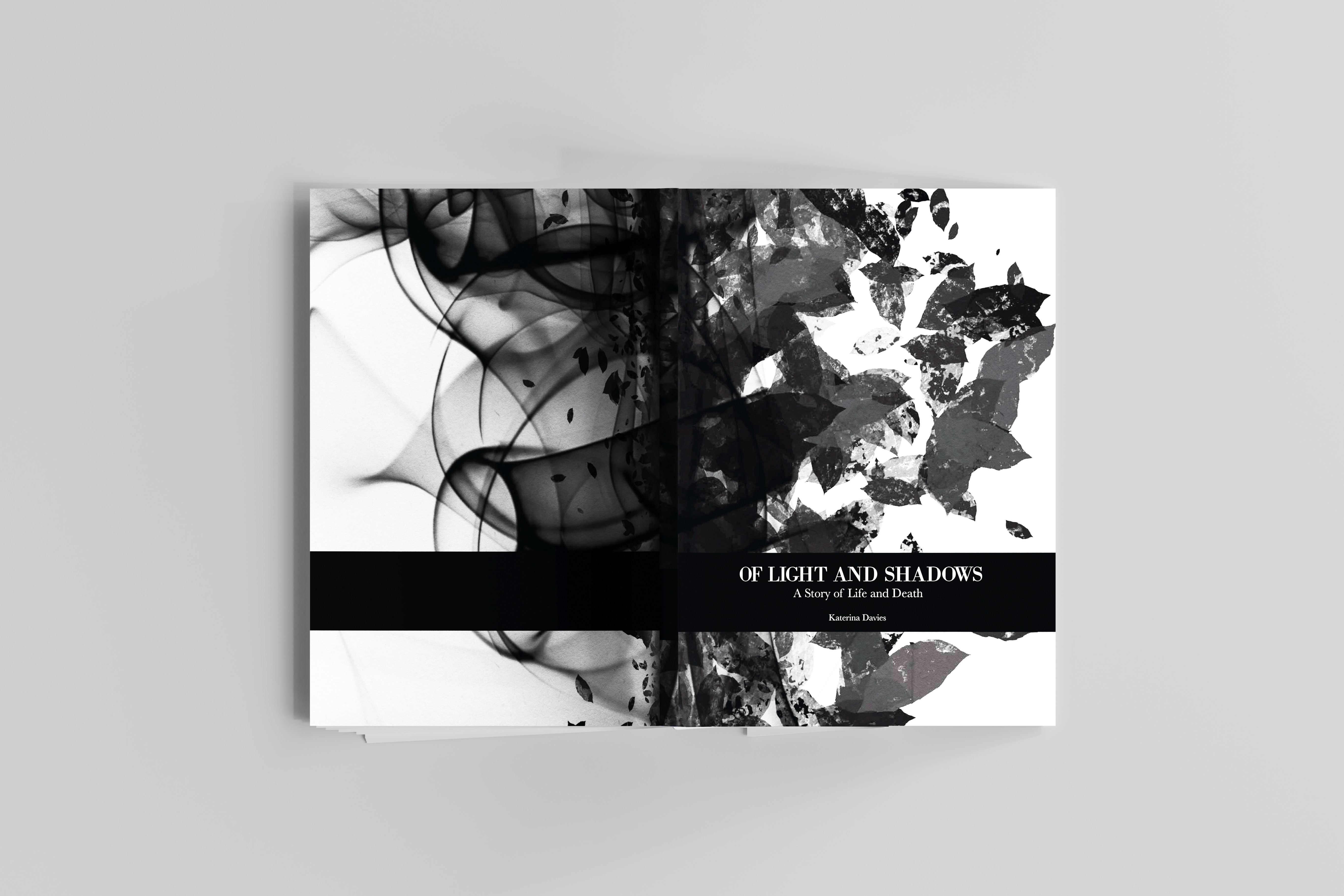
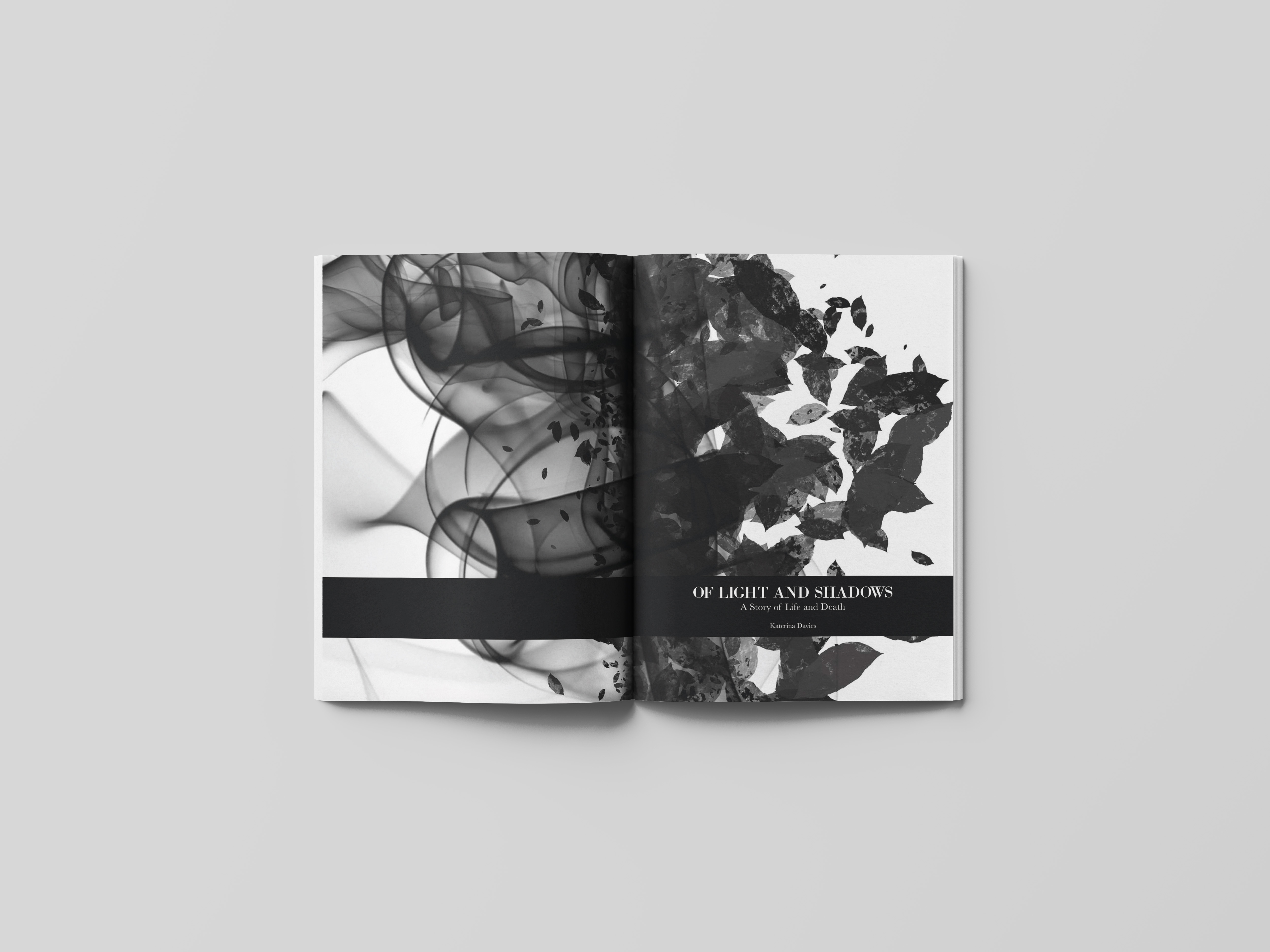
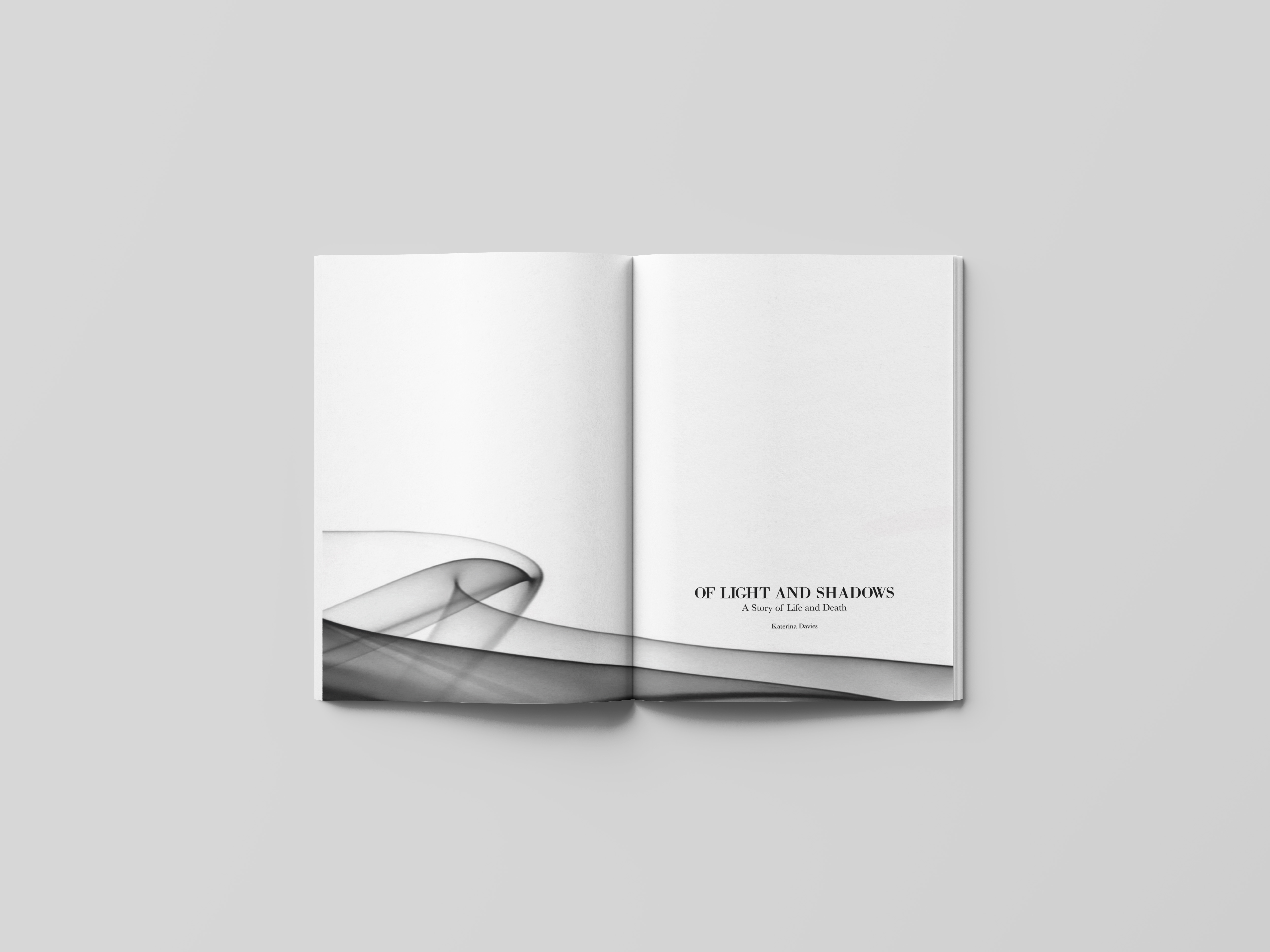
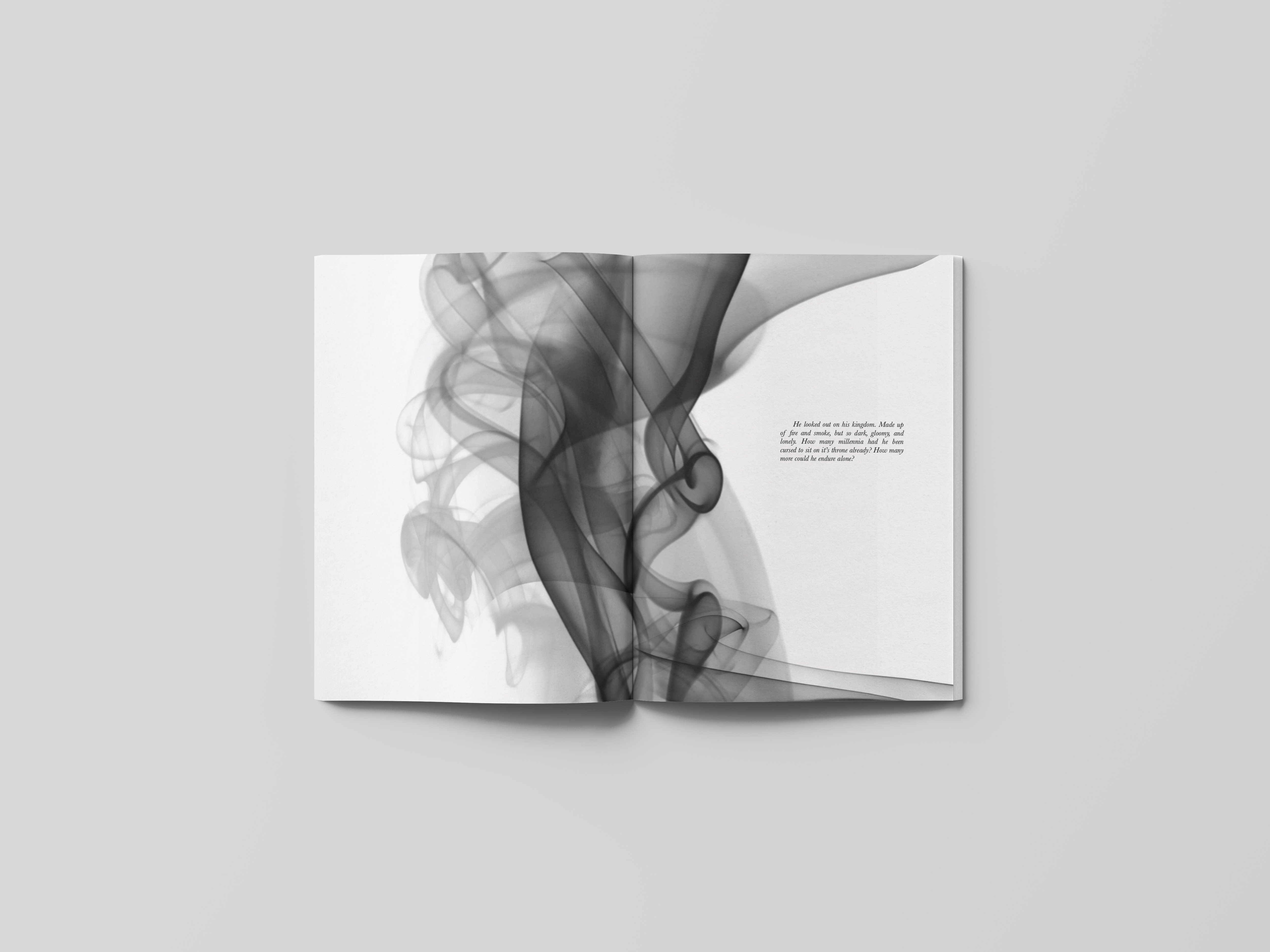
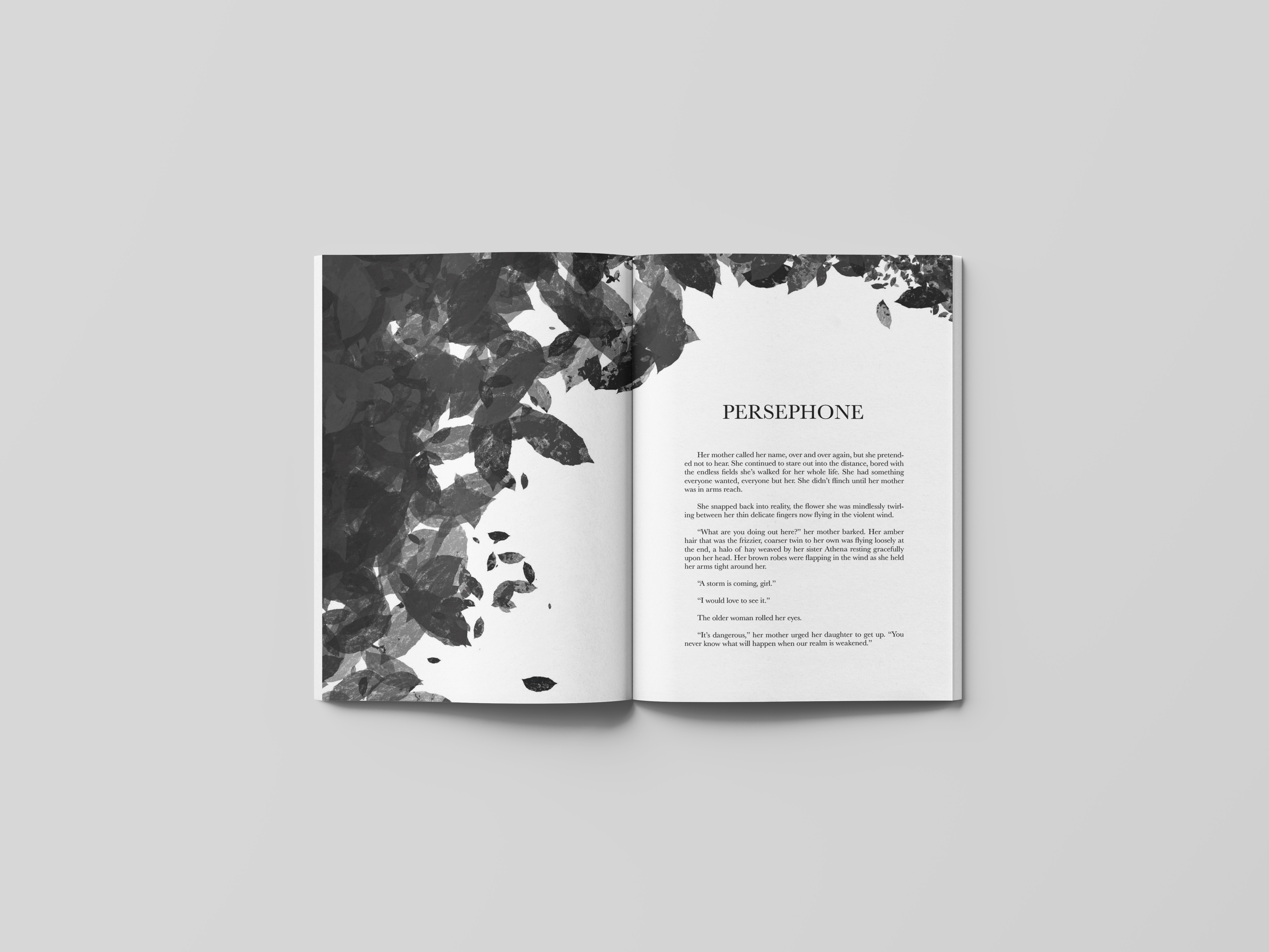
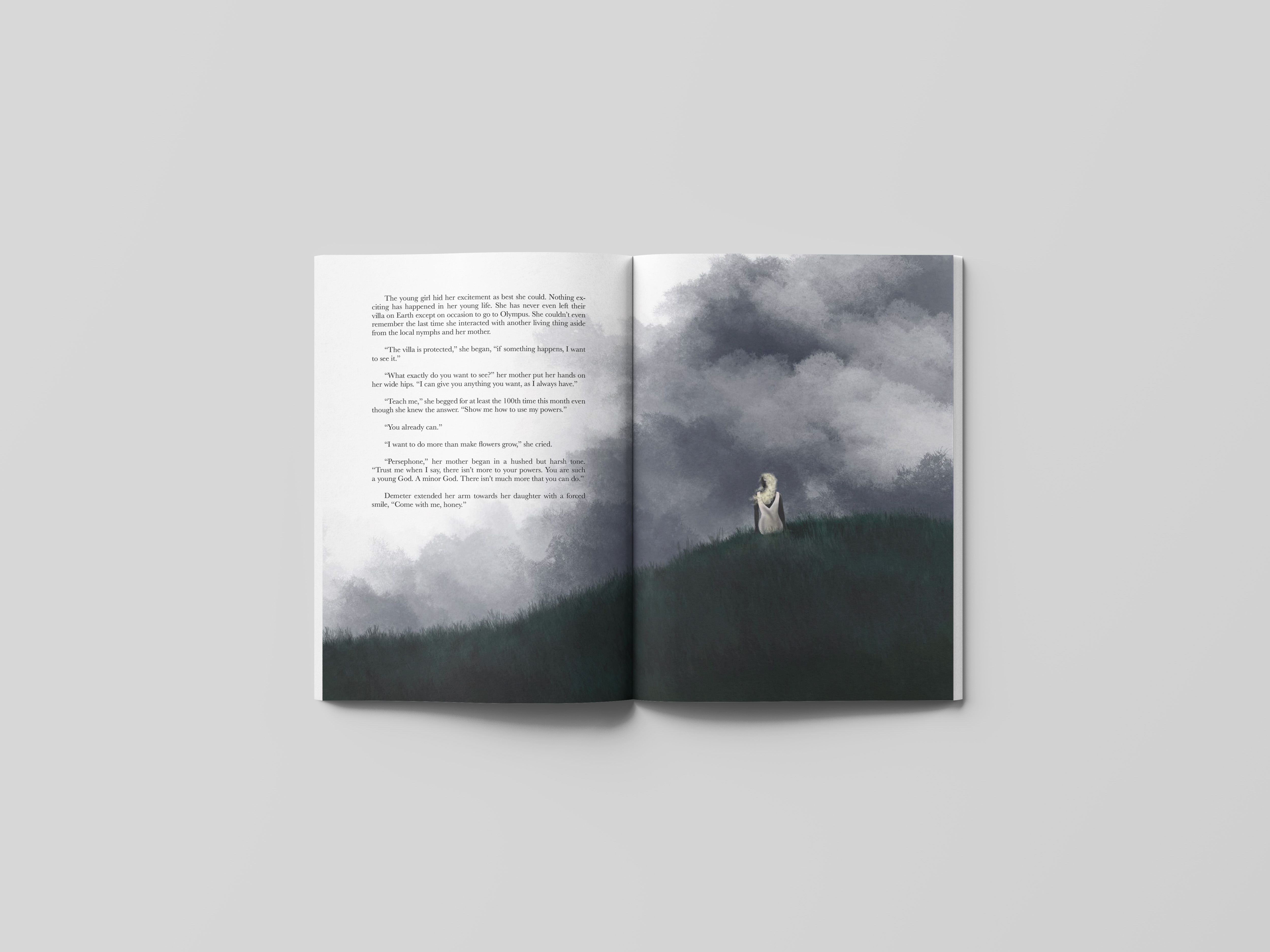
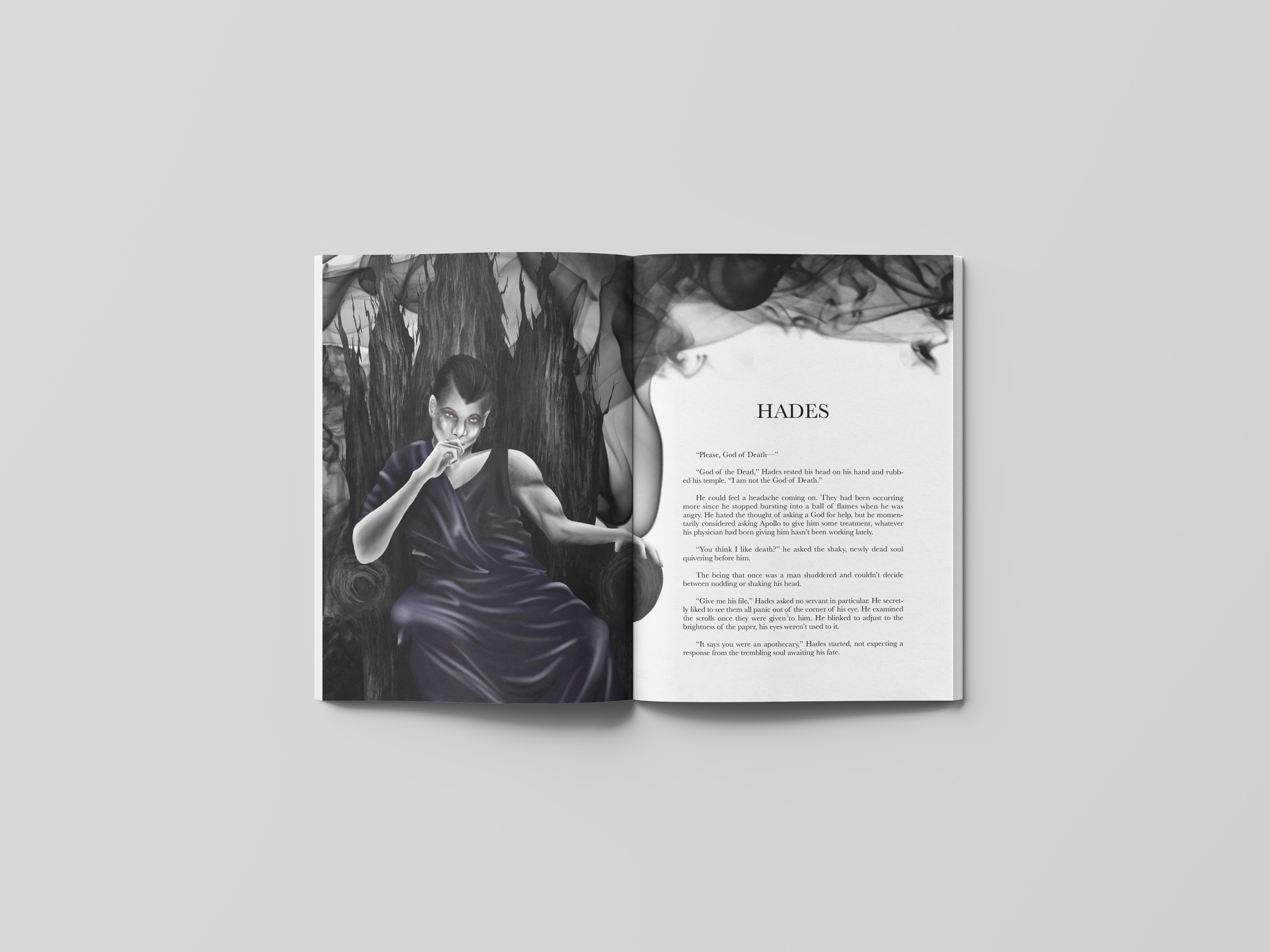
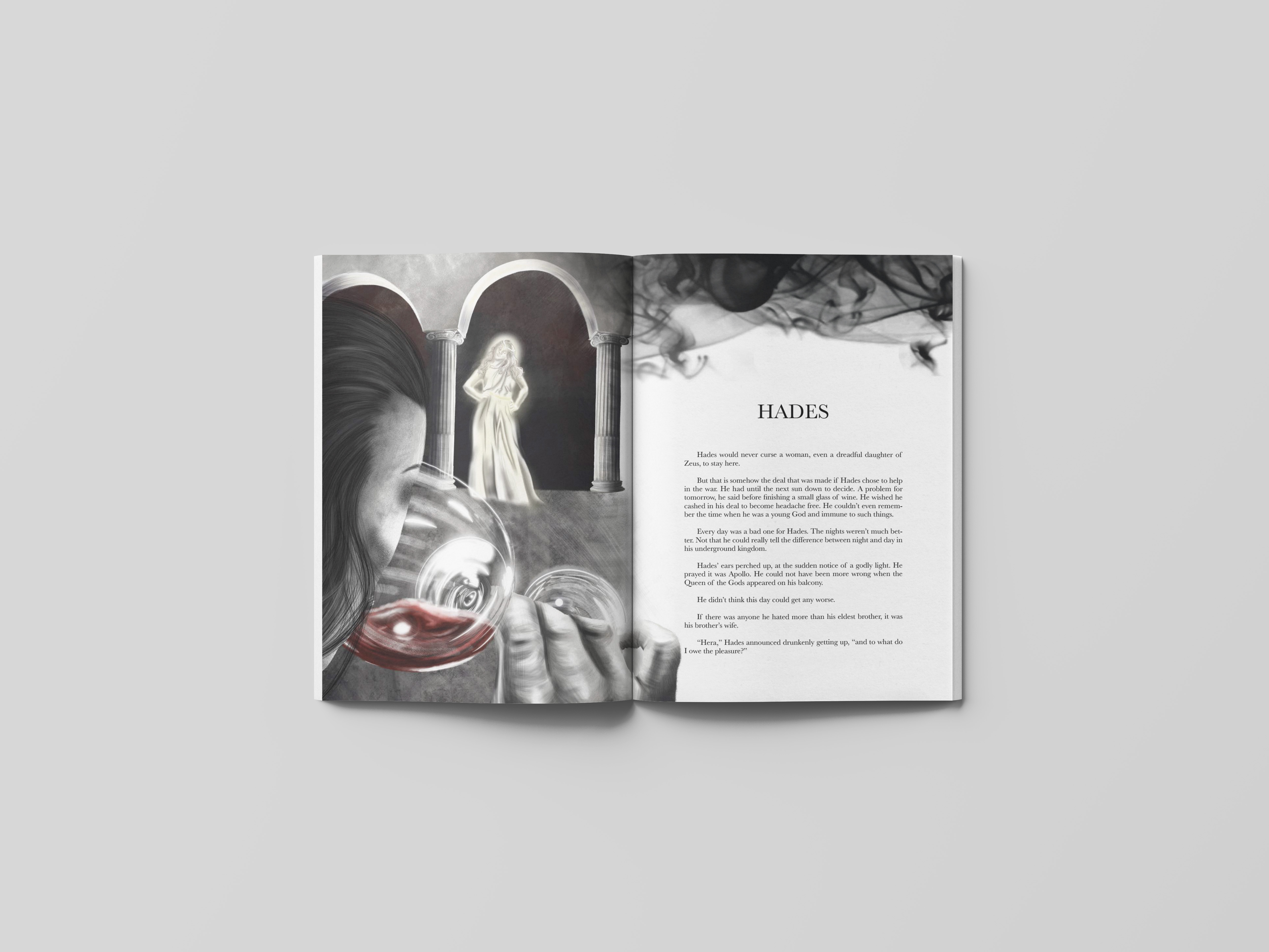
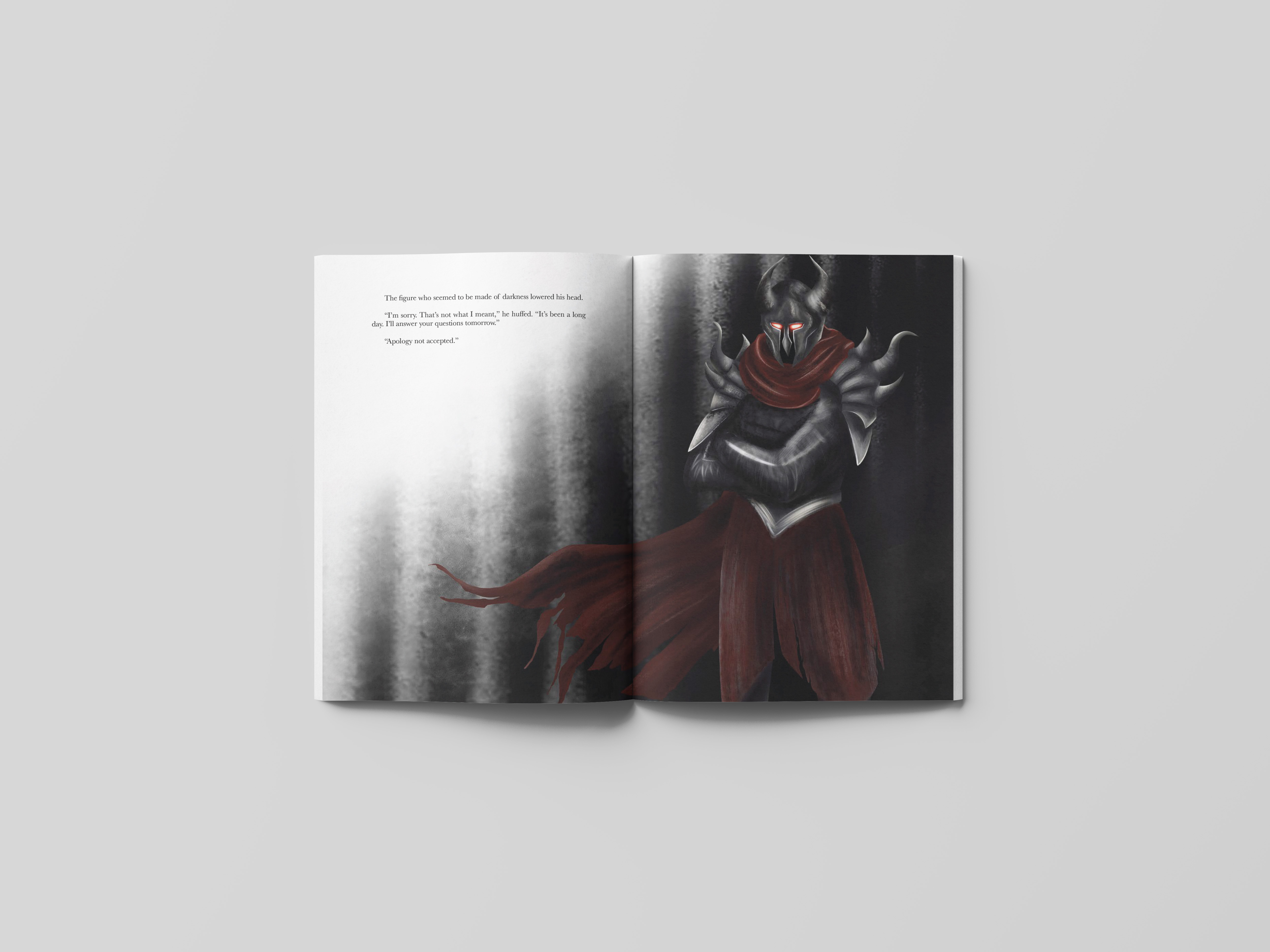
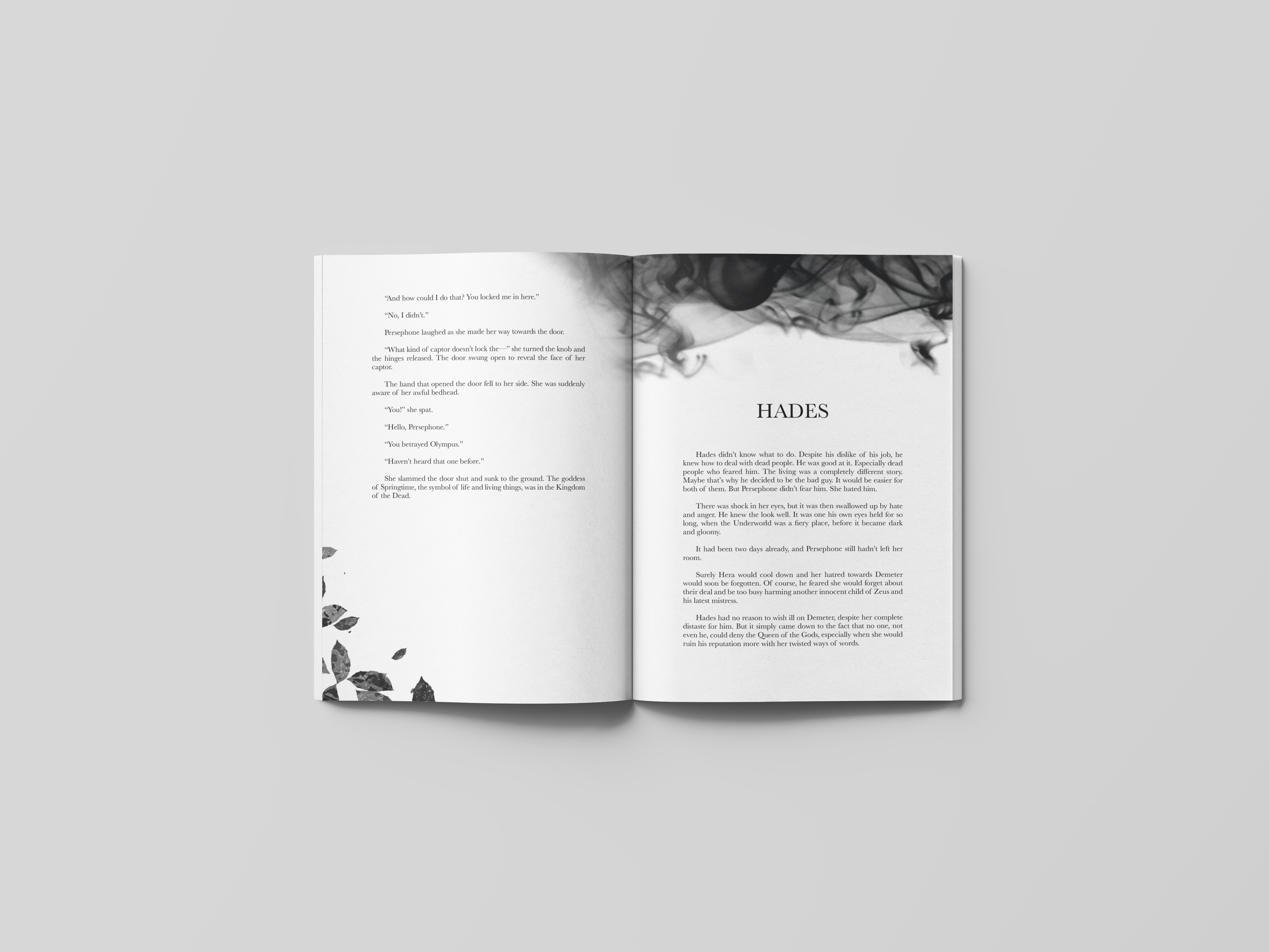
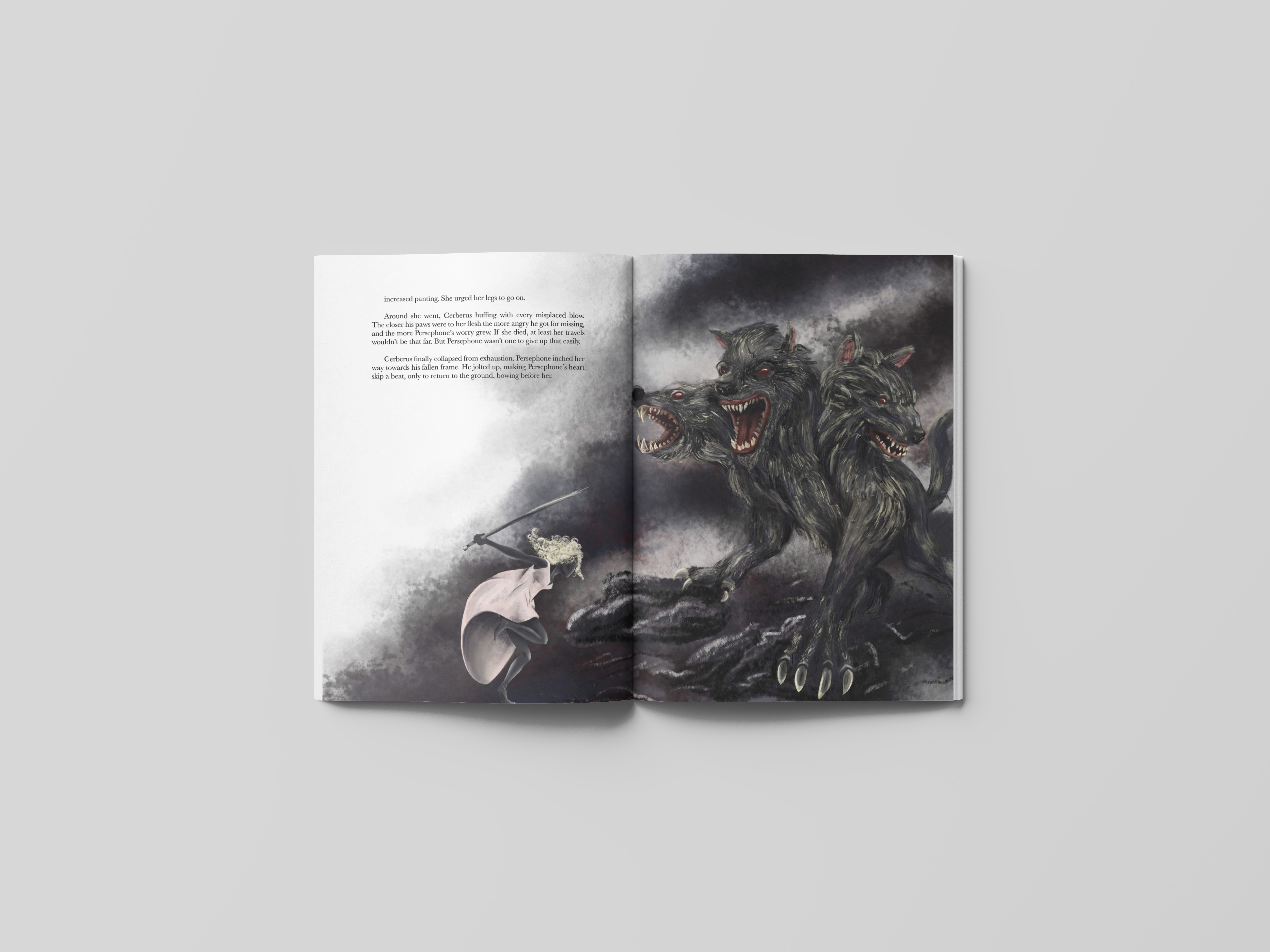
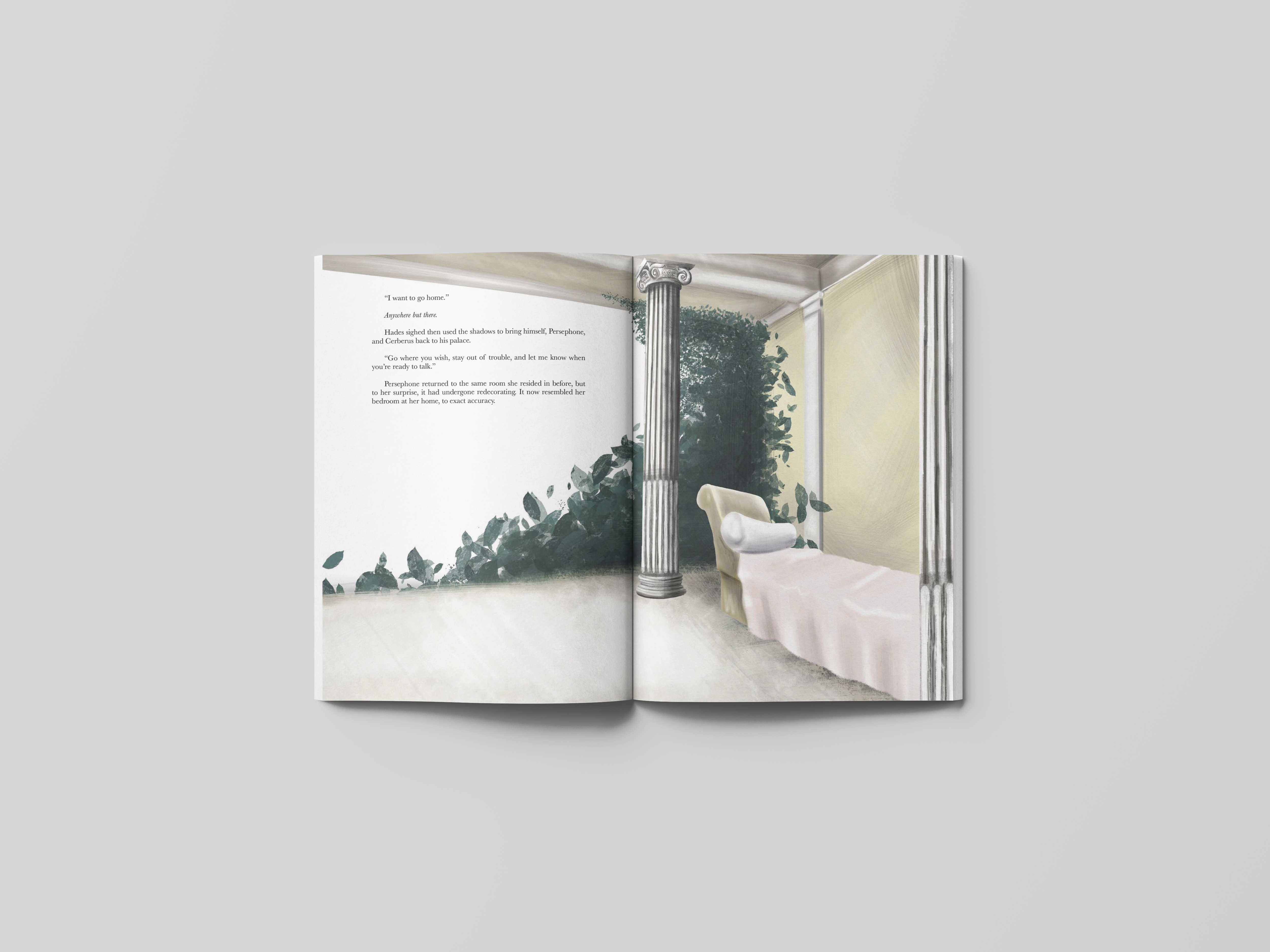
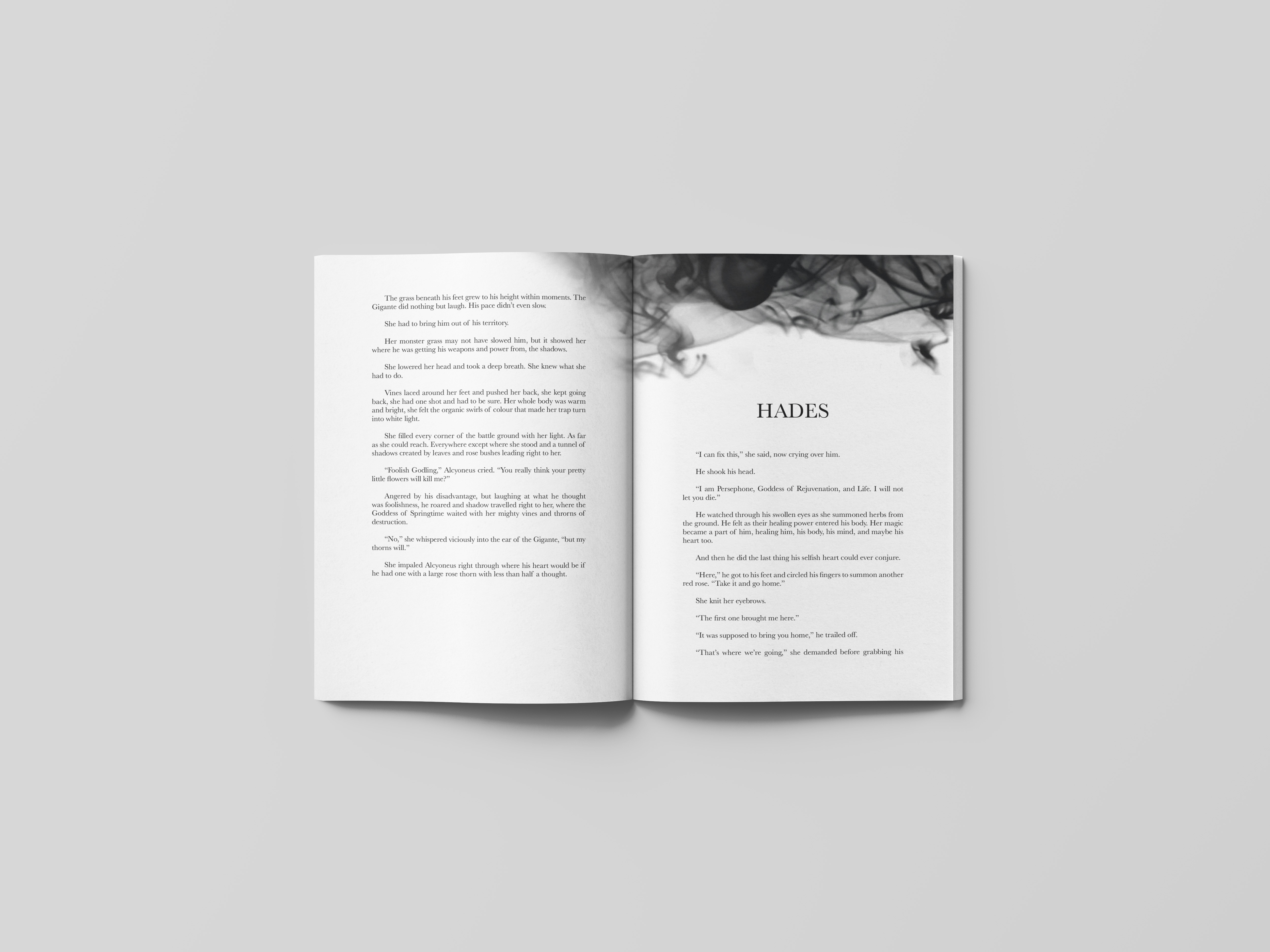
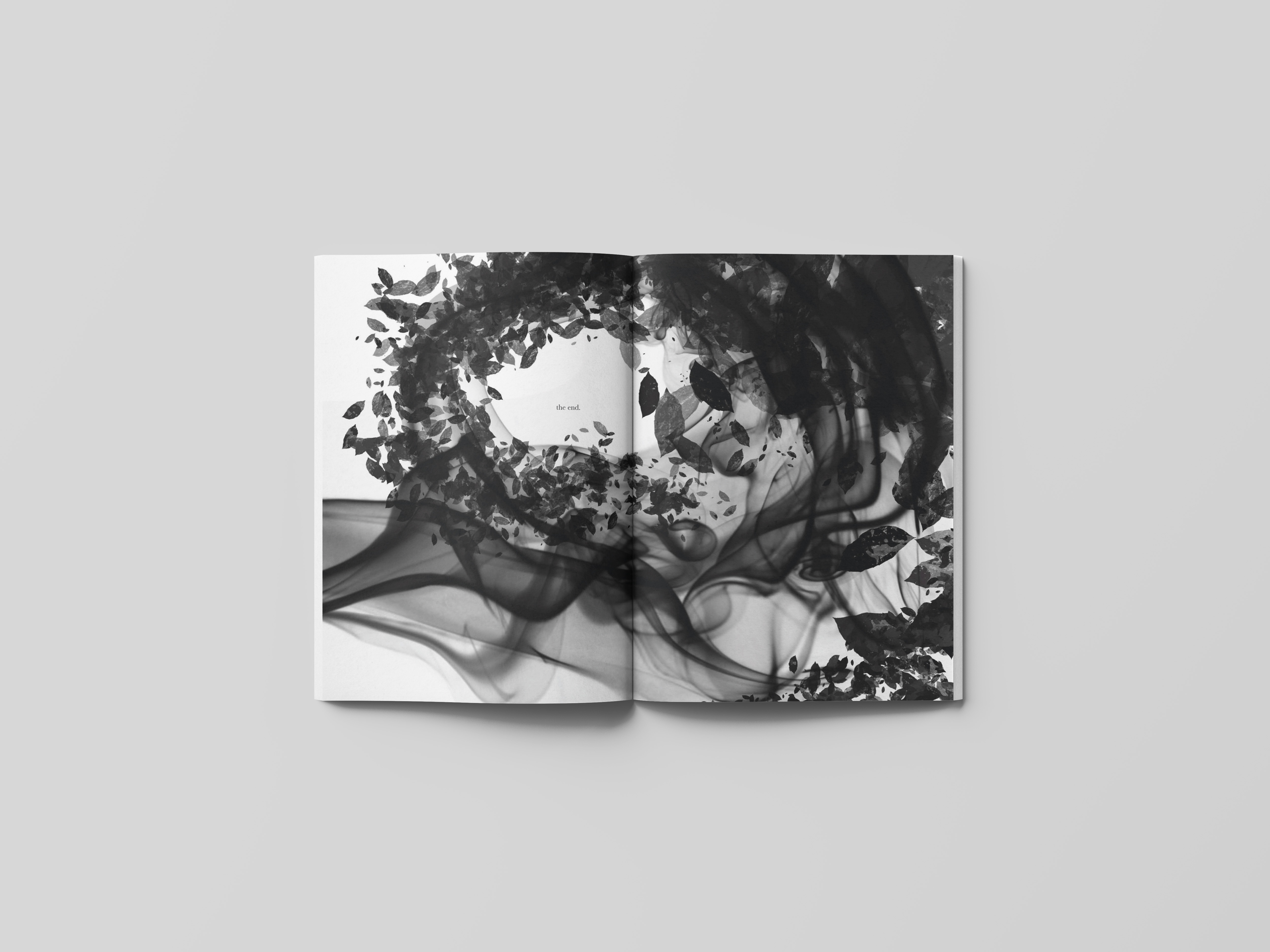
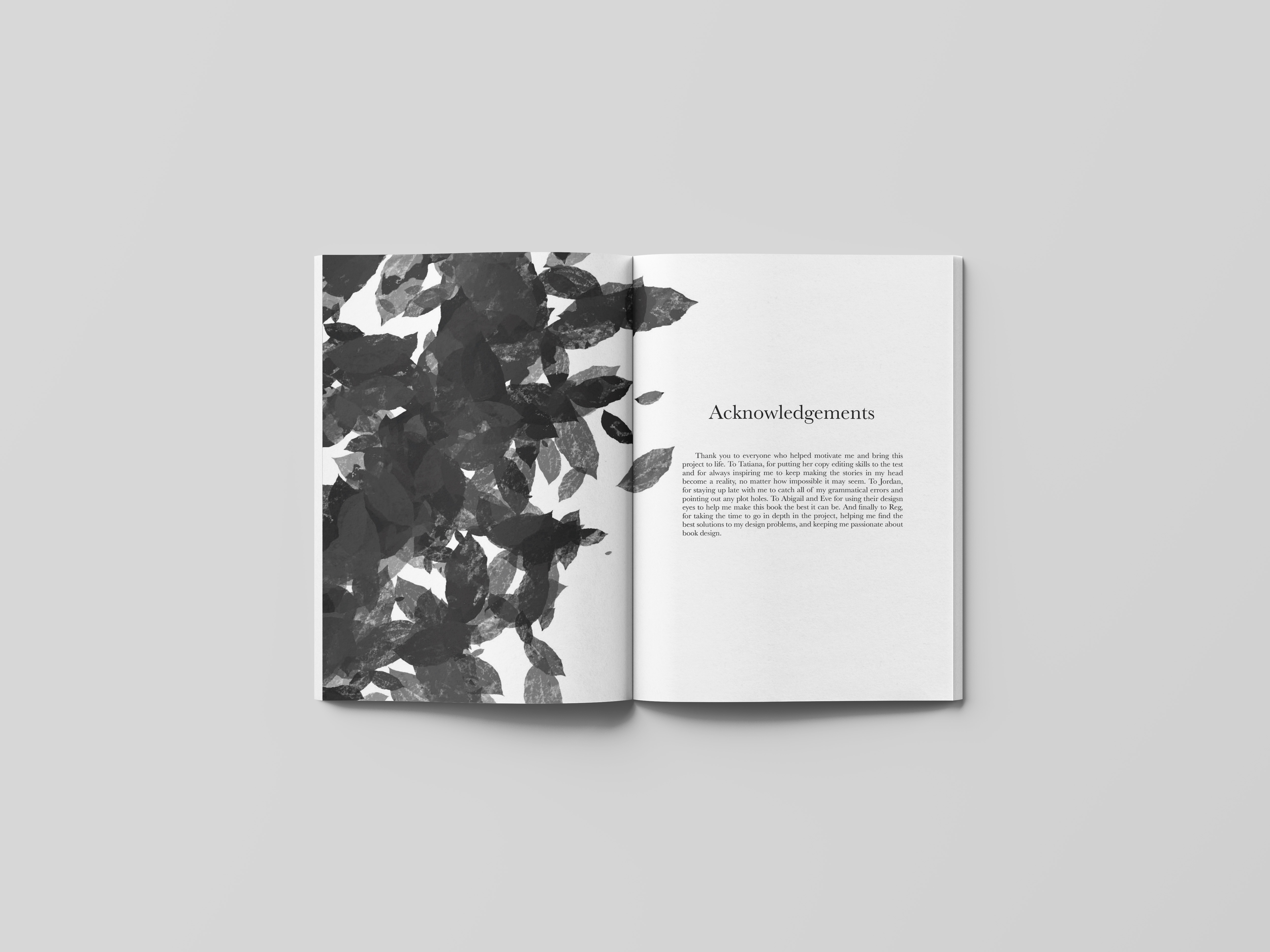
Of Light and Shadows
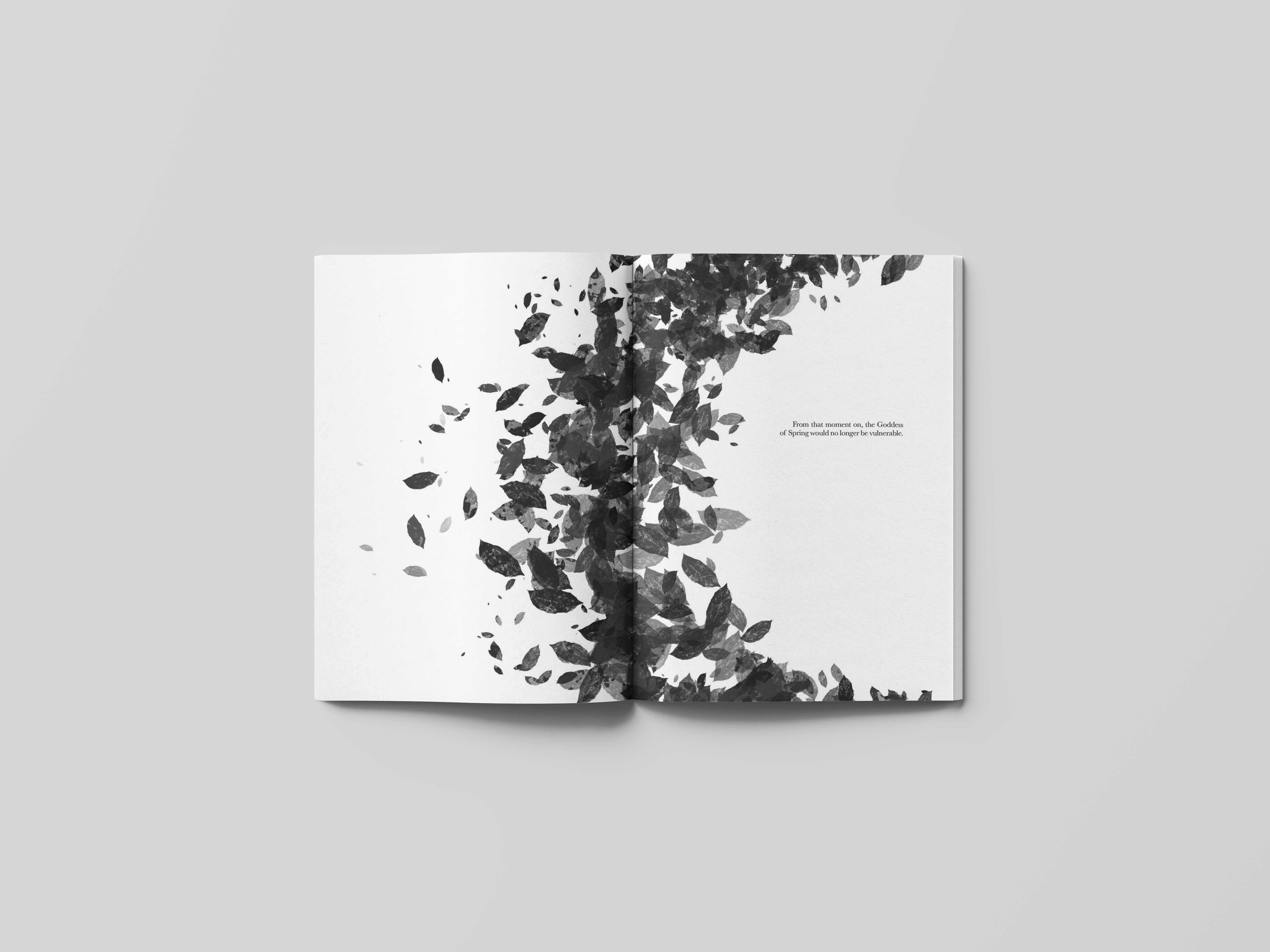
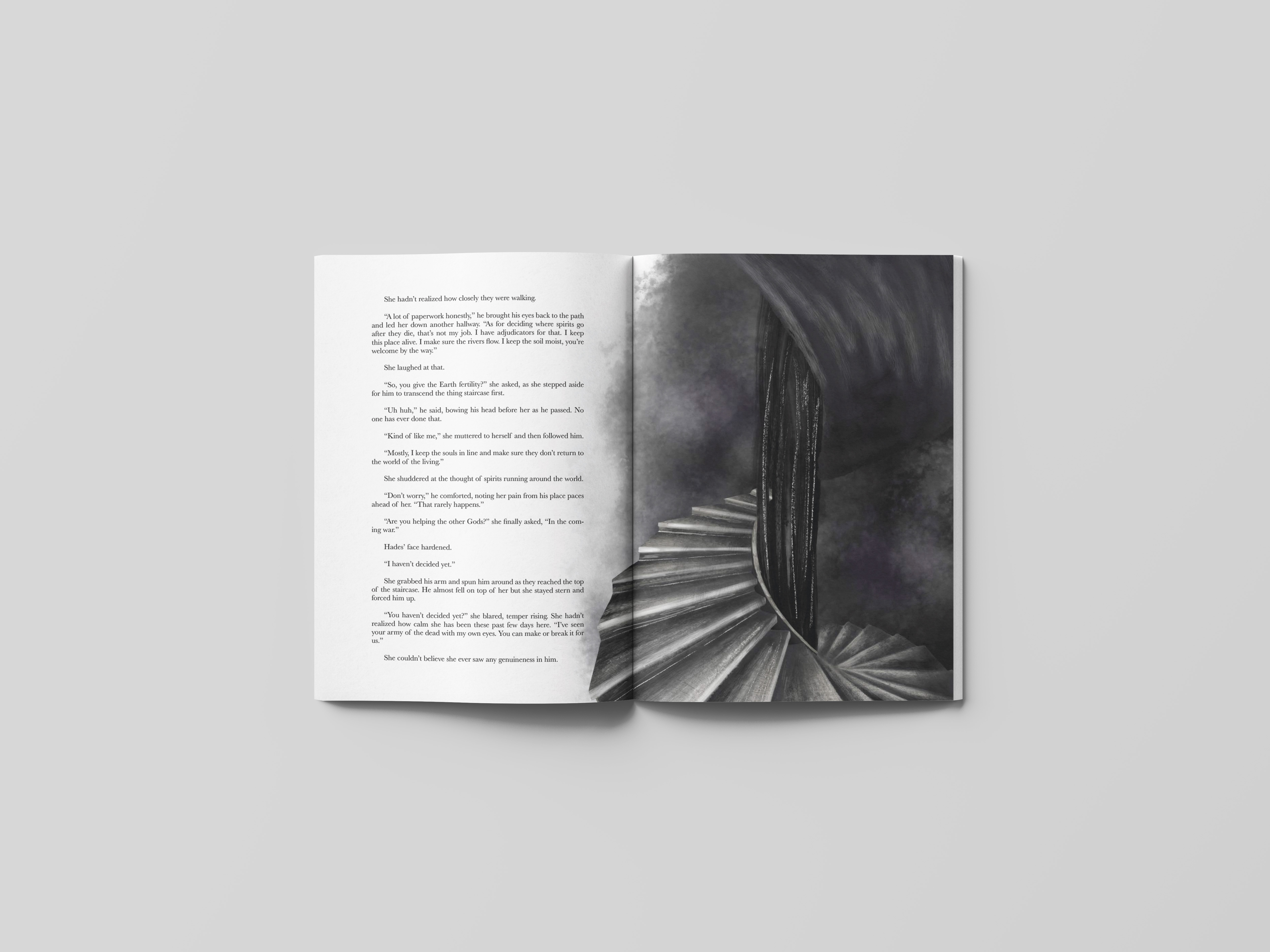
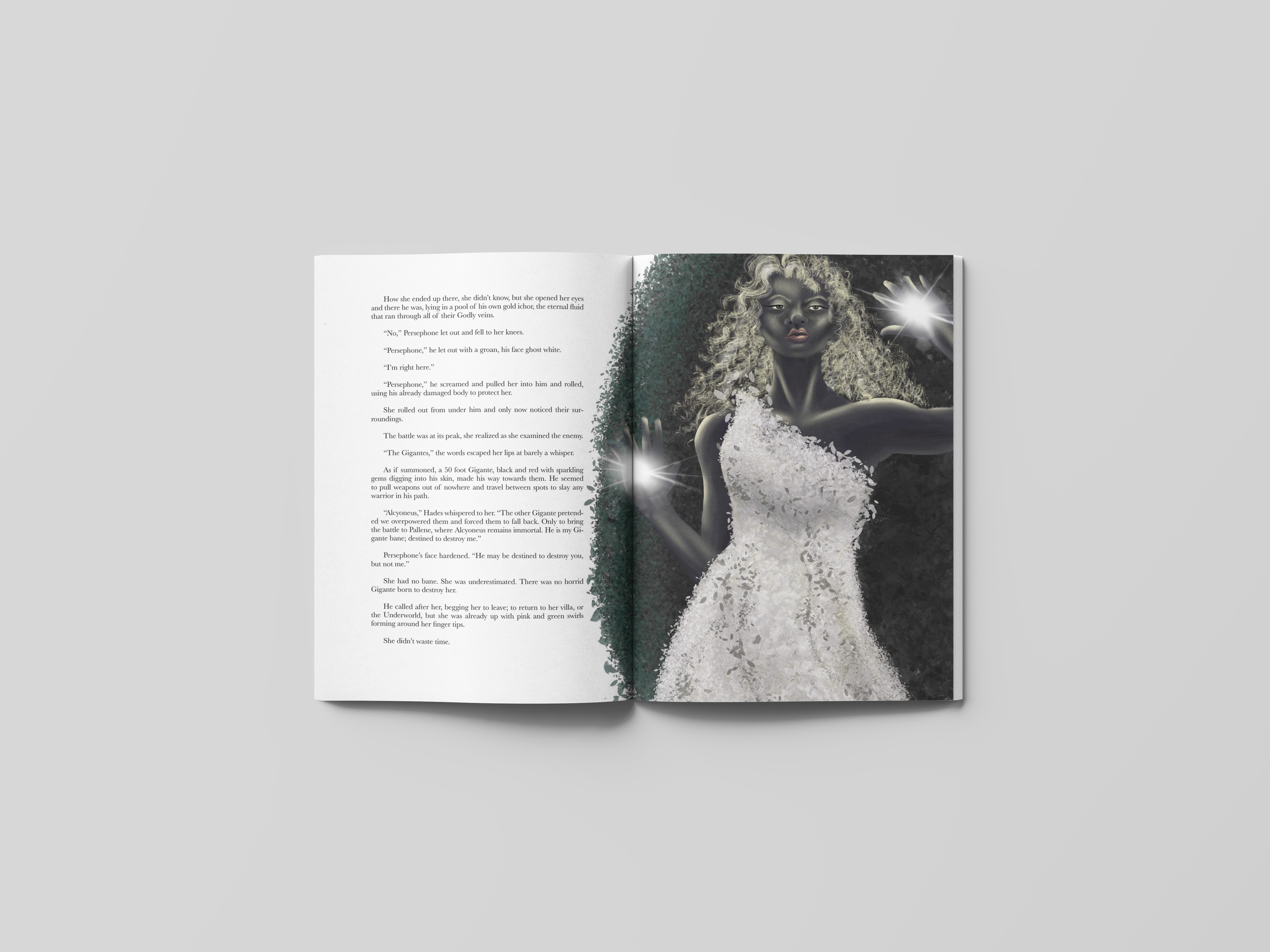
Of Light and Shadows is a retelling of the Greek myth of Hades and Persephone written from the perspective of both characters, who’s differences challenge each other to become better versions of themselves. The motif of light is used to represent the Goddess of Spring and dark to represent the God of the Underworld. These elements of dark leaves and smoke interacting show that need each other to prevail and the beauty light and dark hold.


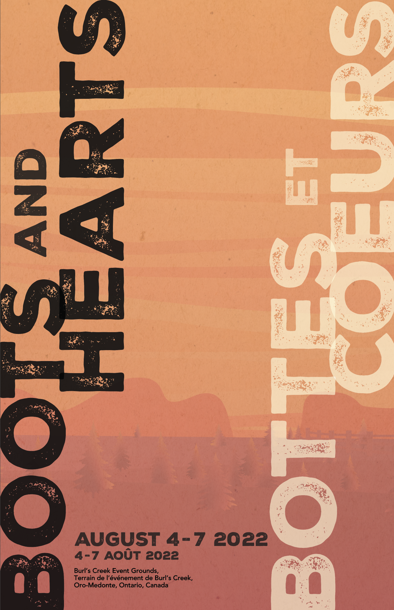
Boots and Hearts Festival Identity
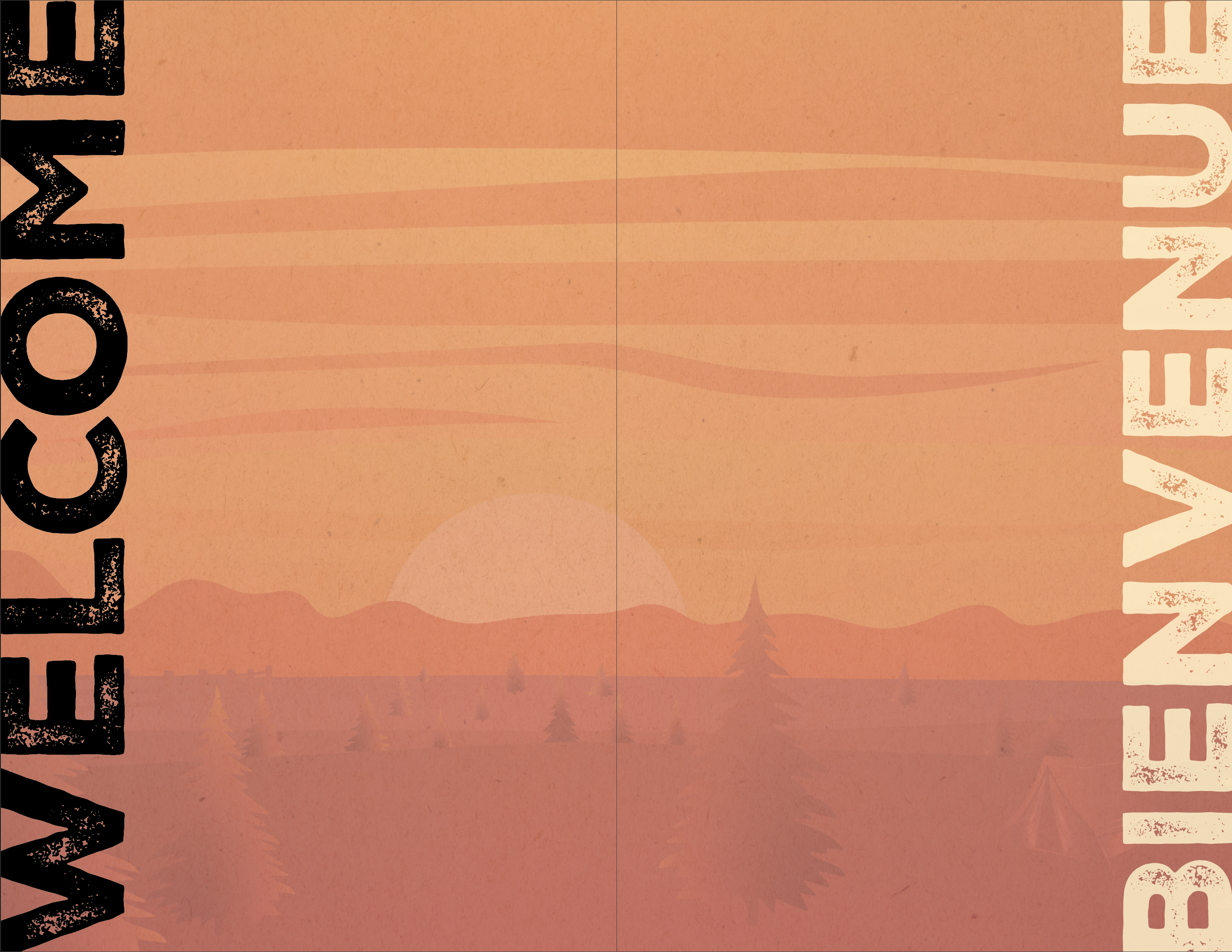
Design IntentAn exciting youthful design inviting audiences, typically North American country music and nature lovers ages 16-34, to the heart of country music with warm colours, organic shapes, and a unique rustic font paired with a modern sans serif.
History of Boots and Hearts Festival
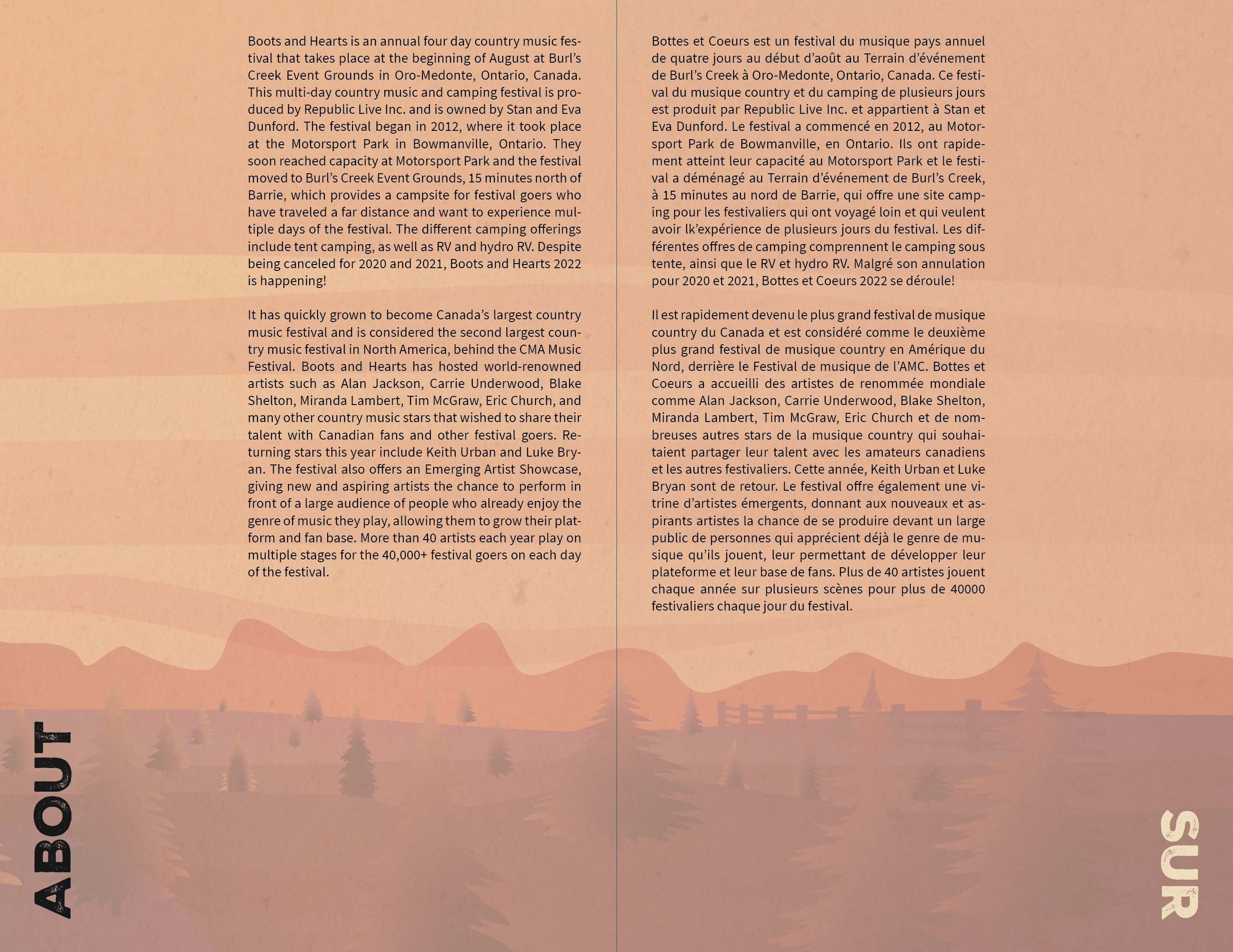
Boots and Hearts is an annual four day country musical festival that takes place at the beginning of August at Burl’s Creek Event Grounds in Oro-Medonte, Ontario, Canada. This multi-day country music and camping festival is produced by Republic Live Inc. and is owned by Stan and Eva Dunford. The festival began in 2012, where it took place at the Motorsport Park in Bowmanville, Ontario. Soon after, it was moved to Burl’s Creek Event Grounds, 15 minutes north of Barrie, which provides a campsite for festival goers who have traveled a far distance and want to experience multiple days of the festival.
Target Market
Extraverted North American females and males ages 16-34 of higher income families who listen to and enjoy country music.


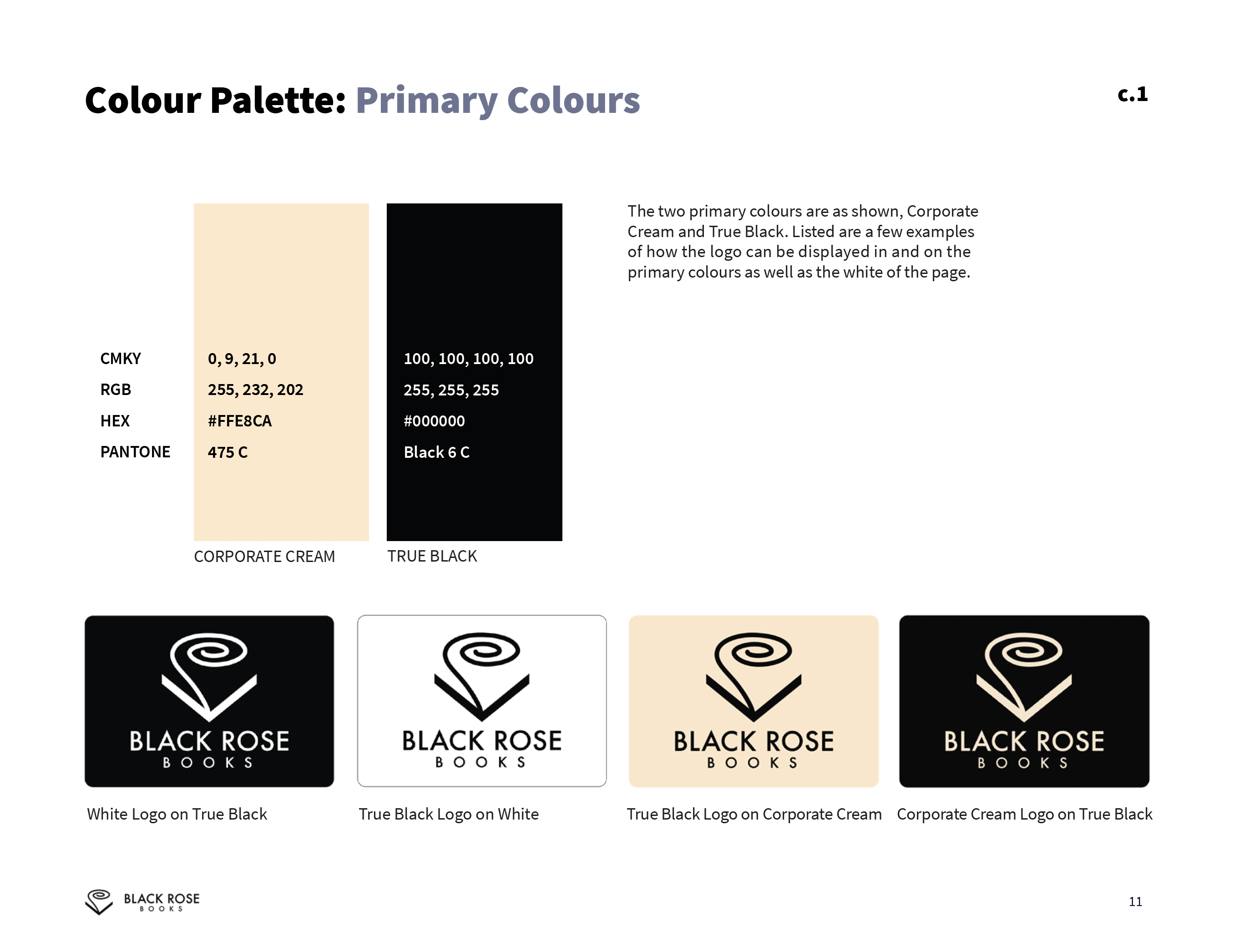
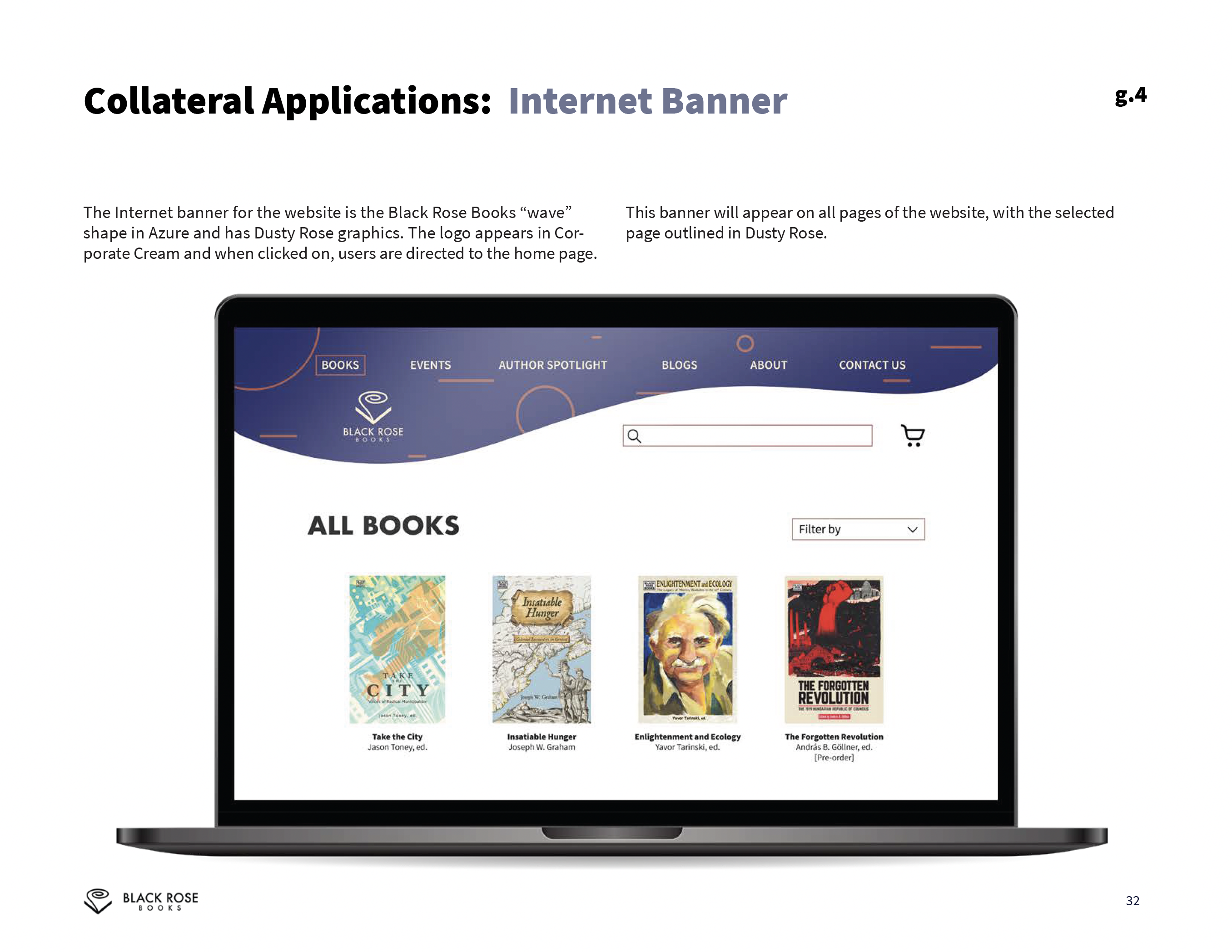
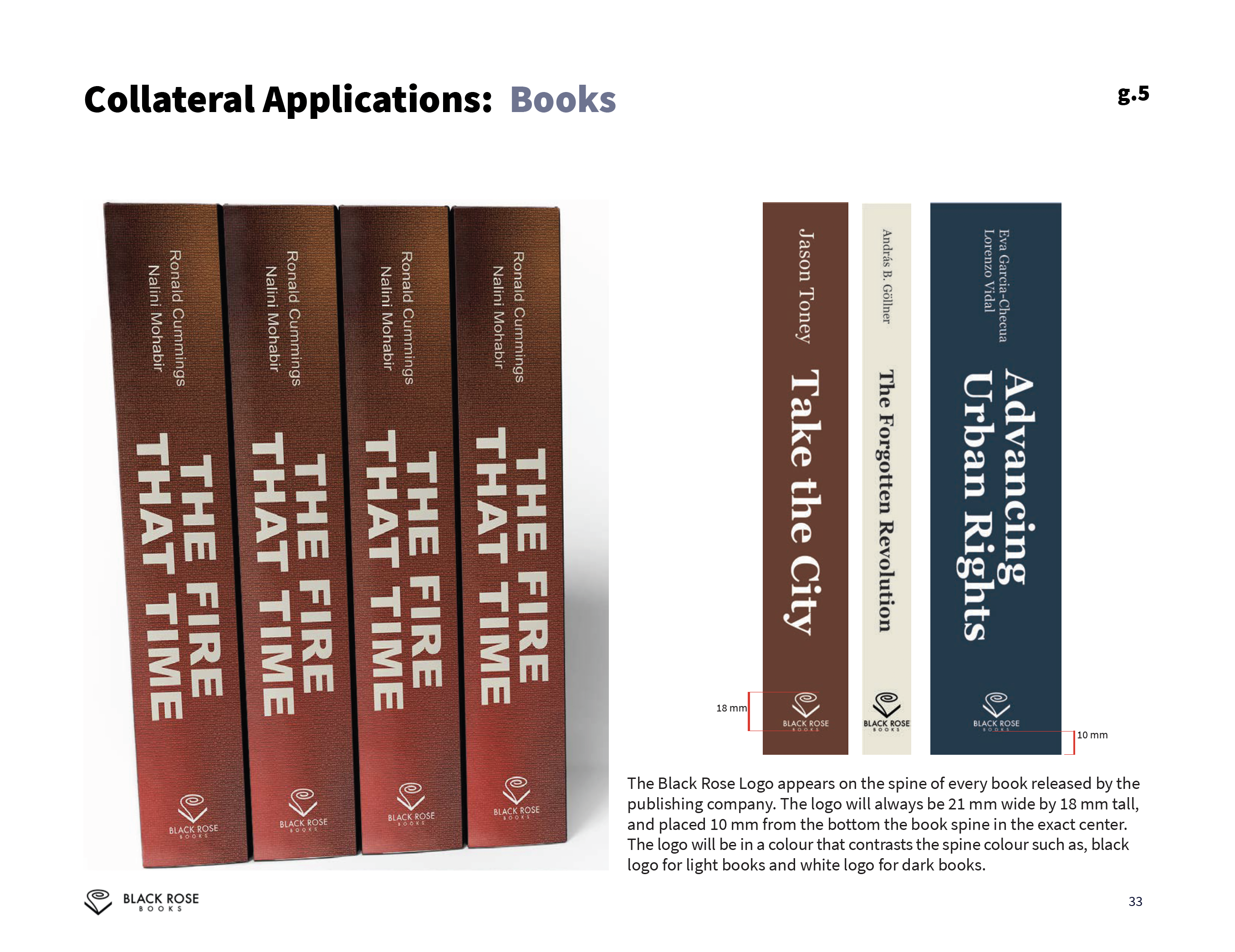
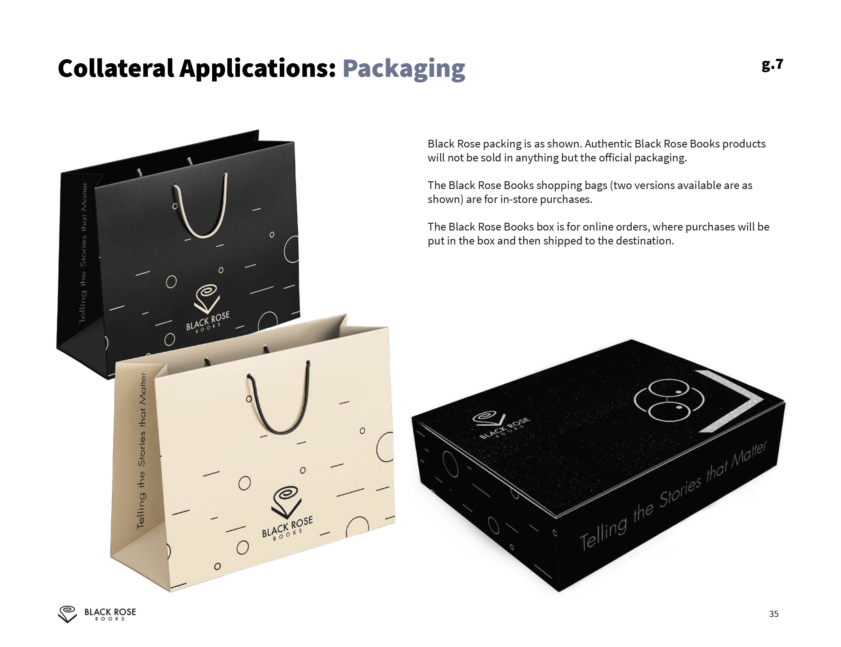
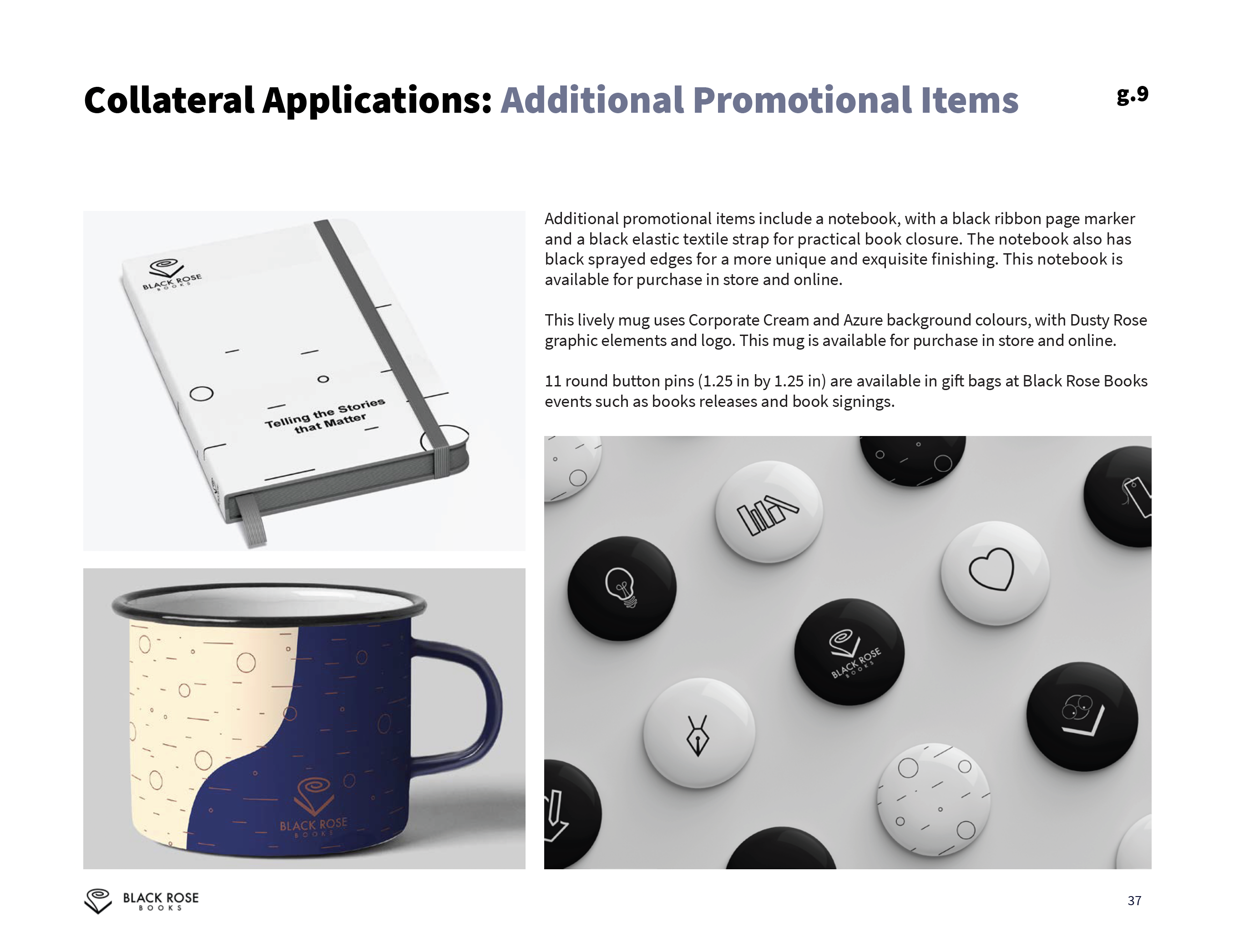
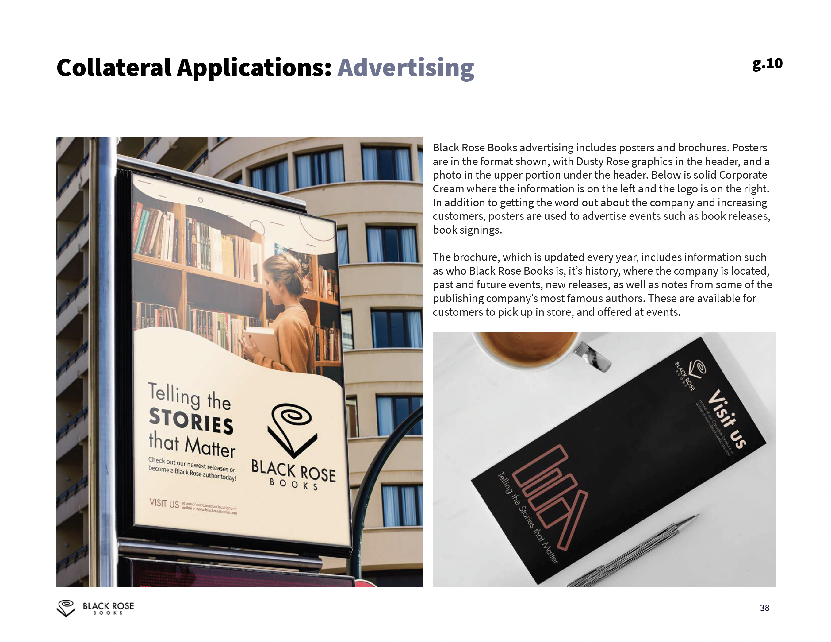
Black Rose Books
Black Rose Books is a non-profit book publisher of non-fiction books, most of which are focused on the fields of sciences and humanities.The rebrand was designed to modernize the company’s corporate identity and represent that they stand for telling stories and sharing knowledge, while staying true to their history.
Logo Rational
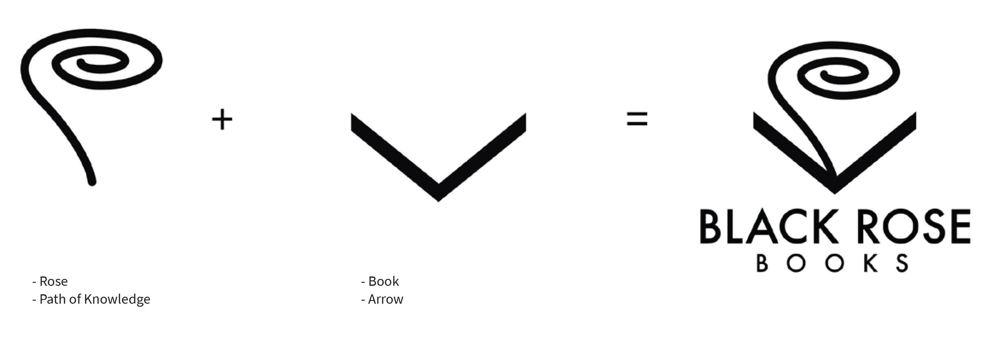
The black rose is a symbol of freedom. This logo represents how reading a book published by Black Rose Books puts you on a path of knowledge, upwards towards enlightenment. The knowledge is represented by a swirl rising out of the book, which is mimicking the abstract shape of a rose. The open book is a downward arrow pointing towards the name of the company, implying that to reach the enlightenment shown in the logo, one should buy a book published by Black Rose Books.


Fluid Elements
The Black Rose Books pattern consists of the outline of perfect circles in various sizes and horizontal lines of varying lengths. The lines represent knowledge that is traveling between people reading, who are represented by the various circles.
The graphic elements may appear in any of the following presented forms and colours in advertising, on merchandise, and in any other Black Rose Books related branding.
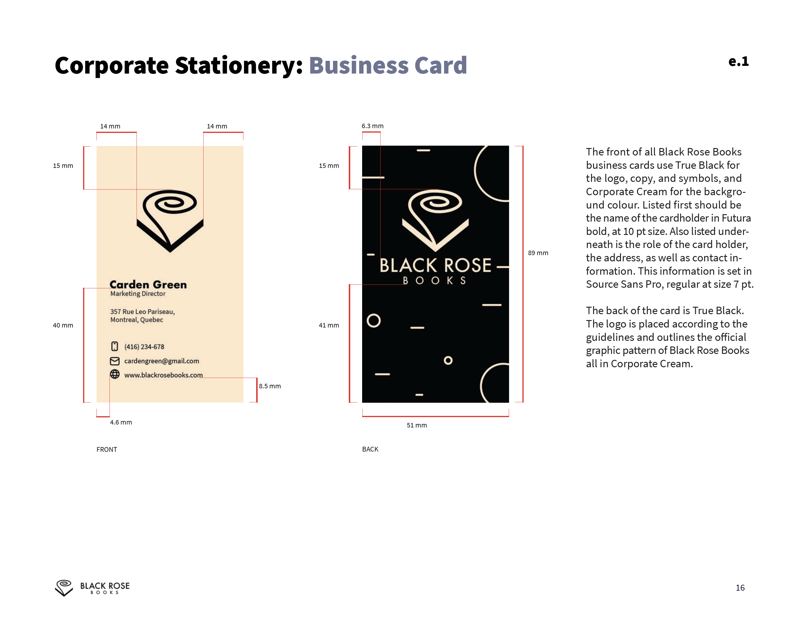
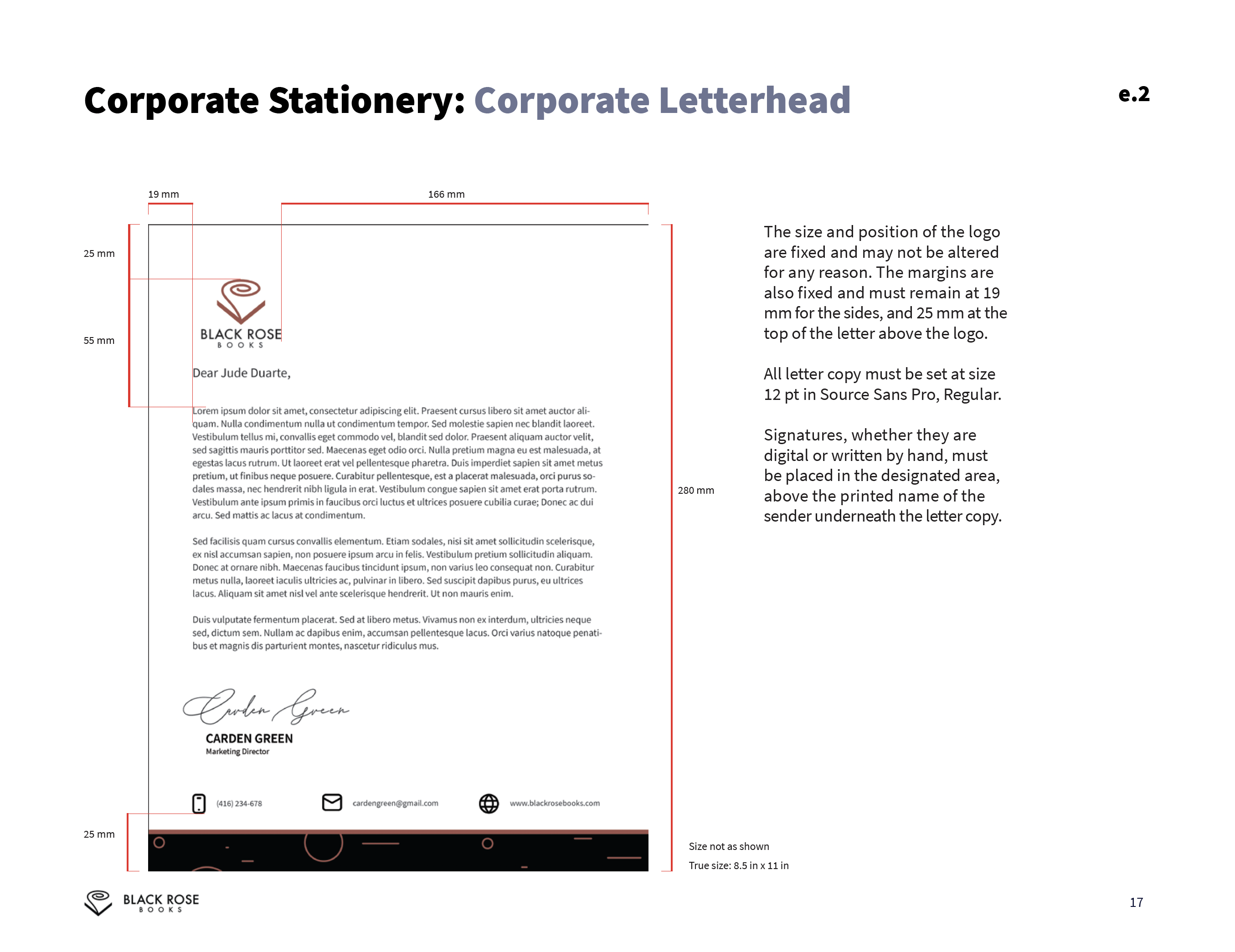
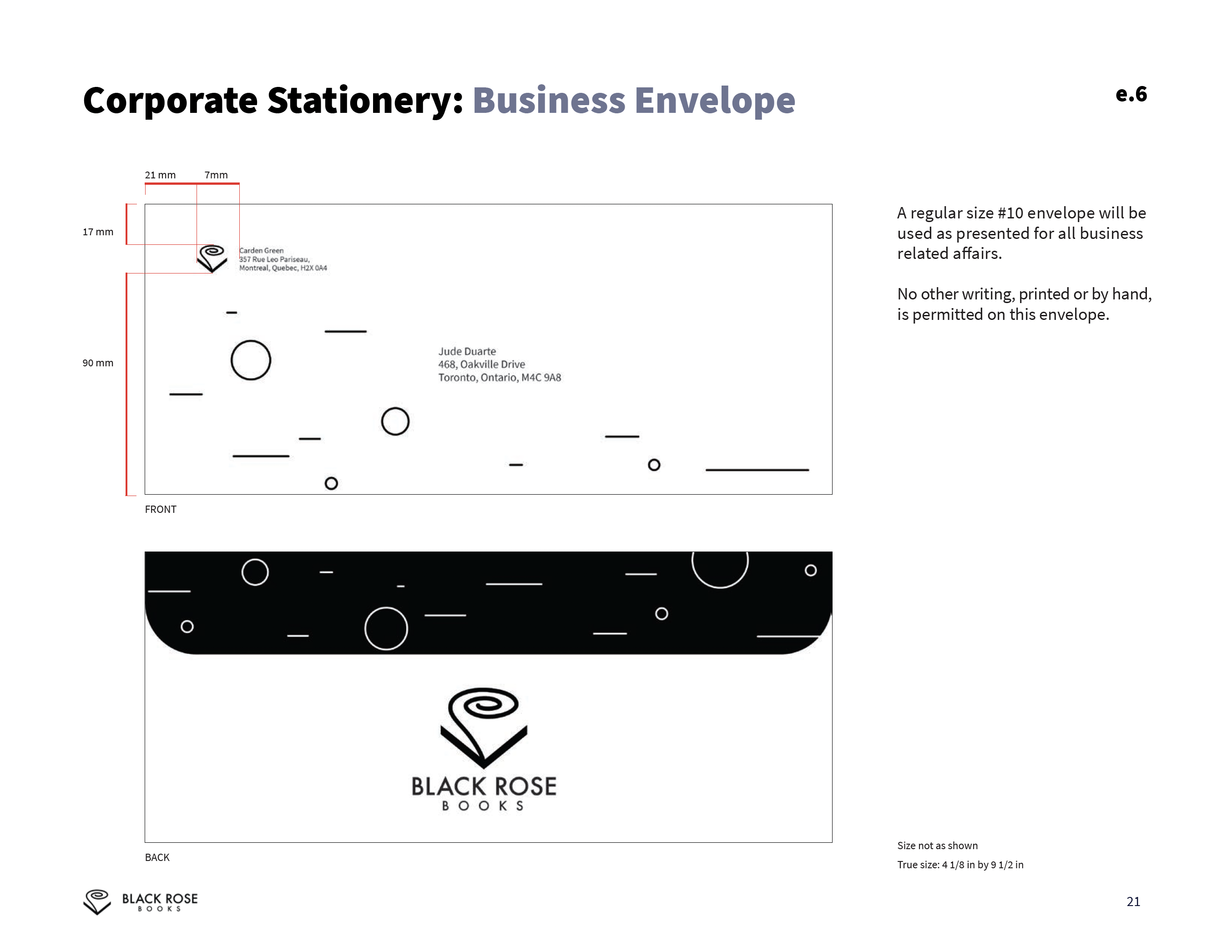
Corporate Stationary
![]()
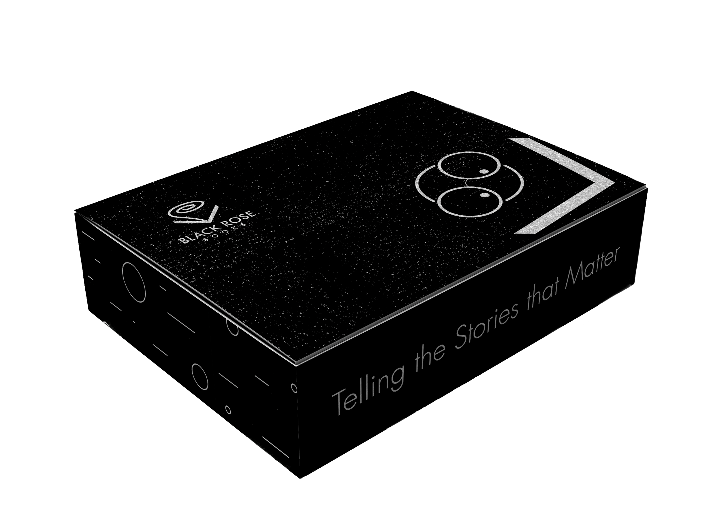
Packaging (Shopping Bags and Shipping Boxes)

Packaging (Shopping Bags and Shipping Boxes)


Round Metal Button Pins (1.25 in by 1.25 in)
![]()

Bookmarks (Back and Front)
![]()


View the Corporate Manual document here!
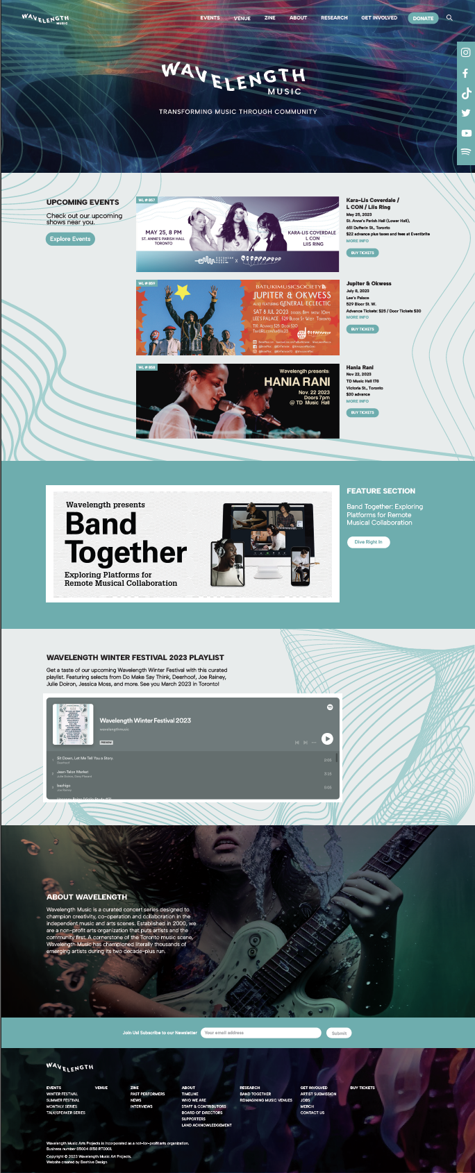
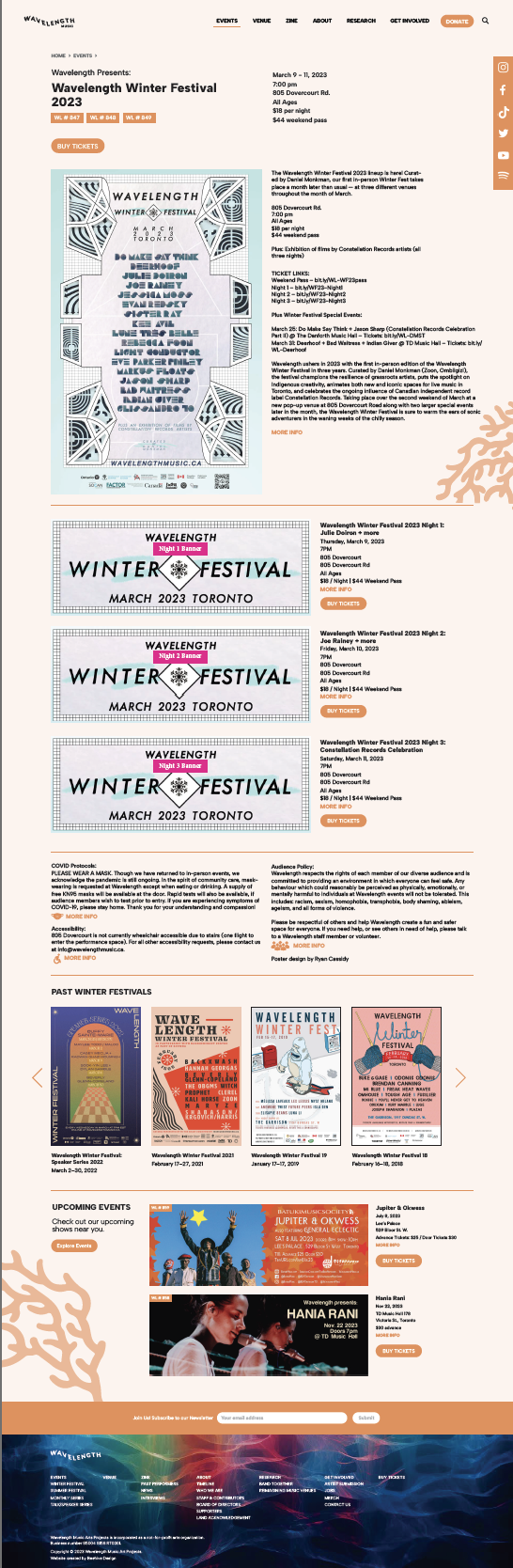
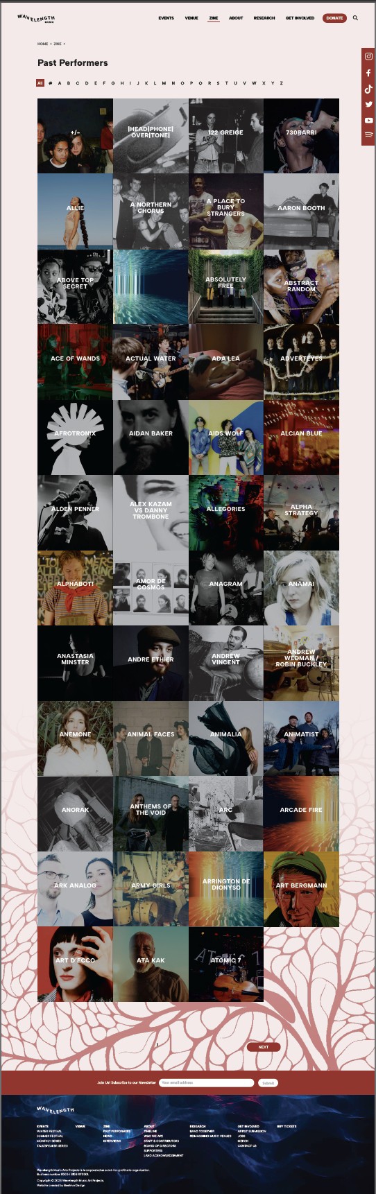
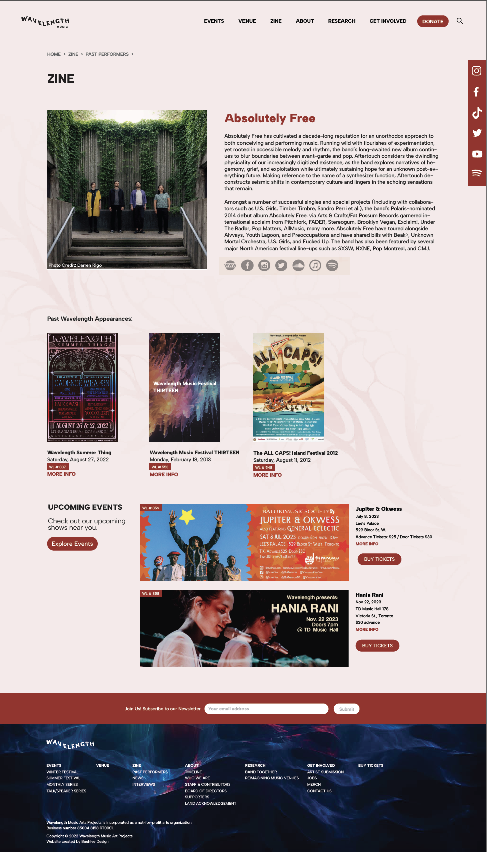
Website Design, UI/UX
2023Design
Tools
Figma
Miro
Adobe Illustrator
Adobe InDesign
Adobe Photoshop
Collaborators
Beehive Design Team
Wavelength Music
Check out the full website here!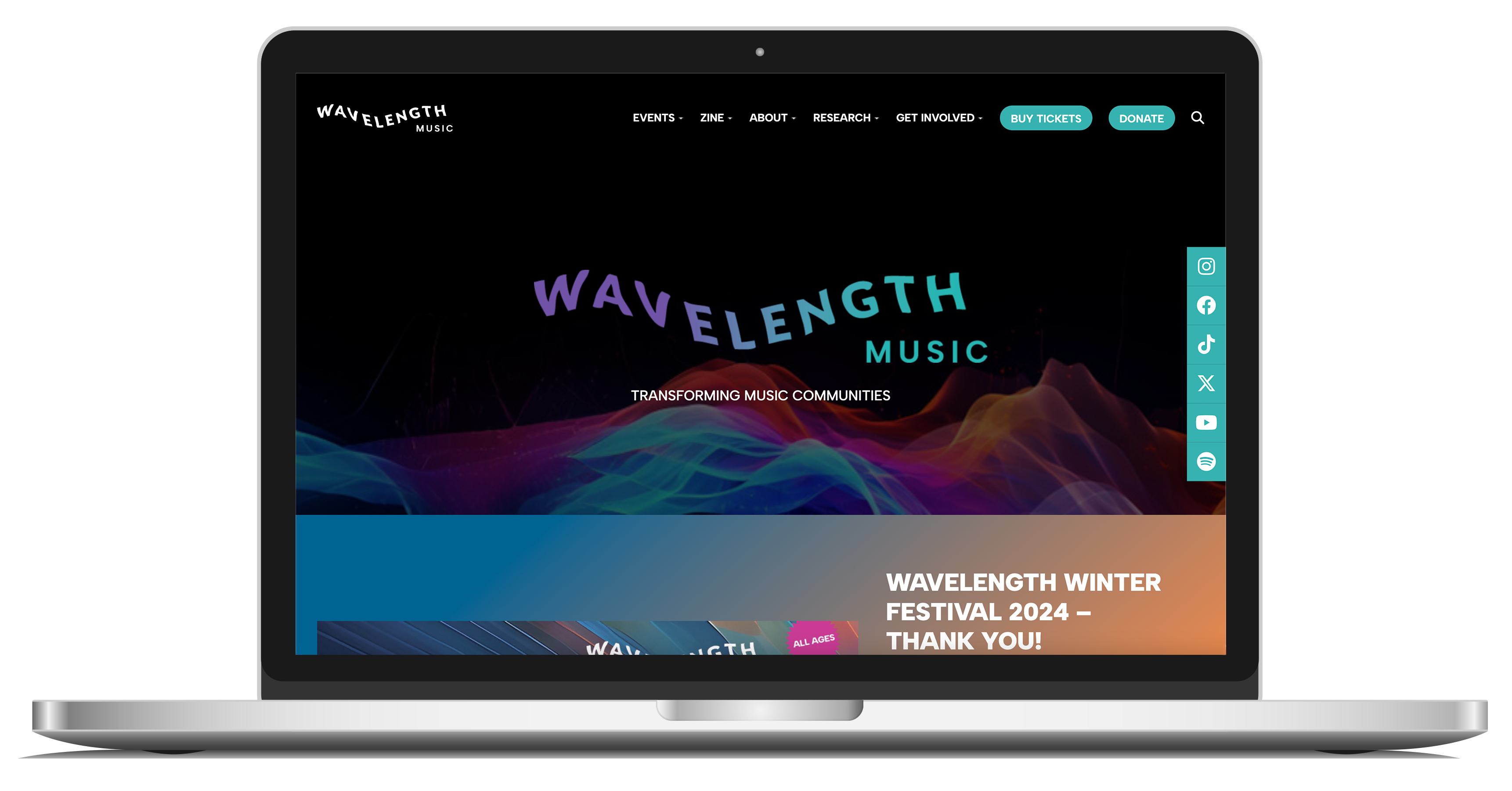
The Problem
As a non-profit arts platform that presents concerts, festivals, and conversations about music and city-building in the Toronto area, Wavelength needed a brand and website that speaks to the organization’s commitment to celebrate, showcase and foster local music artists and its community.The Solution
The new website works fully and completely as an informative and functional platform. But it conveys an overall brand concept that is distinctly Wavelength. It explains how Wavelength passionately conducts its practice of curation skillfully and diligently like no other.Mood Board and Inspiration
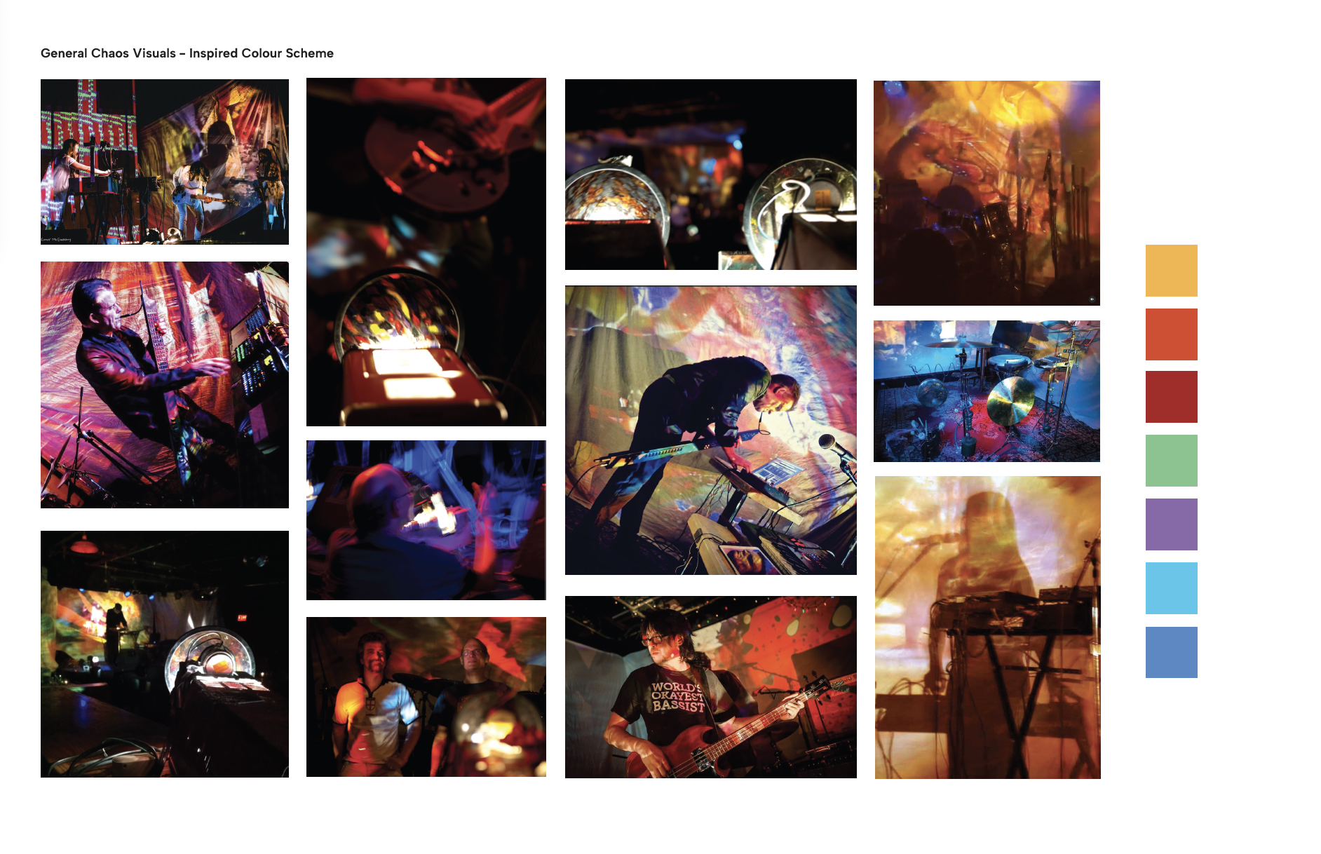
The Theme
We created many themes to unite everything Wavelength stands for, and the client resonated most with the theme of Deep Dive. The new theme to drive the new brand identity invites audiences to engage and take pride in their identity and self expression by being a part of the Wavelength Music culture. It represents simplicity, elegance, versatility, fluidity, and timelessness.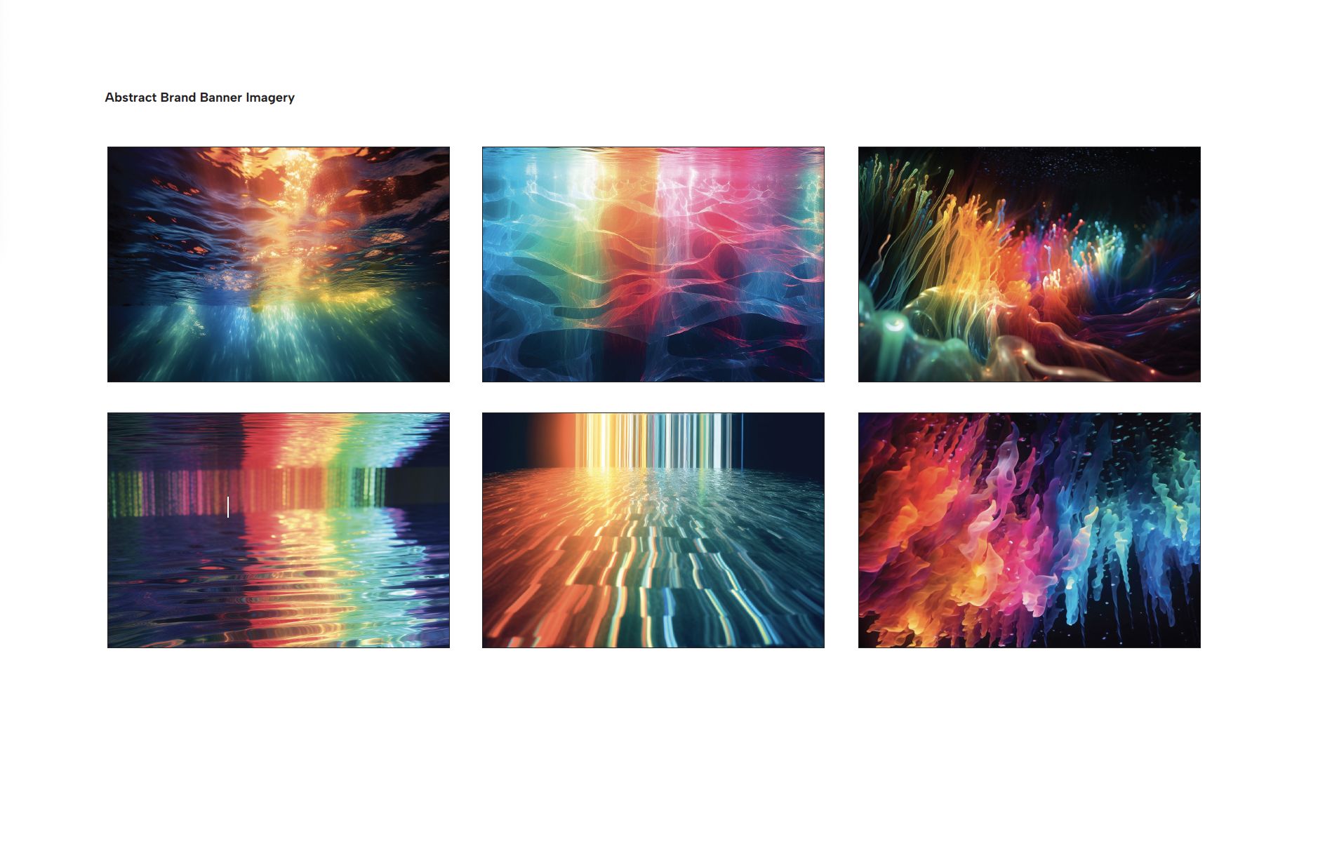

People (Target Audience)
- Indie music and indie arts enthusiasts
- Primary: Adults, 25-34 years old,
- Secondary: Adults 18-24 years old
- Tertiary or Secondary: Adults 35-44+ years old
- (Local) Toronto, GTHA*+
- Inclusive of gender association, male, female, LGBTQ2S++, youth, BIPOC
- Indie music and indie arts enthusiasts
- Primary: Adults, 25-34 years old,
- Secondary: Adults 18-24 years old
- Tertiary or Secondary: Adults 35-44+ years old
- (Local) Toronto, GTHA*+
- Inclusive of gender association, male, female, LGBTQ2S++, youth, BIPOC
Activities
Users will be able to connect with Wavelength as well as with musicians and be redirected to their personal pages to learn more about them. Users can also research past and current festivals.
Users will be able to connect with Wavelength as well as with musicians and be redirected to their personal pages to learn more about them. Users can also research past and current festivals.
Context
Clients in search of information about Wavelength and will likely be browsing musicians and events casually at home or with friends while out in search of things to do locally in Toronto either in advance or last minute.
Clients in search of information about Wavelength and will likely be browsing musicians and events casually at home or with friends while out in search of things to do locally in Toronto either in advance or last minute.
Technologies
The main technologies provided on this website will be redirecting users to social media and contact pages of artists, donation forms, as well as ticket purchases.
The main technologies provided on this website will be redirecting users to social media and contact pages of artists, donation forms, as well as ticket purchases.
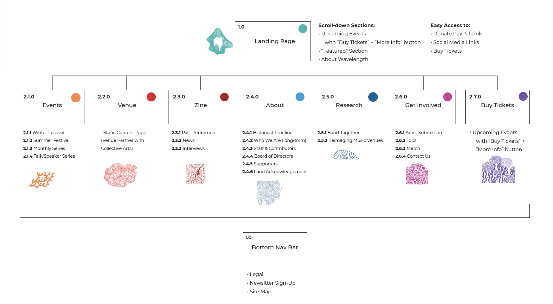
System Map
Wireframes