Black Rose Books
Black Rose Books is a non-profit book publisher of non-fiction books, most of which are focused on the fields of sciences and humanities.The rebrand was designed to modernize the company’s corporate identity and represent that they stand for telling stories and sharing knowledge, while staying true to their history.
Logo Rational
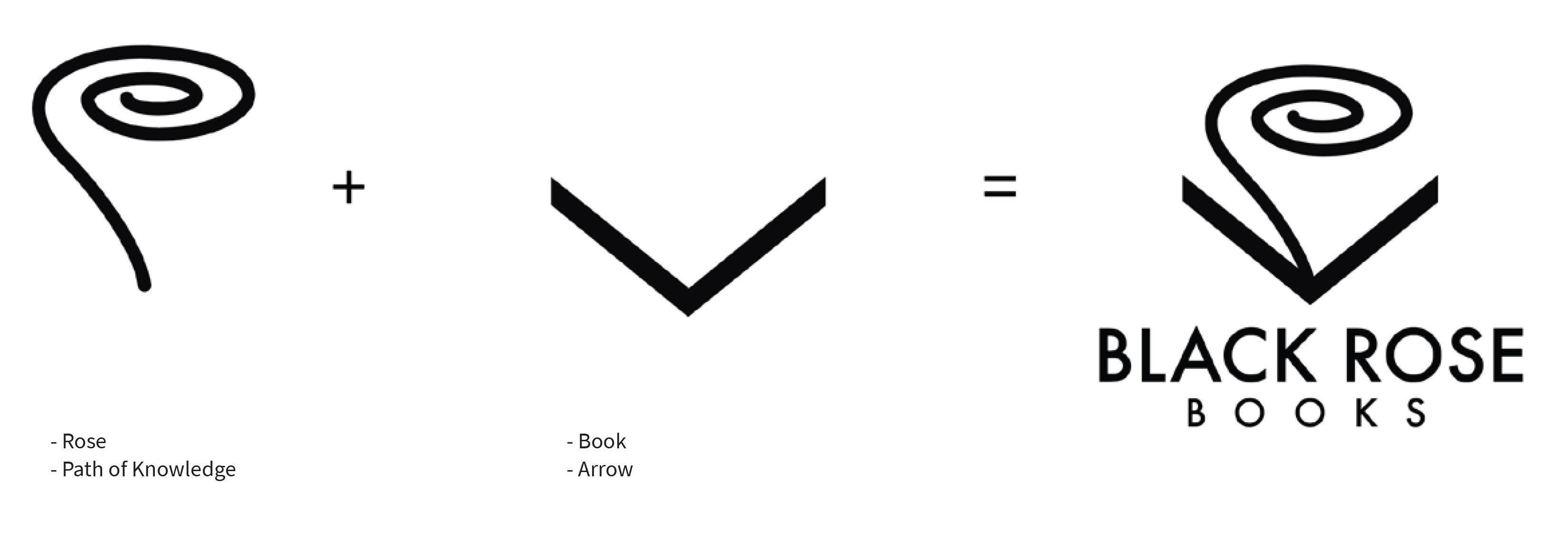
The black rose is a symbol of freedom. This logo represents how reading a book published by Black Rose Books puts you on a path of knowledge, upwards towards enlightenment. The knowledge is represented by a swirl rising out of the book, which is mimicking the abstract shape of a rose. The open book is a downward arrow pointing towards the name of the company, implying that to reach the enlightenment shown in the logo, one should buy a book published by Black Rose Books.


Fluid Elements
The Black Rose Books pattern consists of the outline of perfect circles in various sizes and horizontal lines of varying lengths. The lines represent knowledge that is traveling between people reading, who are represented by the various circles.
The graphic elements may appear in any of the following presented forms and colours in advertising, on merchandise, and in any other Black Rose Books related branding.
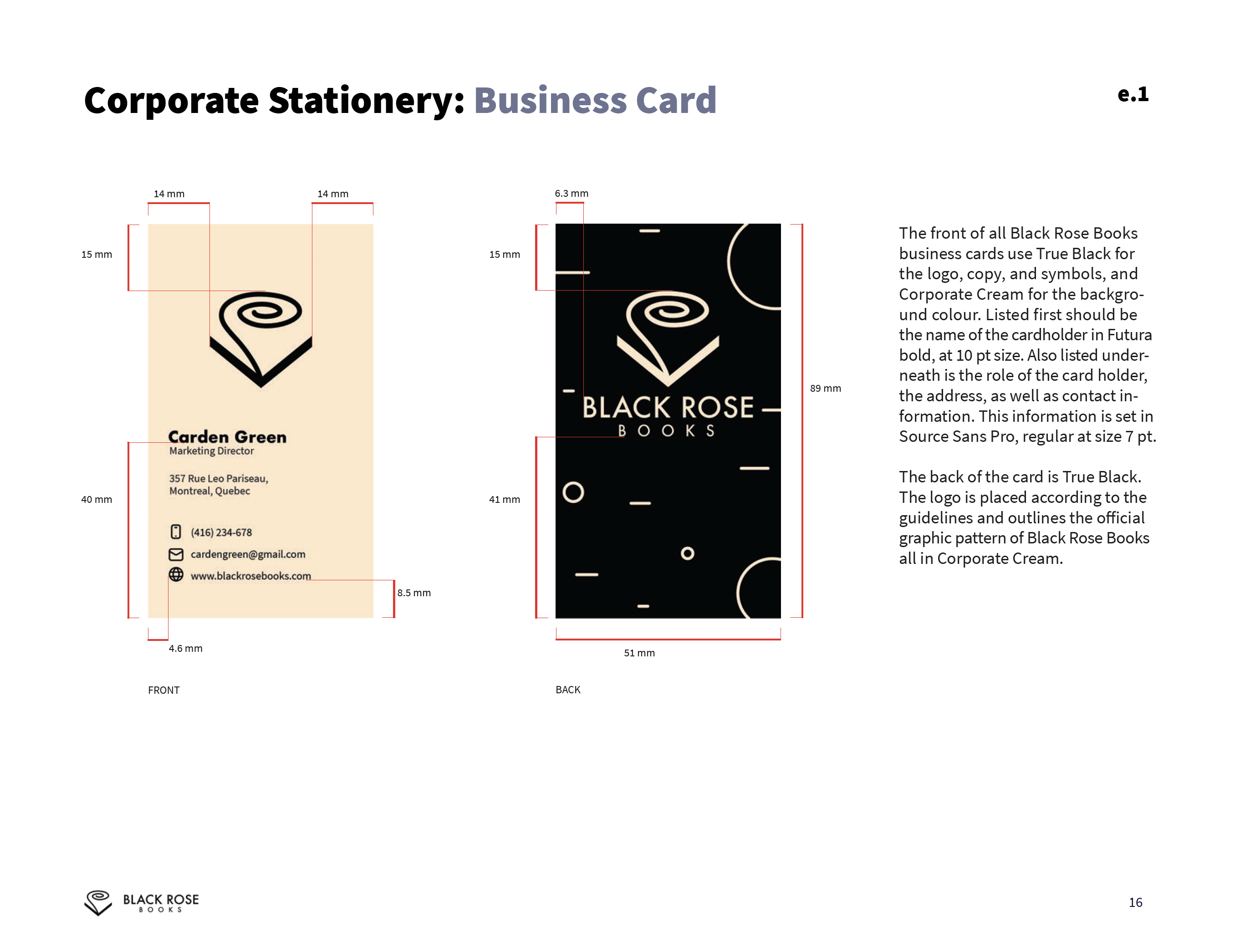
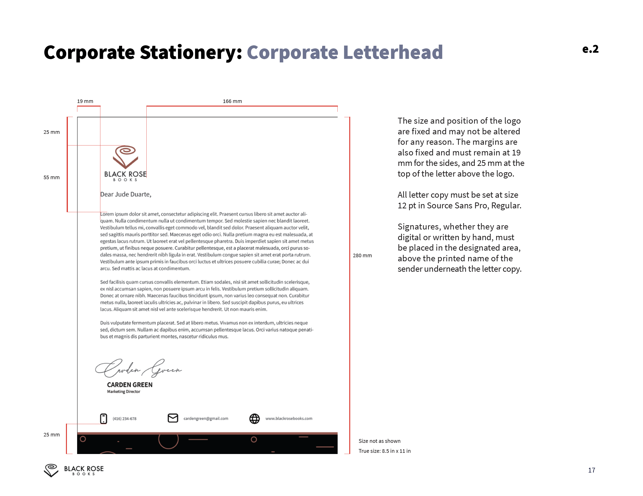
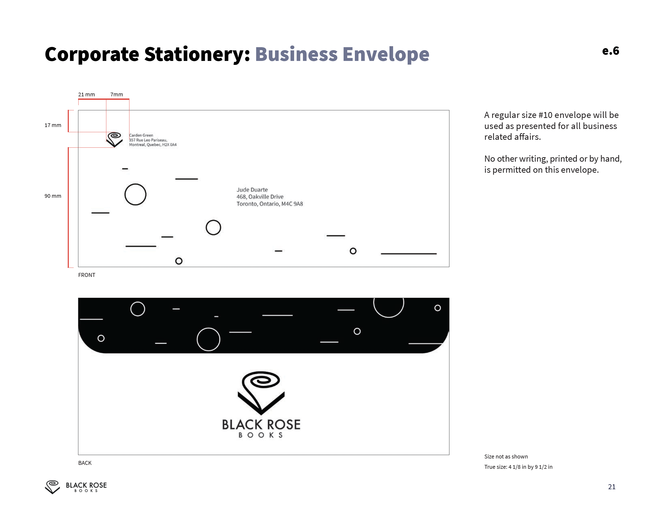
Corporate Stationary
![]()
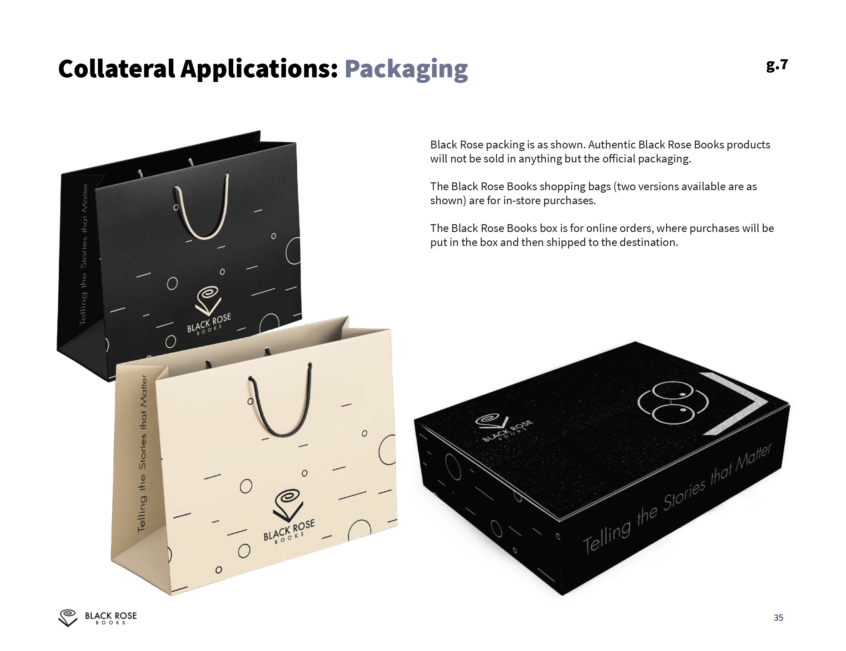
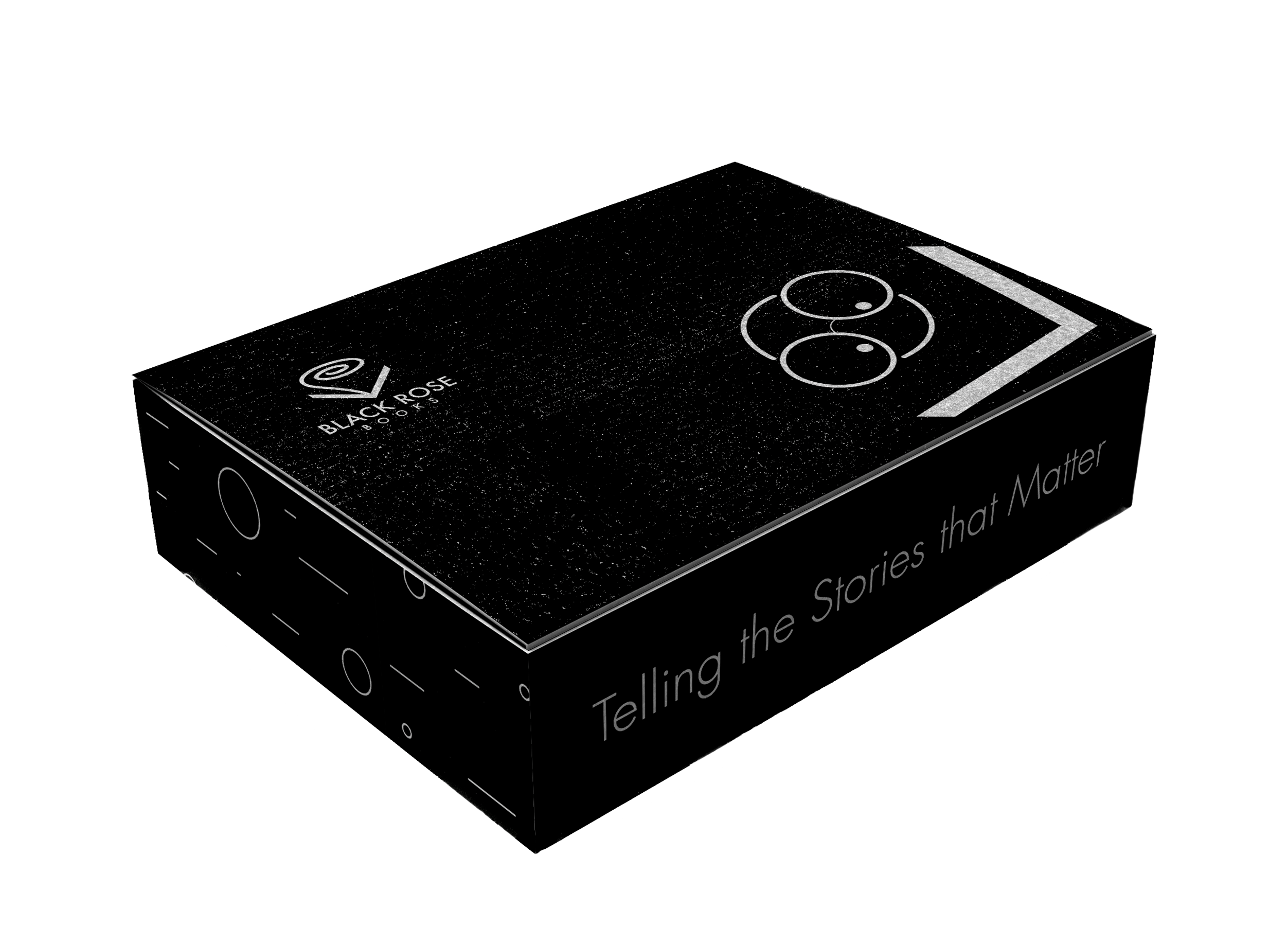
Packaging (Shopping Bags and Shipping Boxes)

Packaging (Shopping Bags and Shipping Boxes)


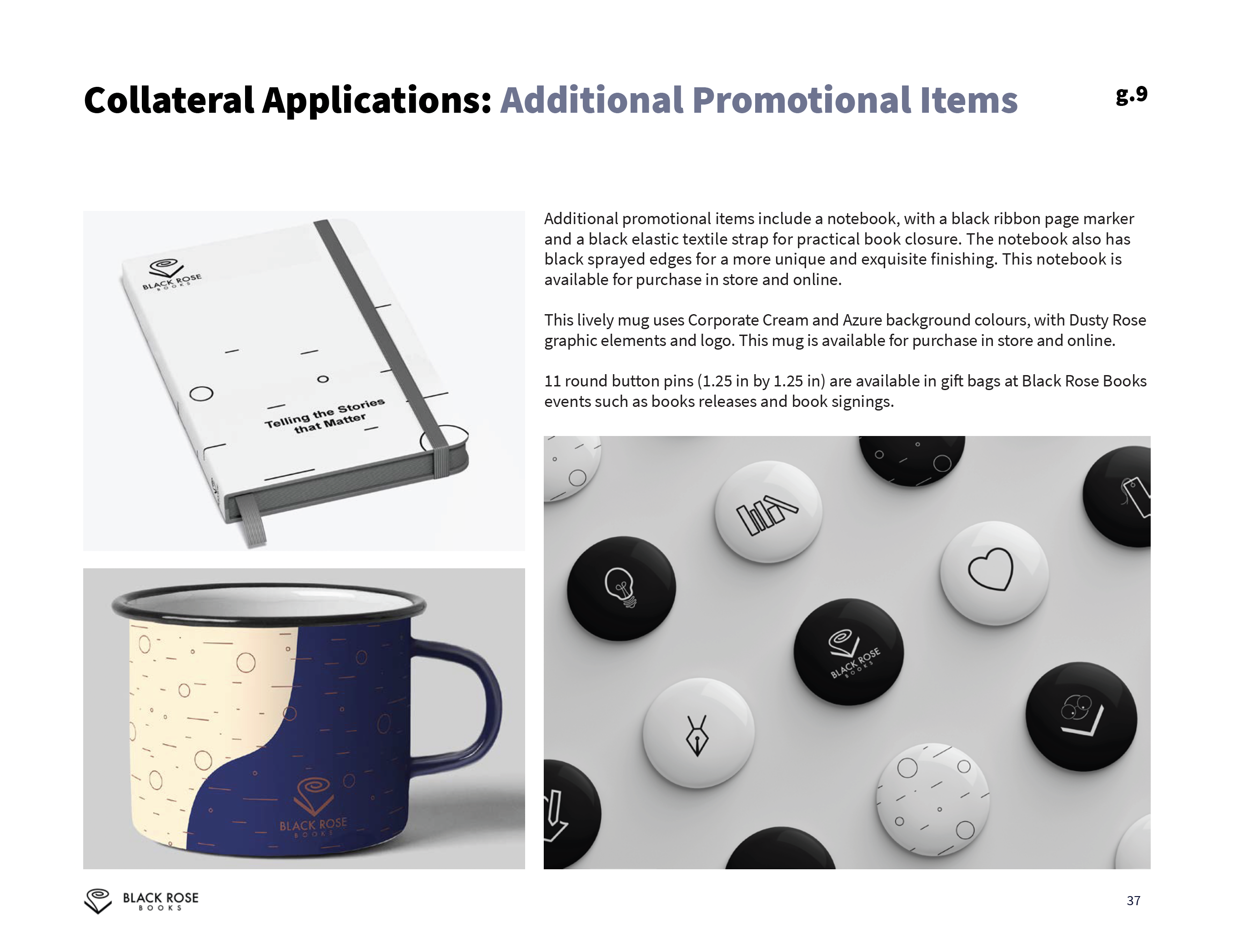
Round Metal Button Pins (1.25 in by 1.25 in)
![]()

Bookmarks (Back and Front)
![]()